Bekunis - Marque a sua Hora*
*Mark your time with Bekunis

Client: Bekunis
Produced by Creative Lemons Agency
Script + Music + SFX: Creative Lemons Agency
Role
Art Direction + Character Design + Illustration + Animation
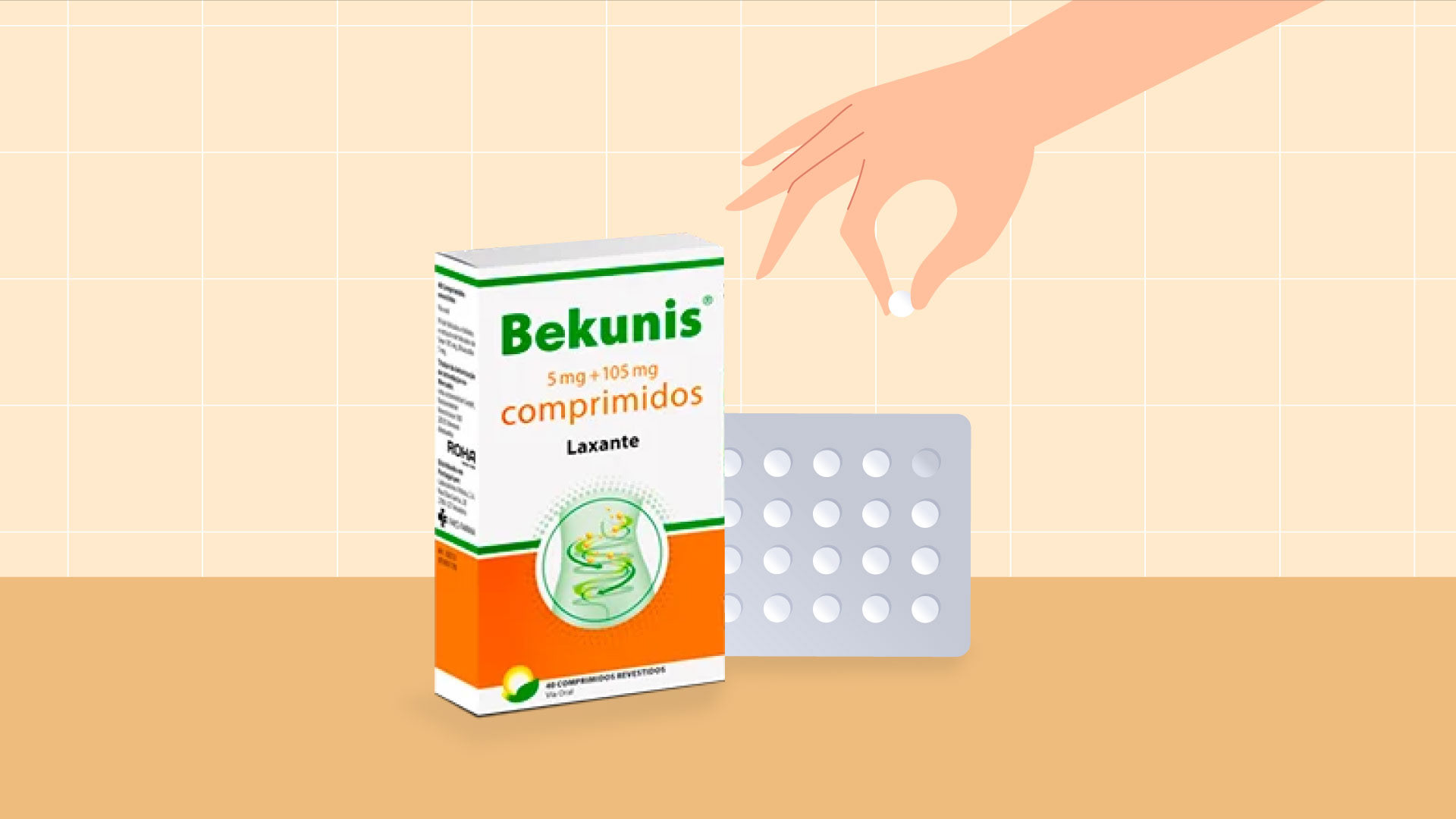
The lovely team at Creative Lemons Agency approached me to illustrate and animate a video for Bekunis, a non-prescription laxative trusted for over 35 years.
There was more to this project than just about creating beautiful visuals. It was about using creativity to explain the product's effective solution in a way that feels human, inviting, and simple to follow.
Huge thanks to Creative Lemons for bringing me into the project!

The Challenge
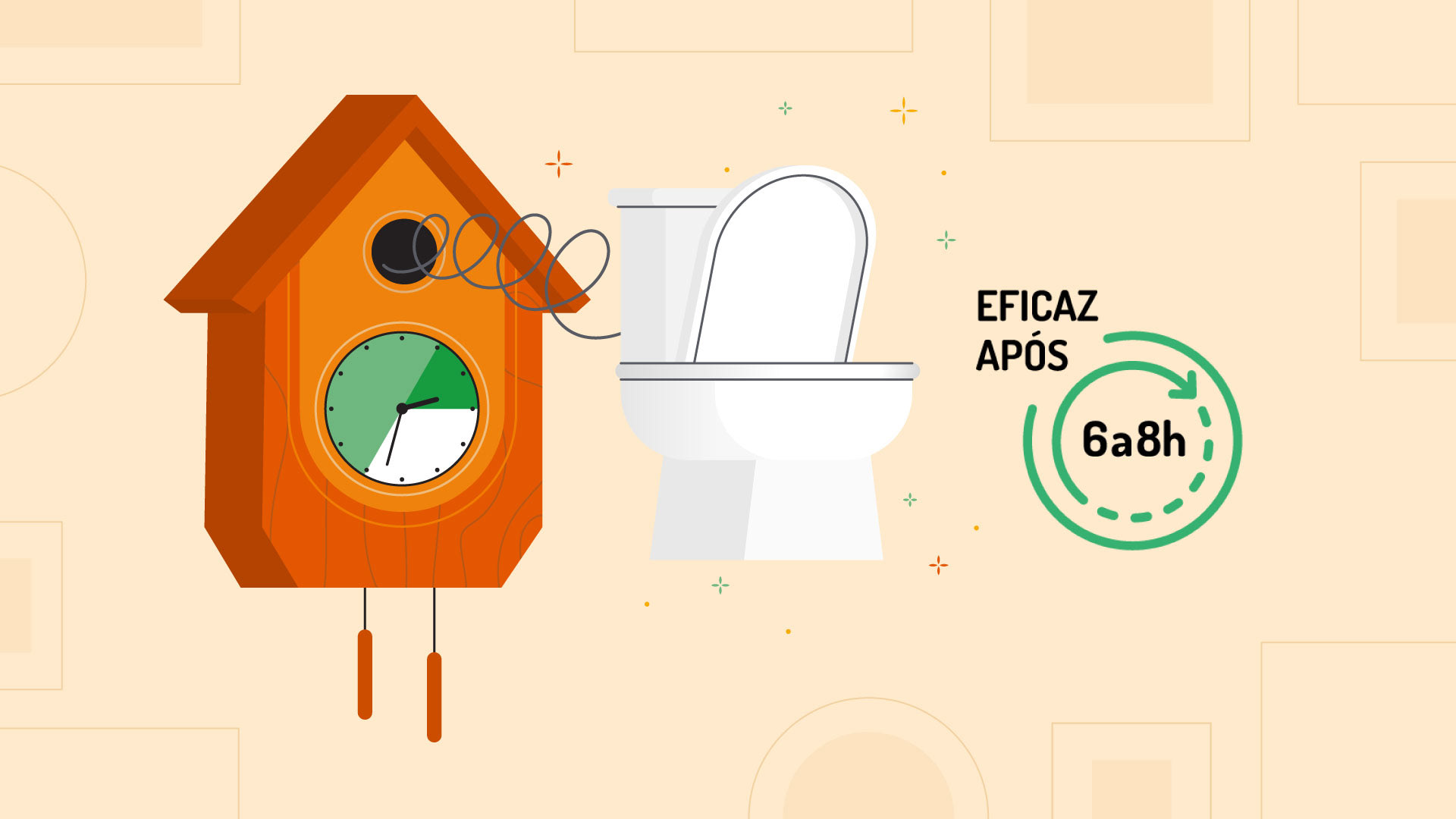
To develop a video that communicate Bekunis effectiveness in relieving constipation in a way that felt real, friendly, and totally easy to understand.
The campaign required two versions of the video: a 15-second and a 30-second cut, to keep everything running smoothly on every platform.
The Solution
To bring the animation to life, my focus was showing the protagonist's journey from discomfort to relief. I used expressive movements and clear visual cues so everyone could easily follow and relate to her transformation.
Deliverables
~ Full visual development from initial concept to final illustrations
~ Original character and environment designs
~ Storyboard + Styleboard + Styleframes
~ Illustration files prepared and optimized for animation
~ Fully animated campaign launch video (16:9 format)
Visual Approach
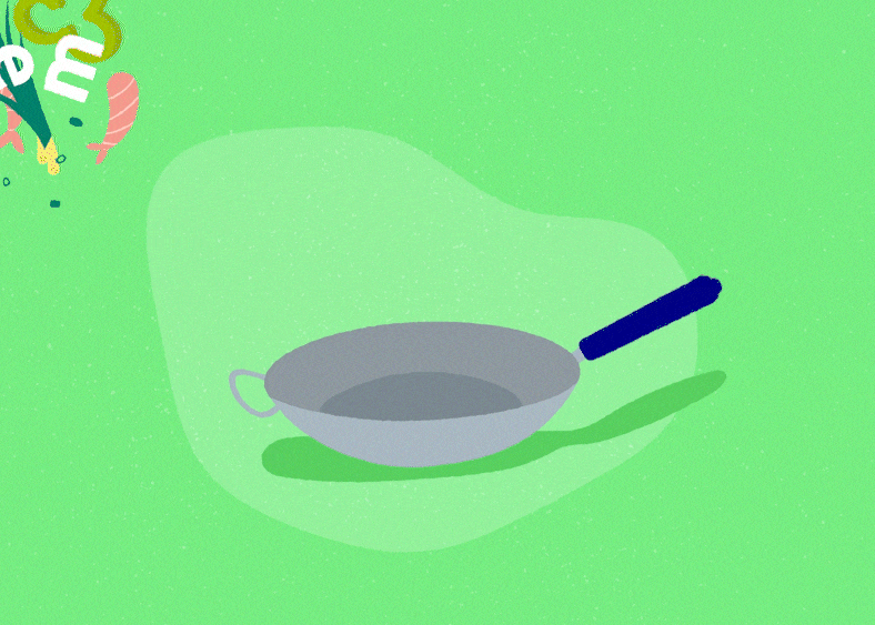
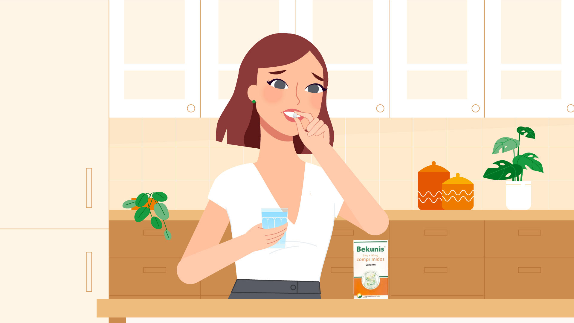
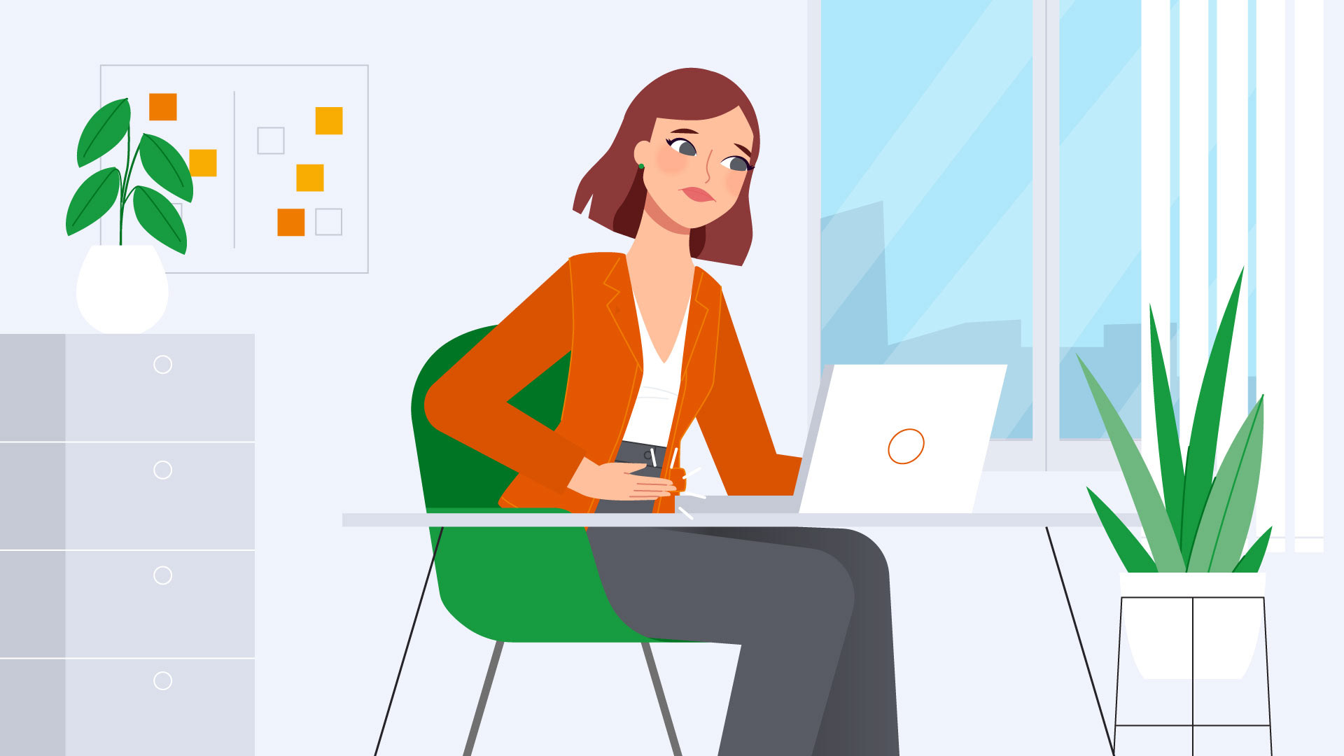
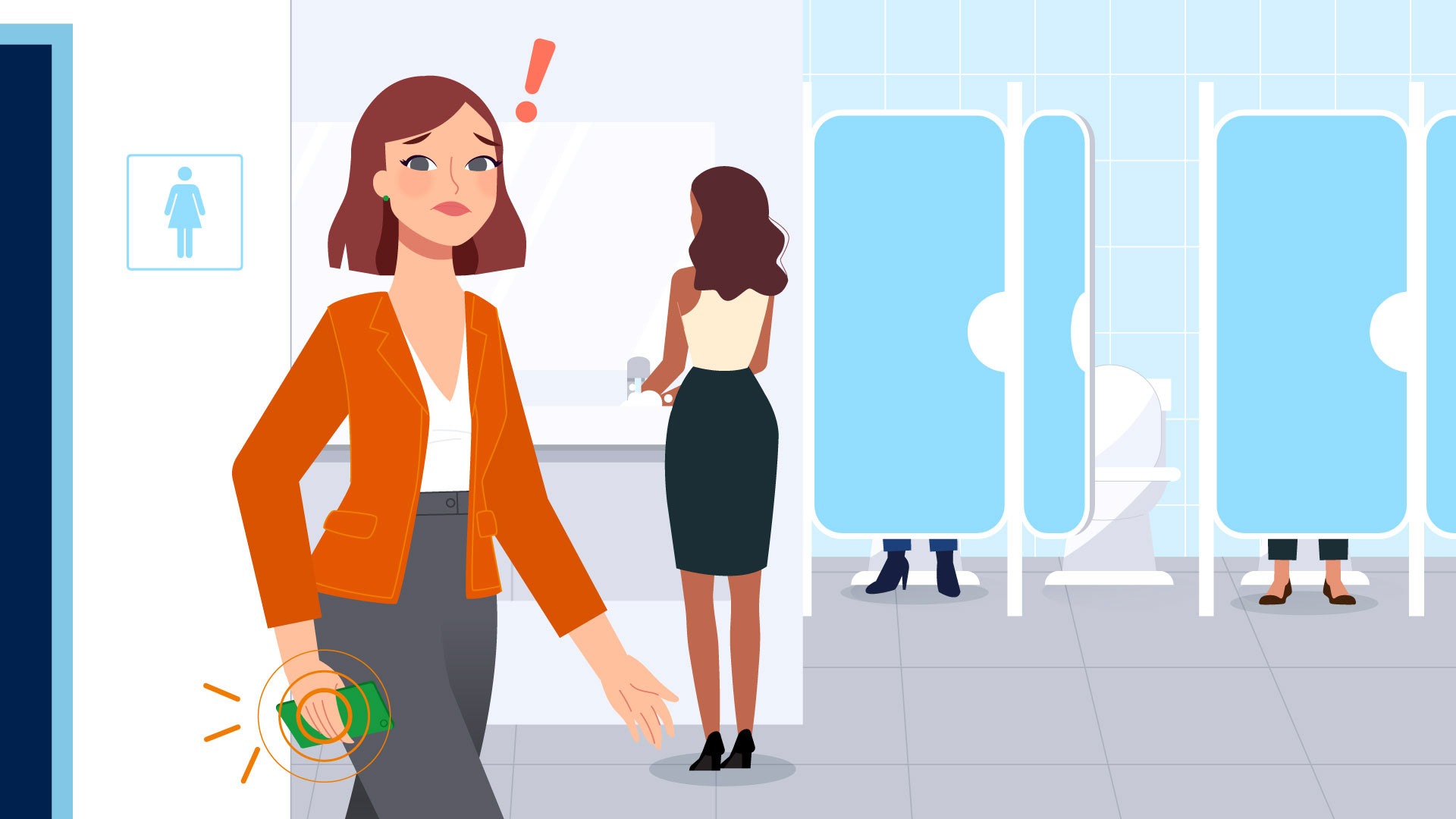
The video takes an empathetic and straightforward look at the experience of someone dealing with digestive discomfort.
The animation style nails a good balance by keeping the illustrations simple and clear, while still retaining enough realism for the audience to connect with the situation.
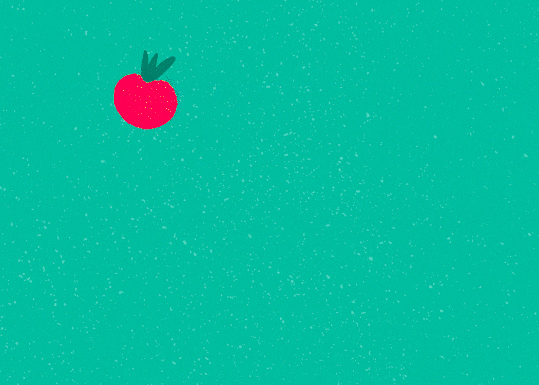
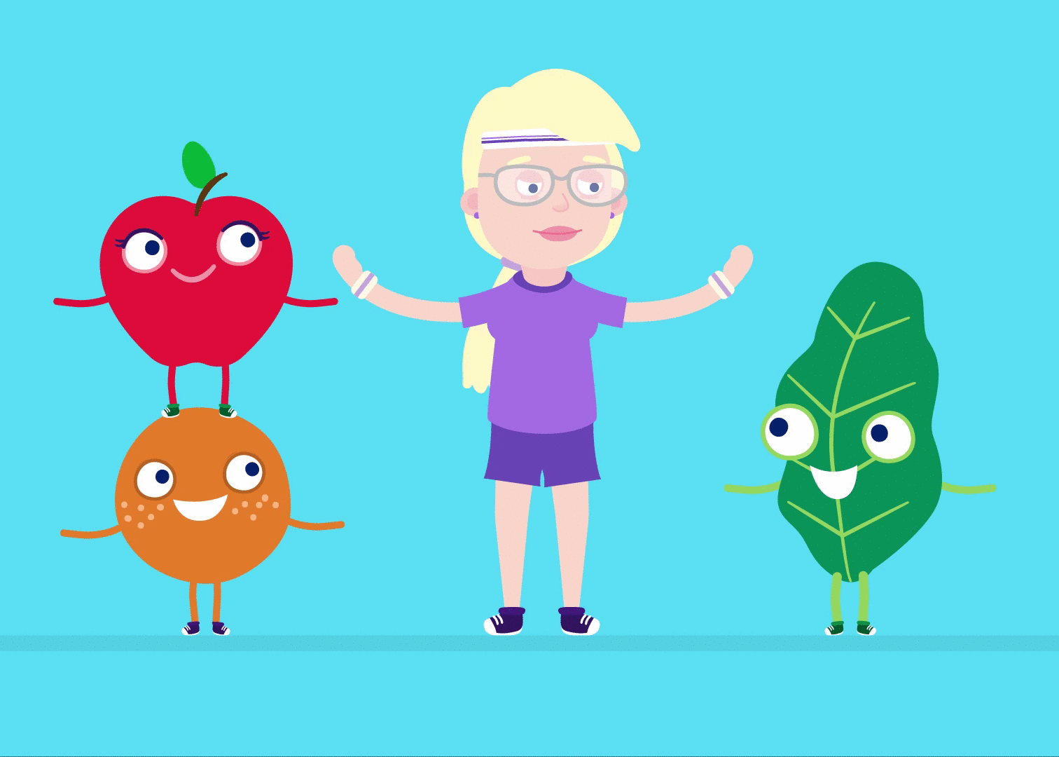
Our protagonist was designed to be instantly relatable. When the video starts, she's noticeably uneasy you can see it affecting her mood and even her work! But then you get to see her transformation. Her facial expressions, body language, and the world around her all shift as she finds relief and joy.

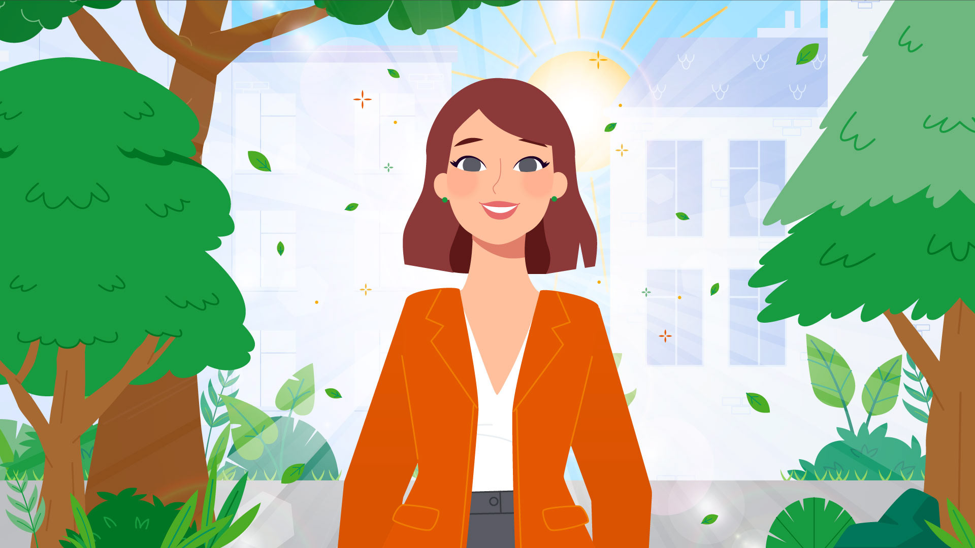
Picking the right color palette was also super important. I added warm colors to the client's already vibrant palette to instantly communicate a sense of coziness, optimism and an overall sense of well-being.
The Result
Ultimately, this animation isn't just to promote a product. It's about helping people tackle a common issue practically, showing them that relief is really just a simple choice away.
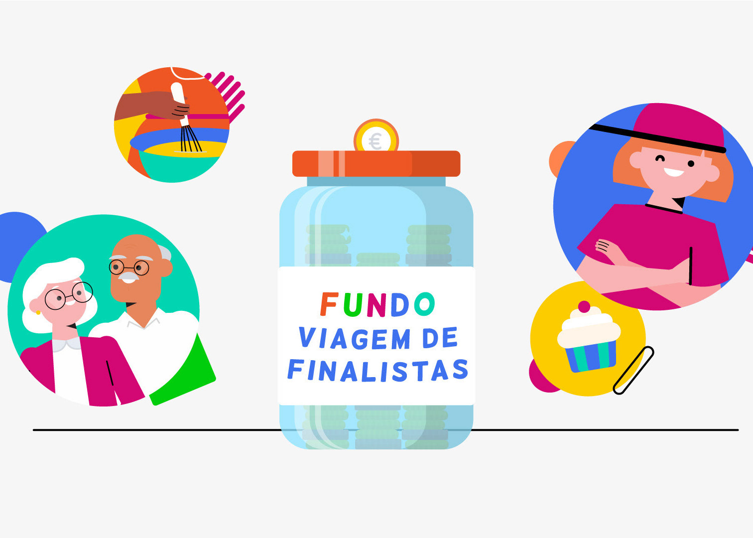
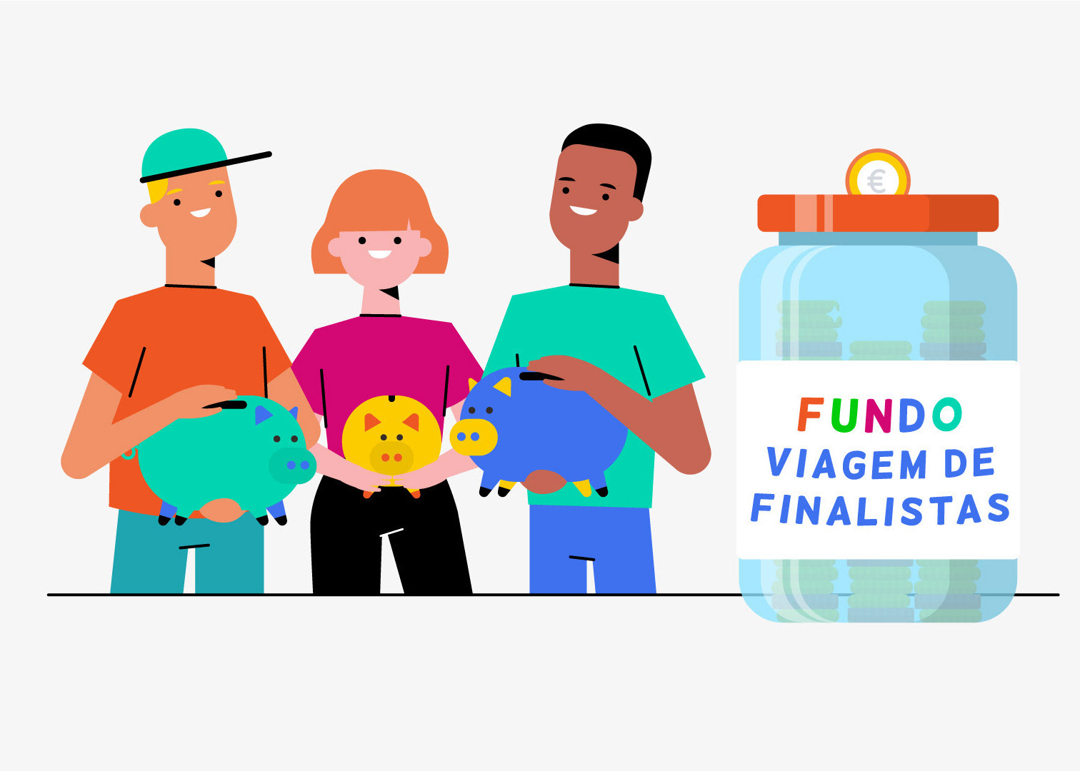
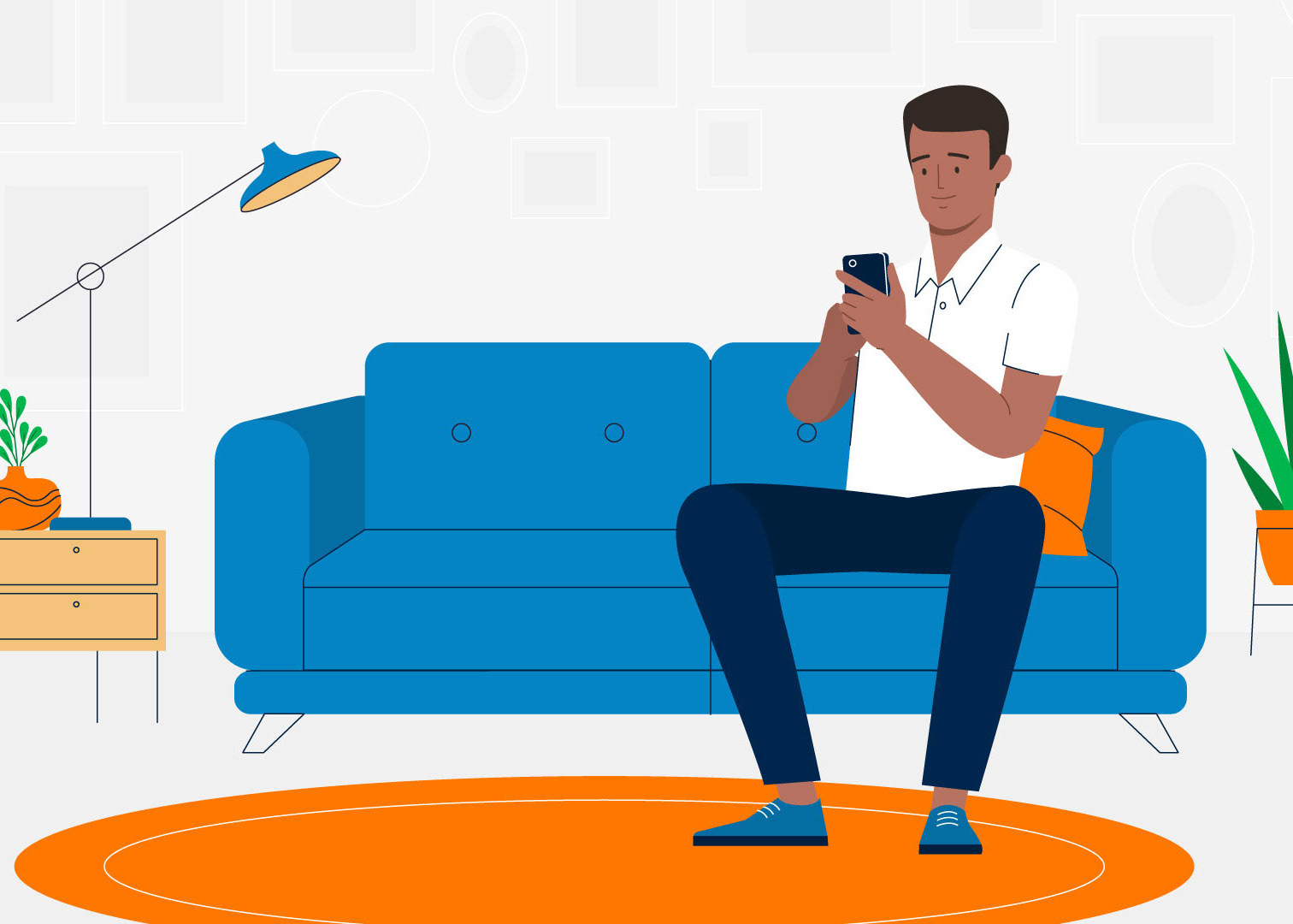
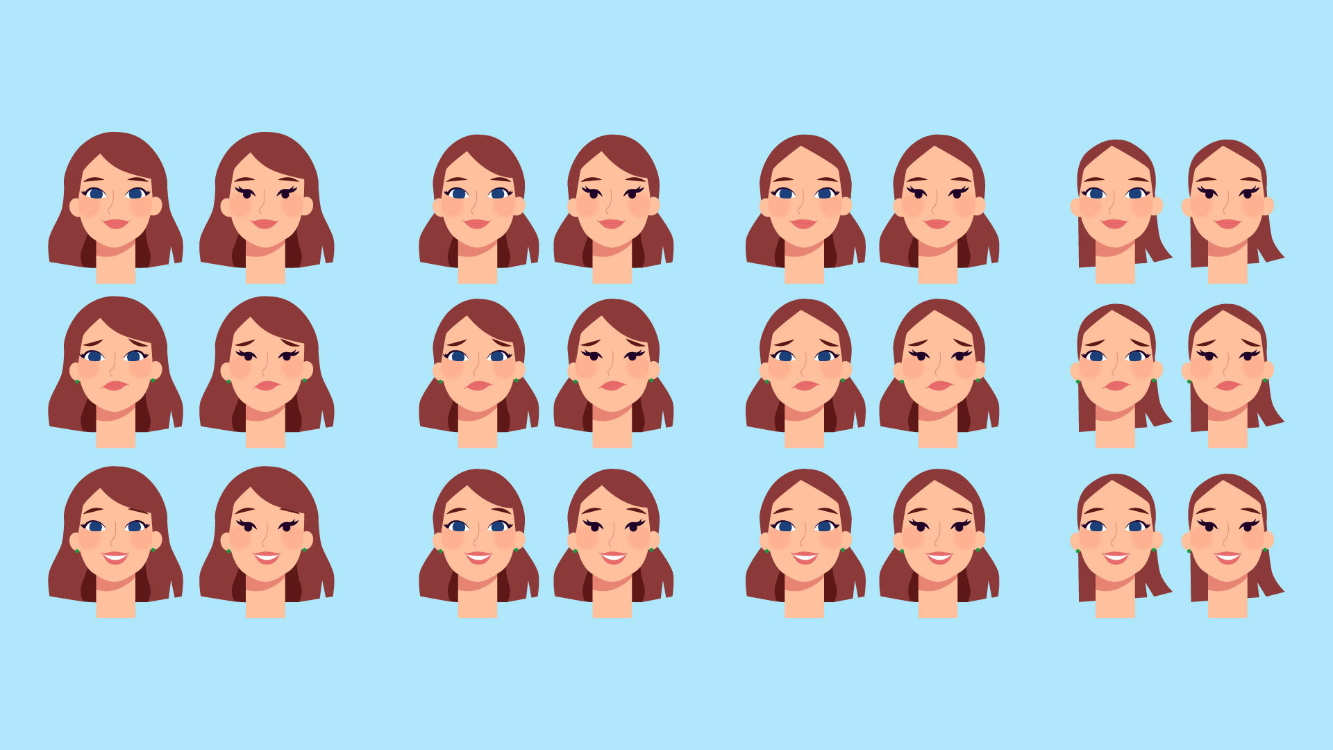
Character Exploration


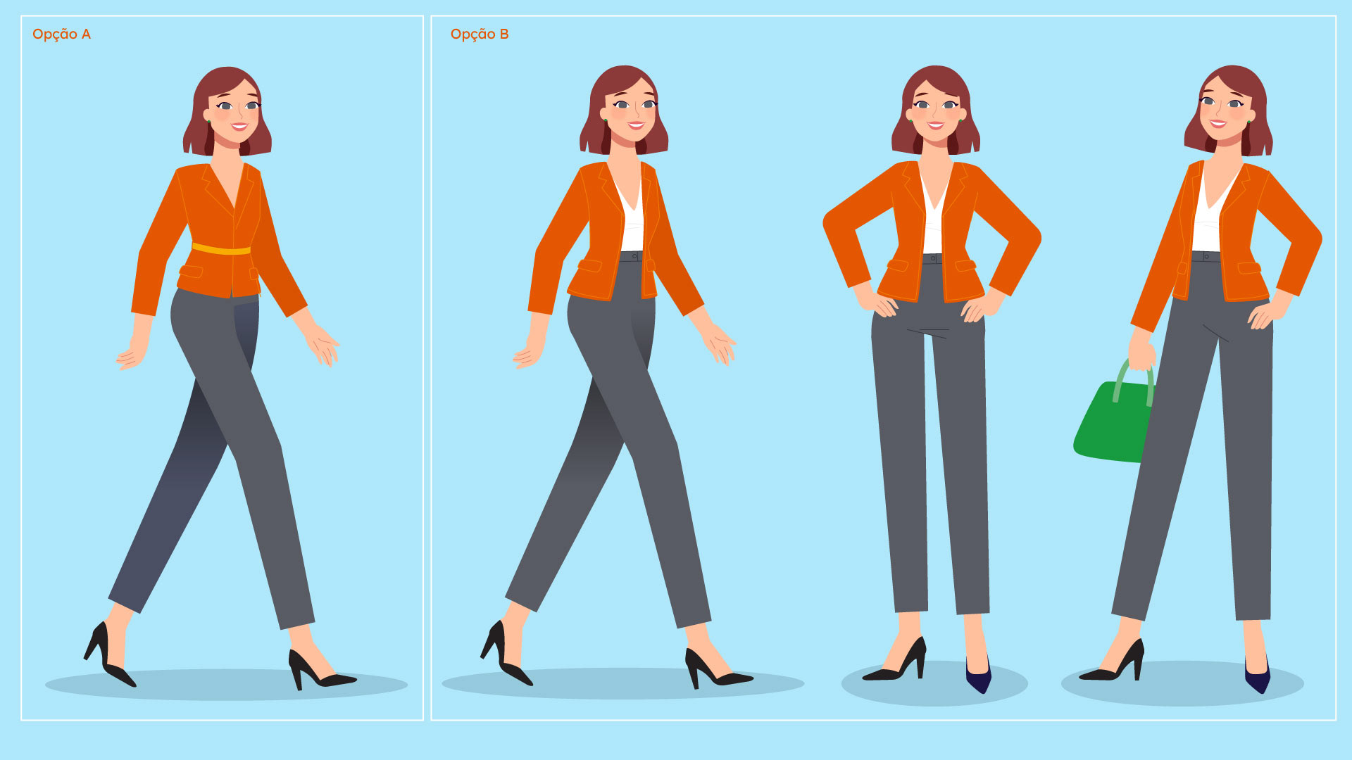
Final Character Design

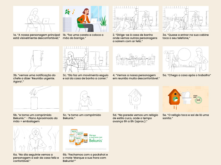
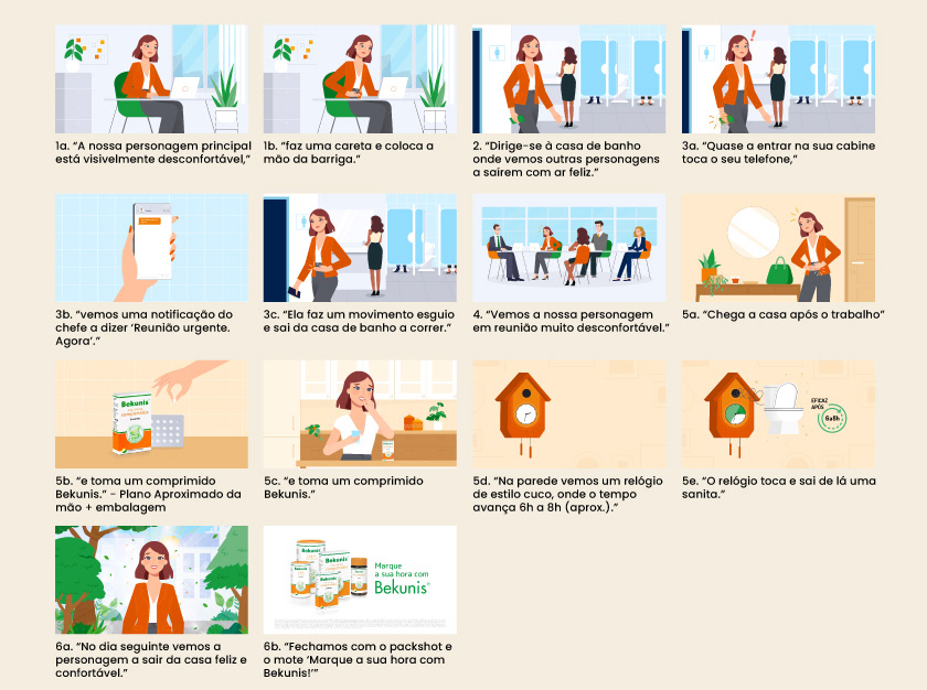
Storyboard, Styleboard & Styleframes


Got a great project idea, or thinking of something like this one? Maybe you're just curious about the process, or you feel like saying hello?
Great projects always start with a conversation. Seriously, drop me an e-mail!, I'd love to hear from you!