Liberty Sem Rodeios*
*Liberty Straightforward

Client: Liberty Seguros
Agency: LLYC Lisboa
Produced by MadStudios
Script & Voice Over: MadStudios
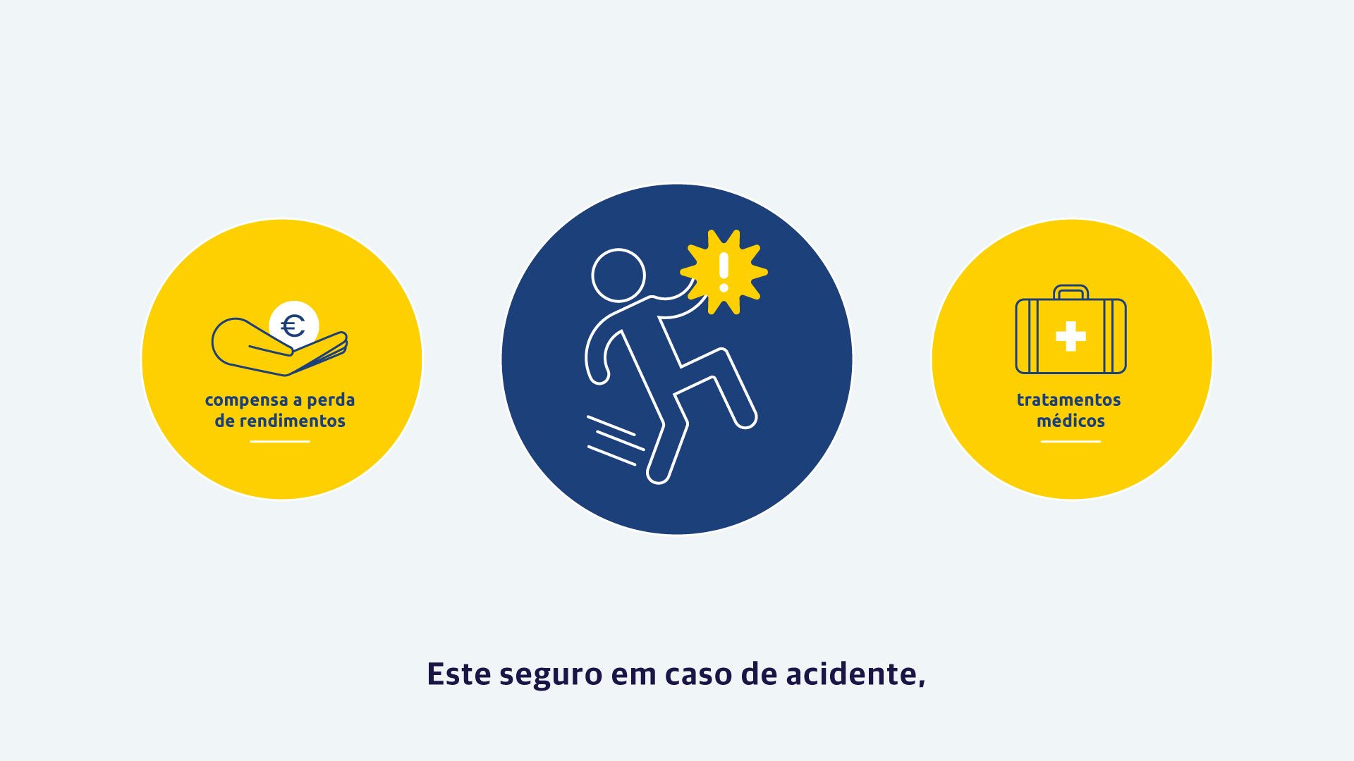
Role
Art Direction + Character Design + Illustration + Animation
I had the great opportunity to partner with the talented team at Madstudios who approached me to design, illustrate, and animate a five-part web series on insurance literacy for Liberty Seguros.
This web series aims to simplify complex insurance concepts through engaging narratives, designed to both educate and entertain viewers.
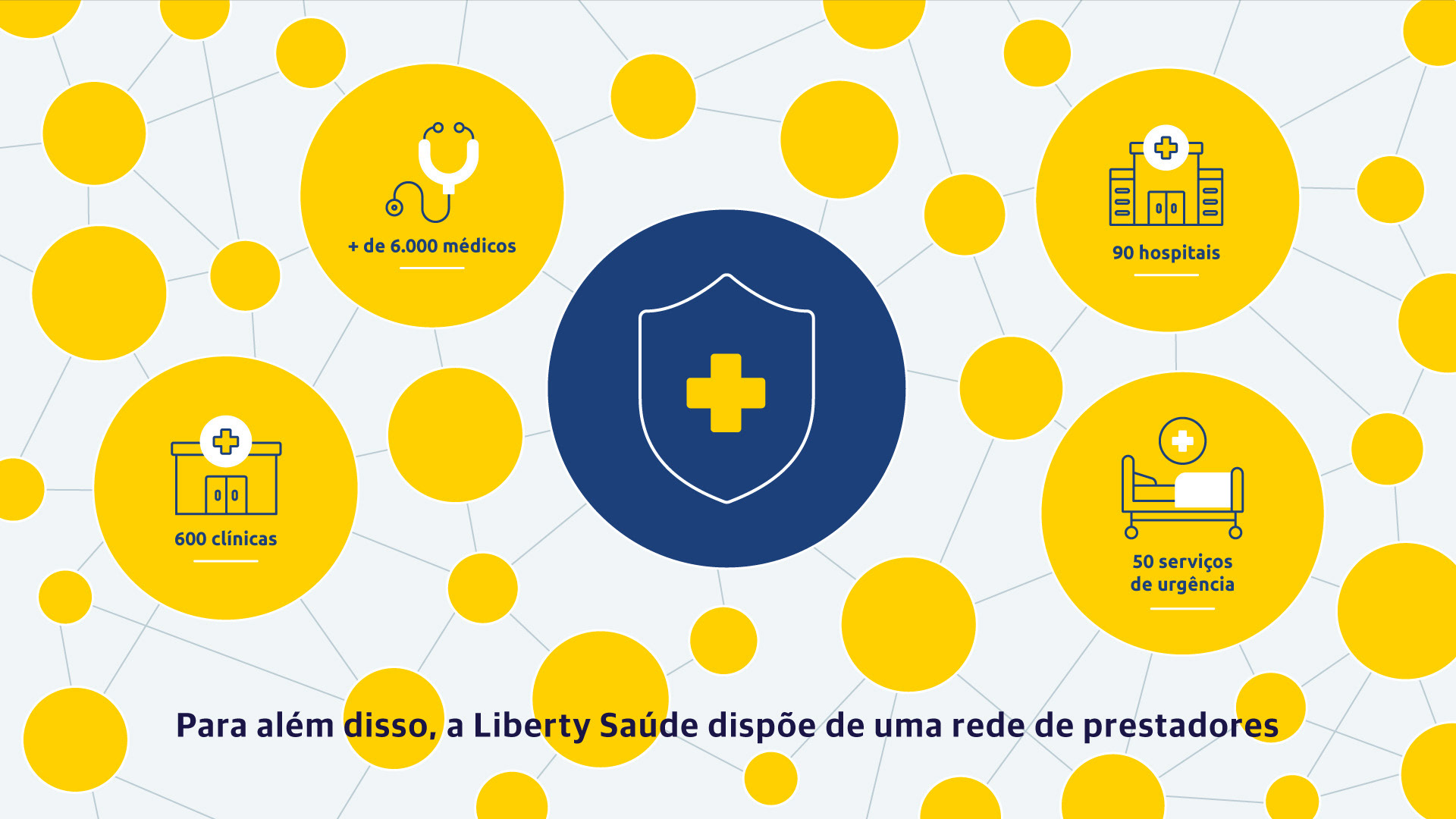
It was blast trying to figure out how to visually explain tricky insurance concepts like 'loss of income', 'medical care', 'family and heir protection', and many others. Thanks to Madstudios for the awesome challenge!

The Challenge
To conceptualize and deliver a five-part web series that uses relatable stories to break down complicated insurance topics, making everything super easy for viewers to understand.
The Solution
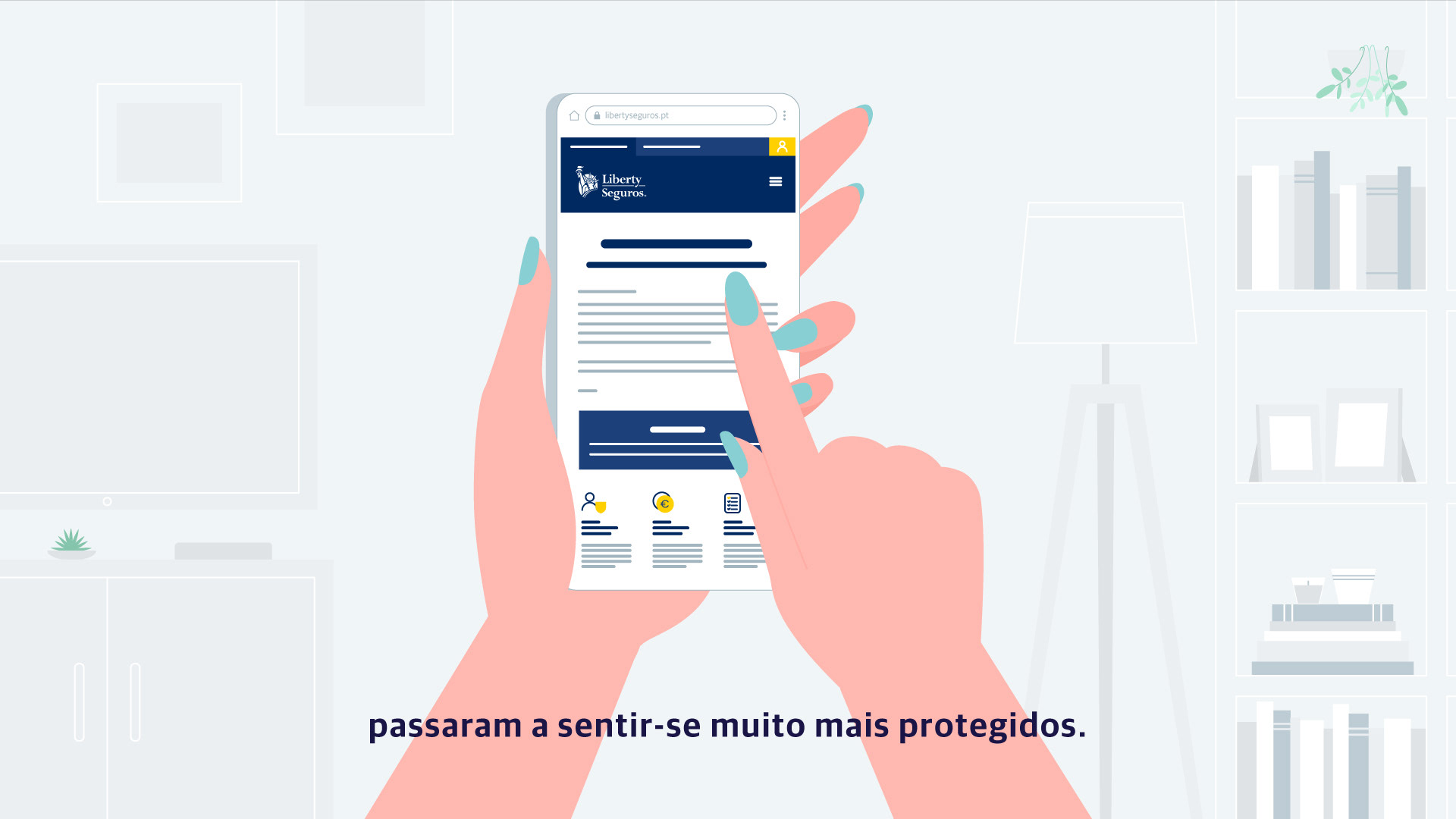
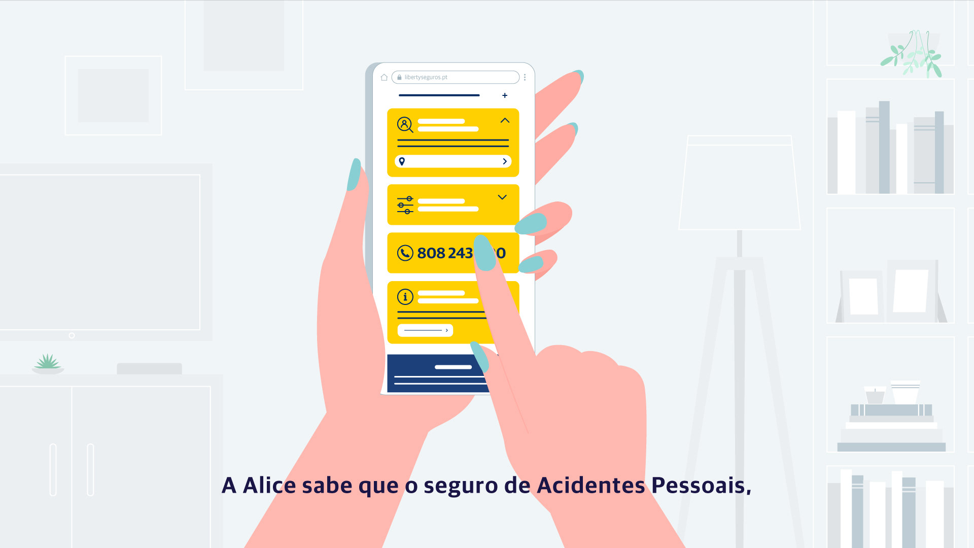
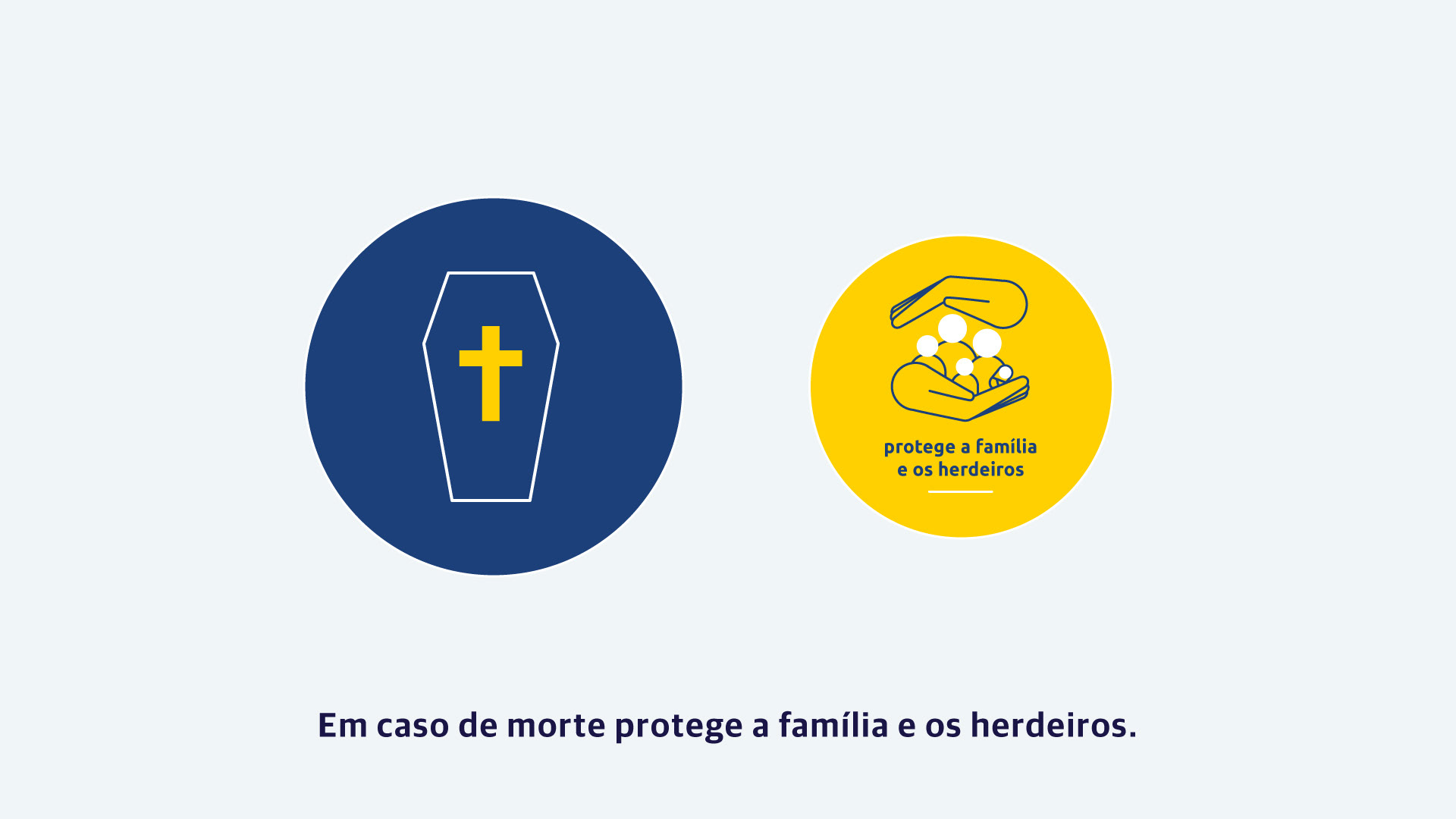
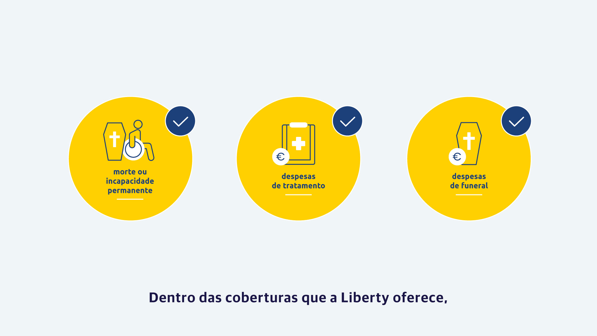
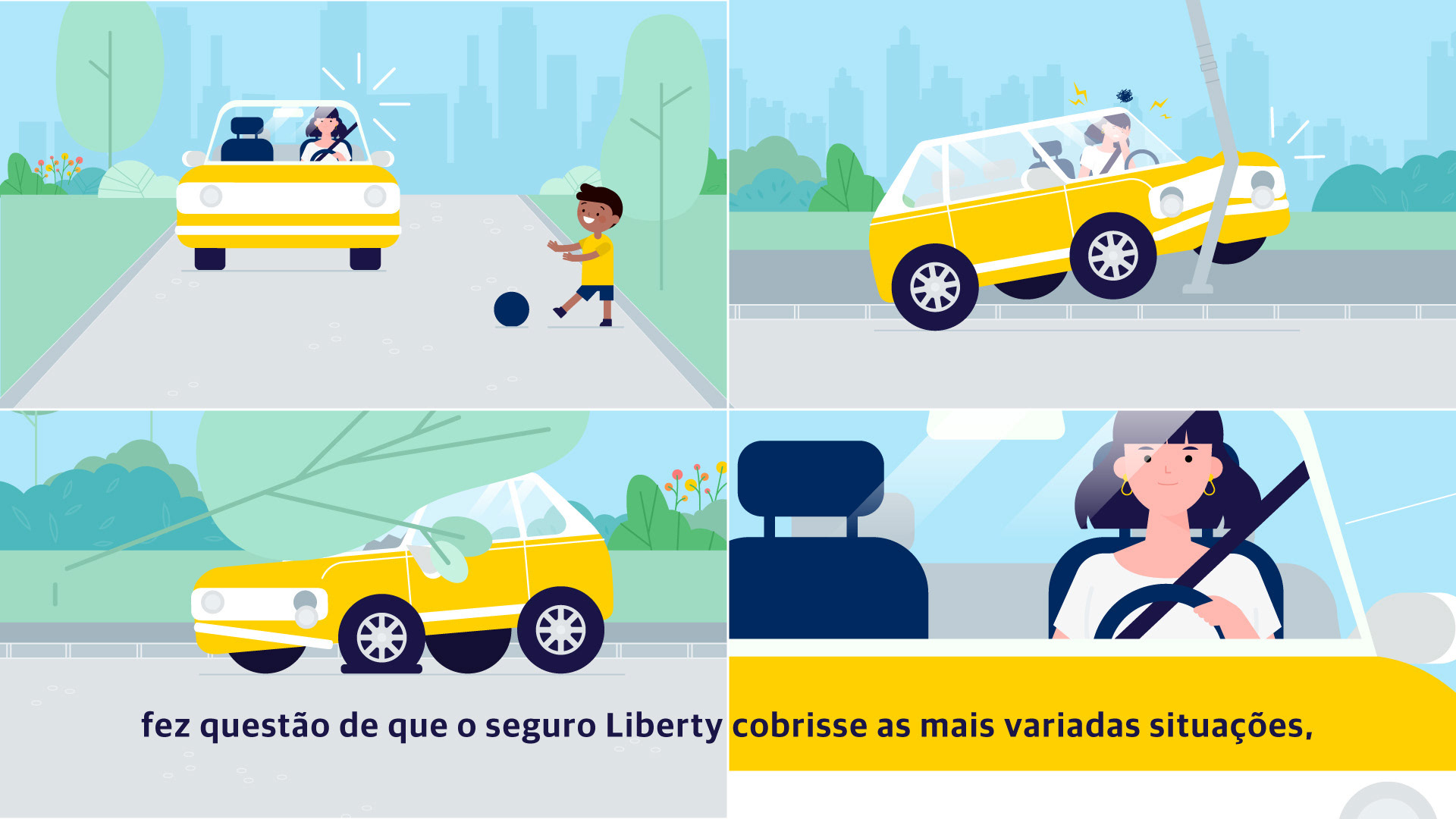
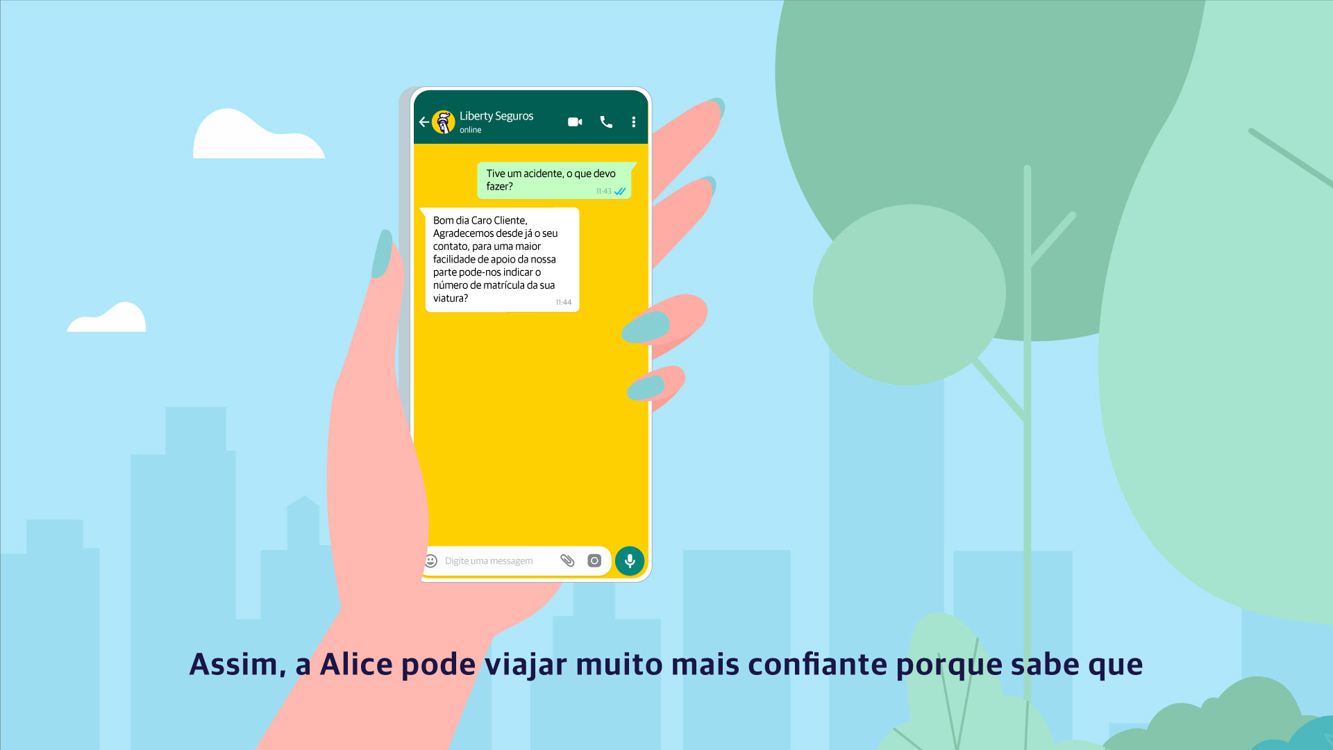
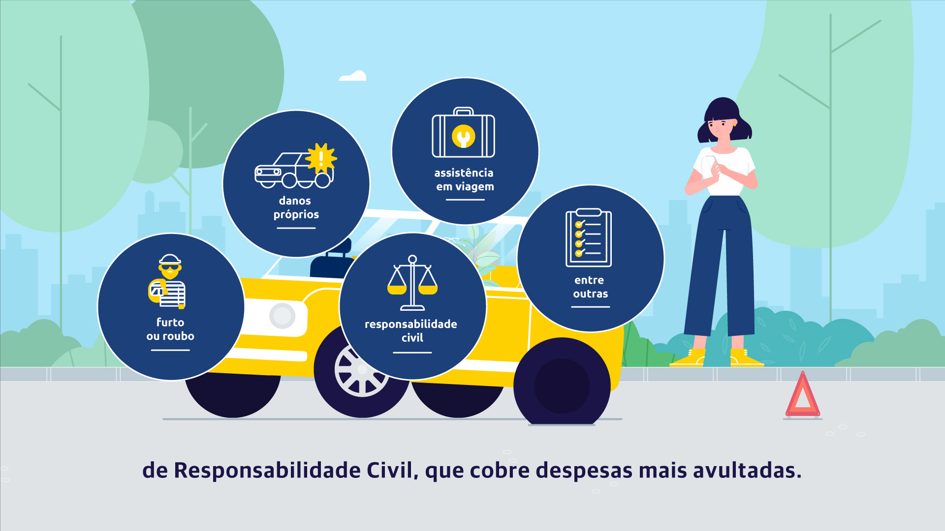
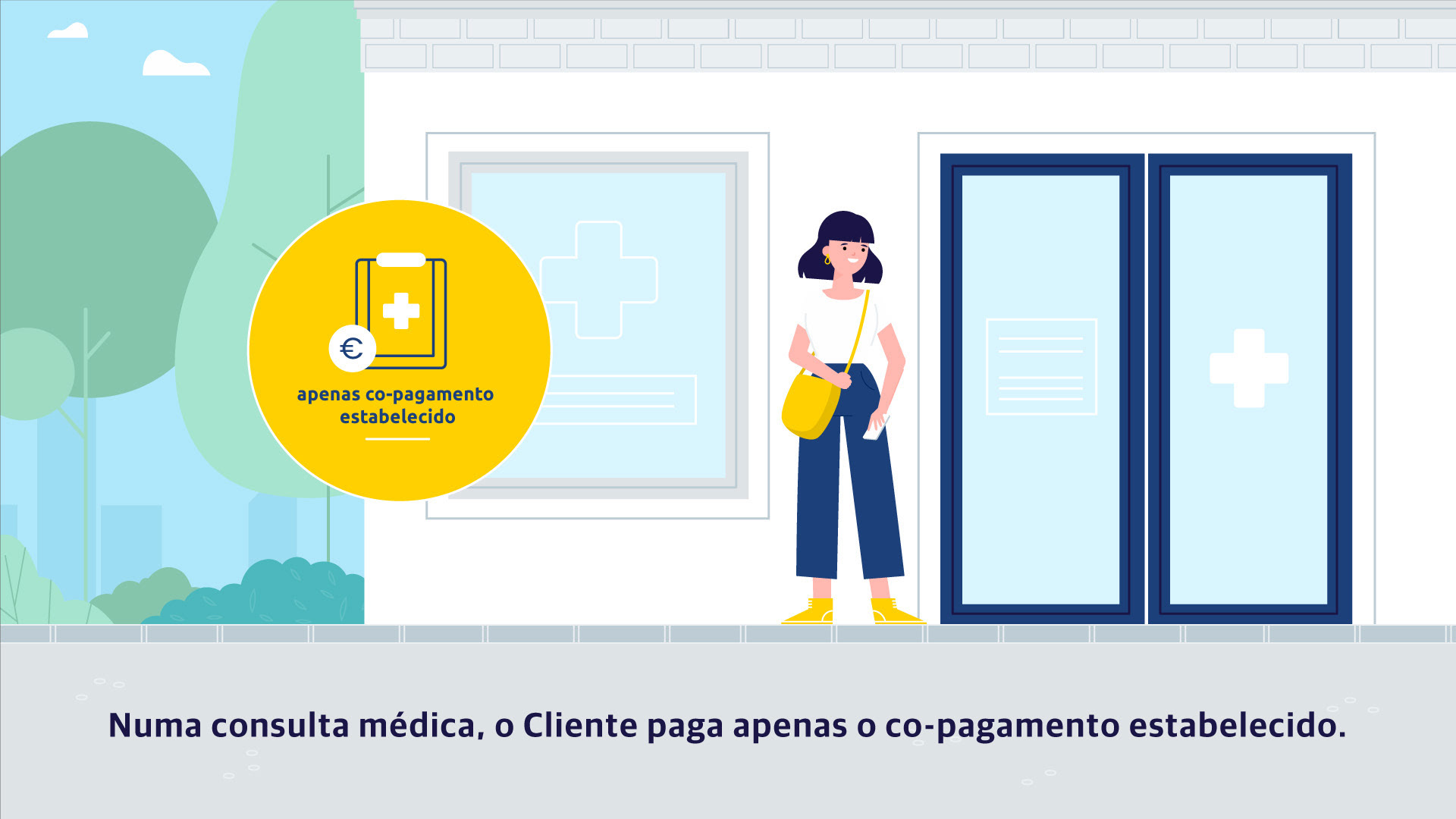
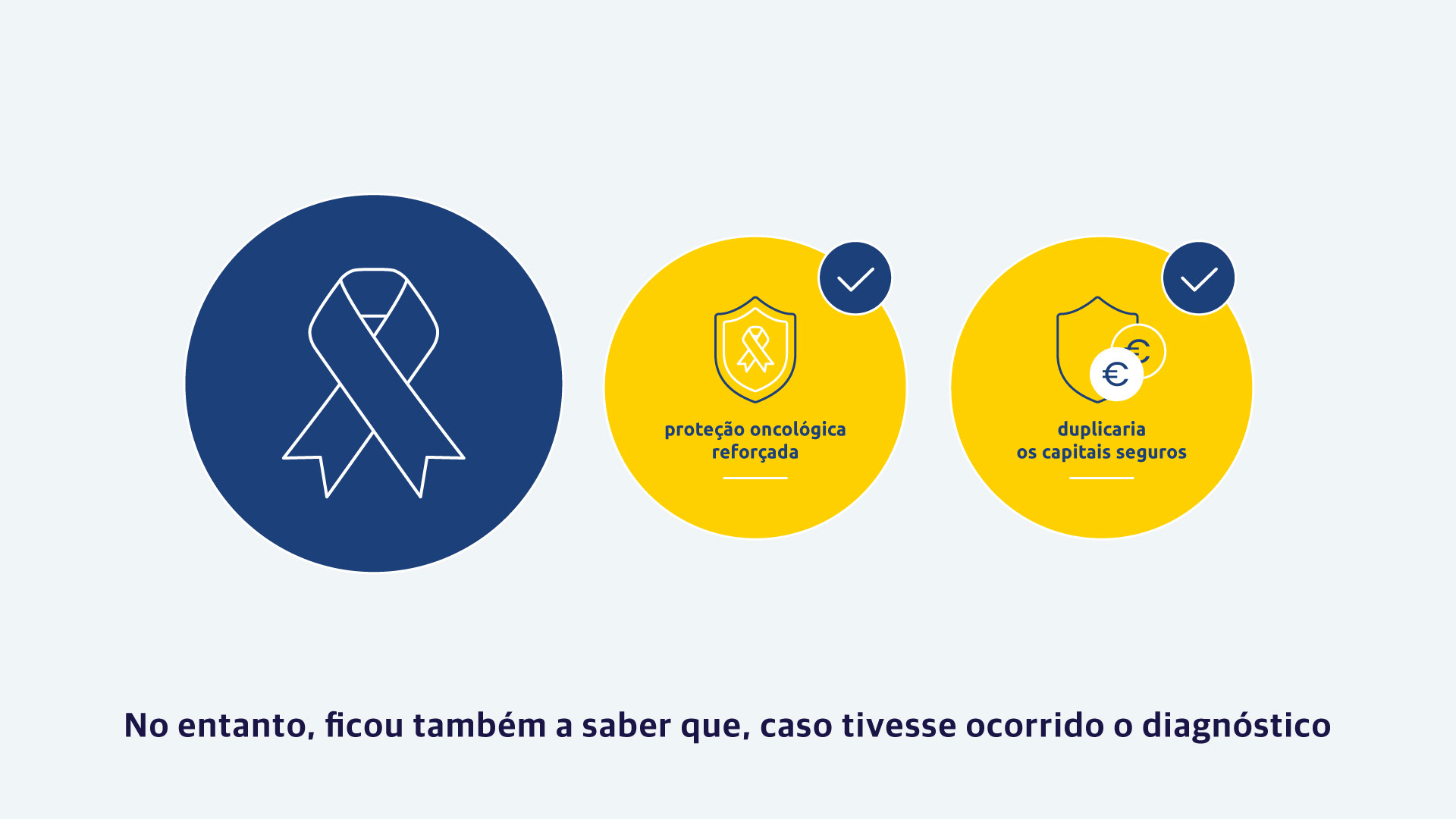
To develop the web series, I mixed narrative and information, using friendly characters to humanize the situations and clean, simple icons to make sure all those complex insurance concepts were easy to follow.
Deliverables
~ Full visual development from initial concept to final illustrations
~ Original character and environment designs
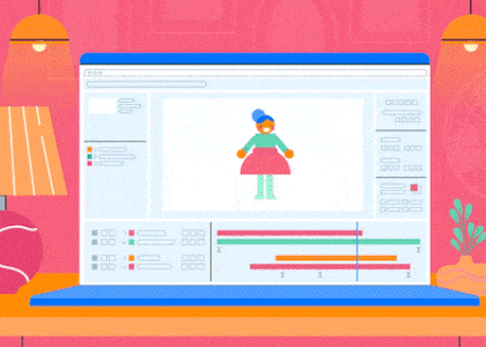
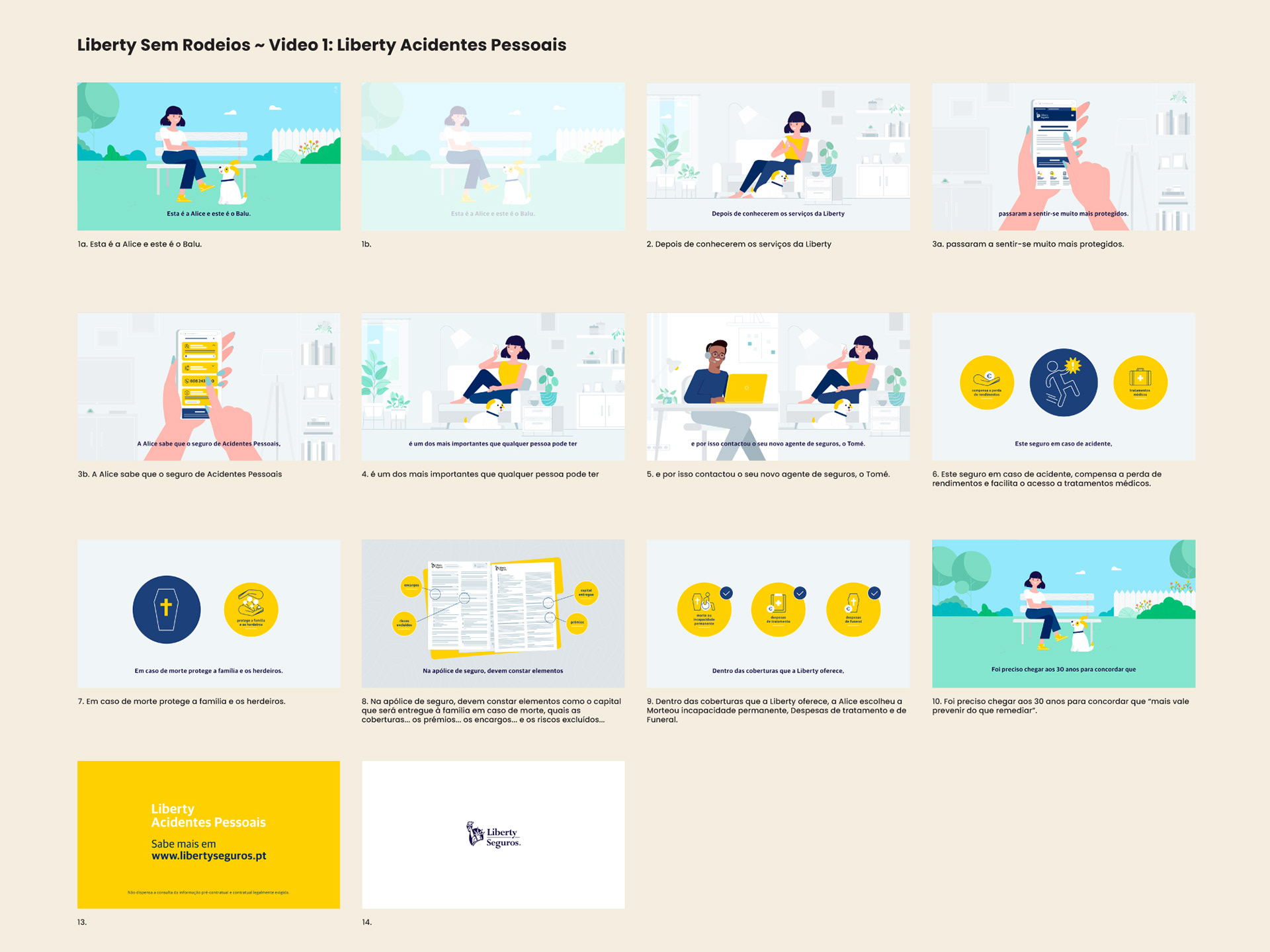
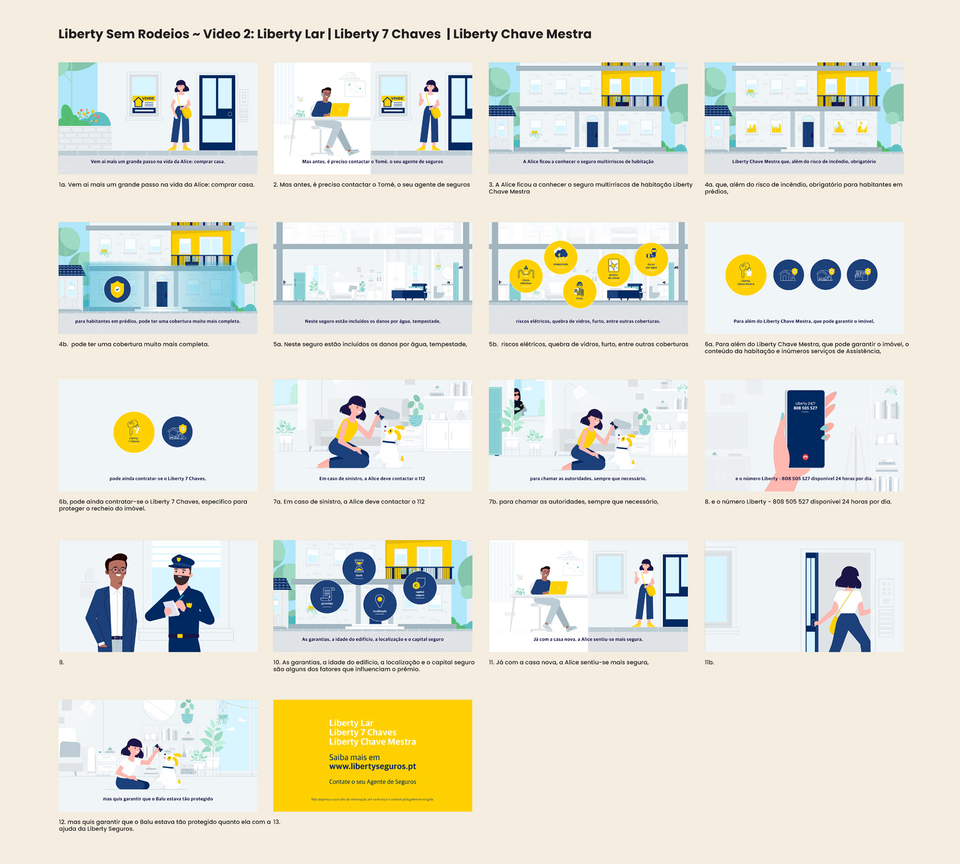
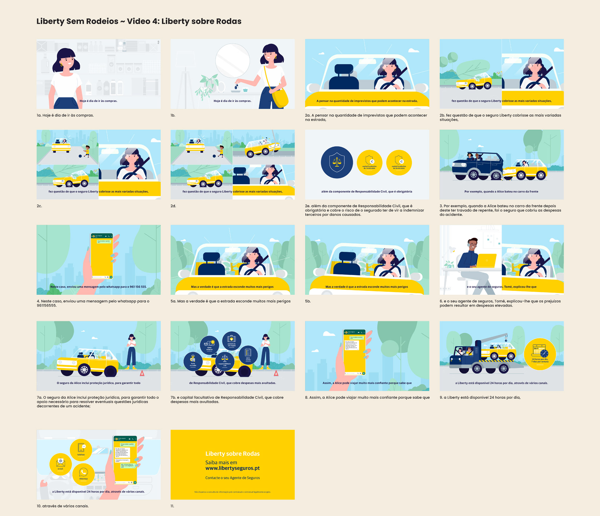
~ Storyboard + Styleboard + Styleframes
~ Illustration files prepared and optimized for animation
~ Five fully animated episodes for the web series (16:9 format - approximately 1:30 per episode)
The Visual Approach
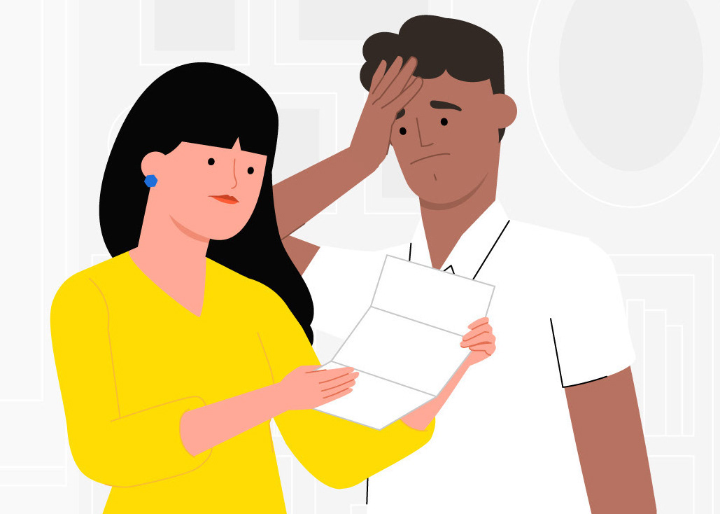
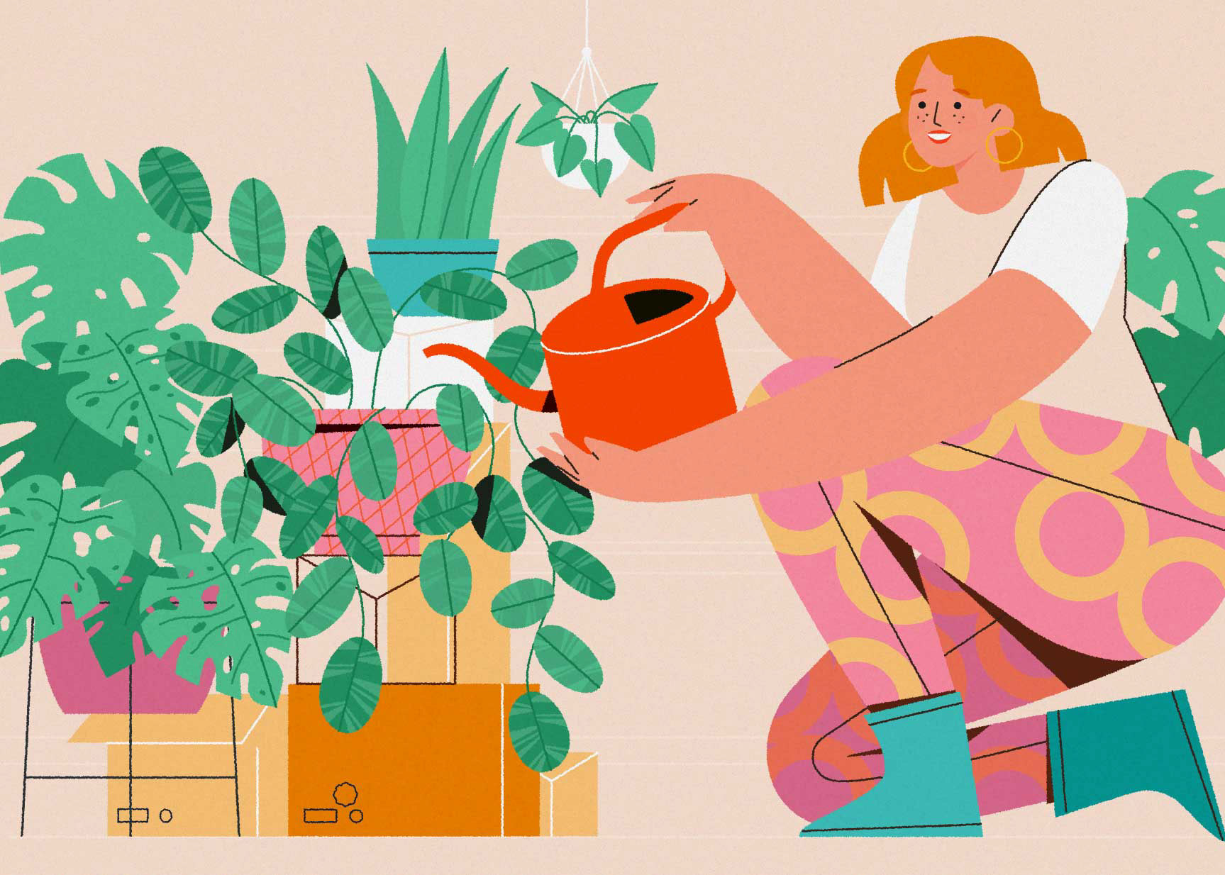
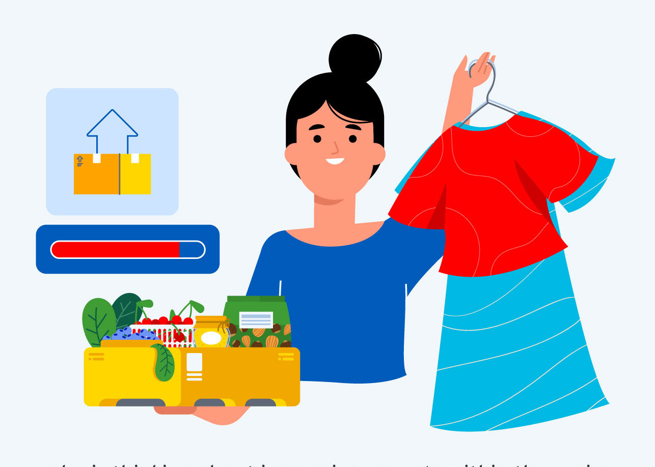
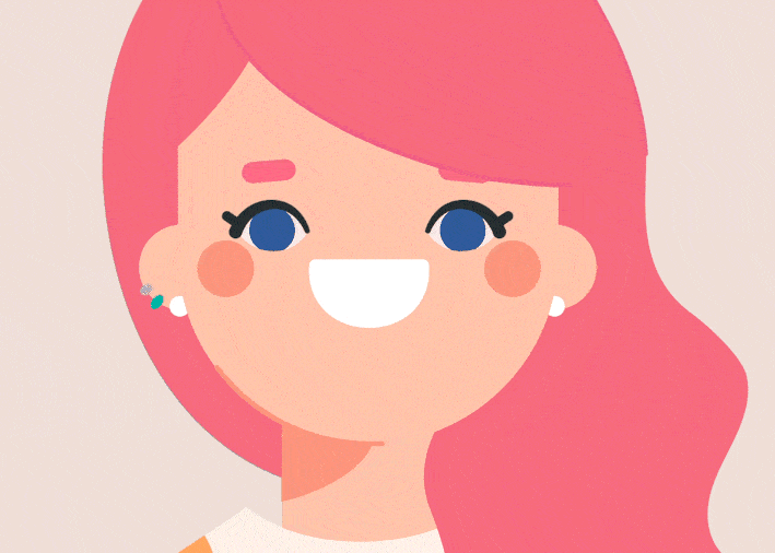
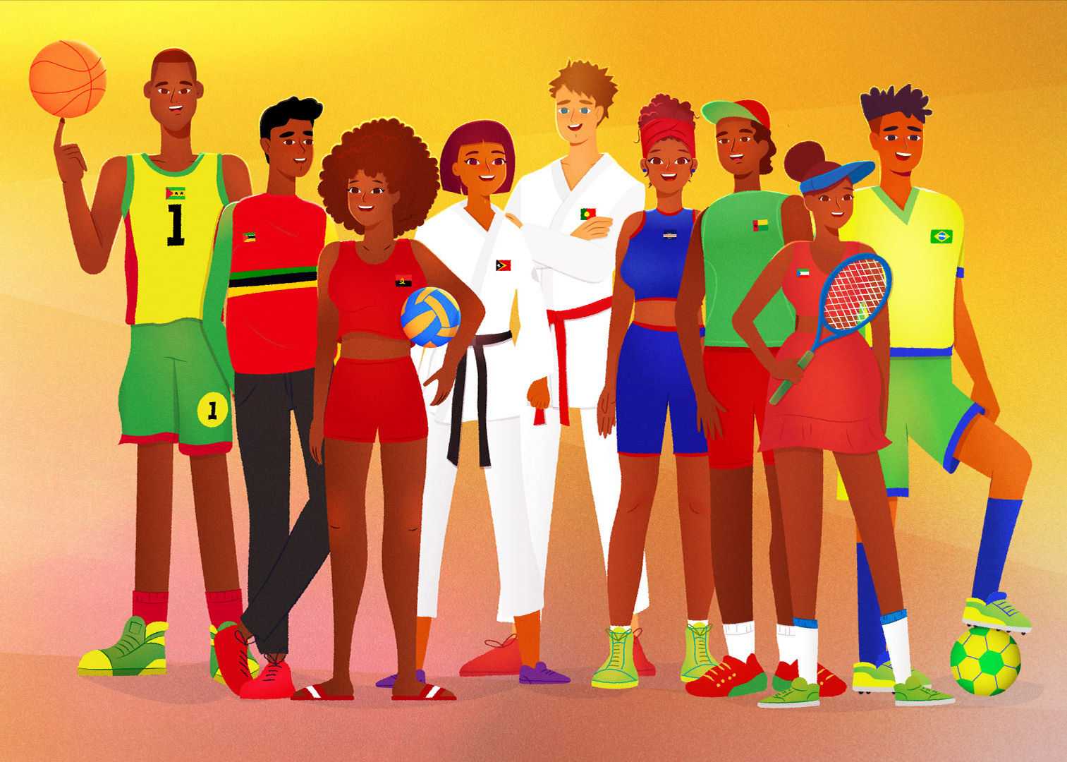
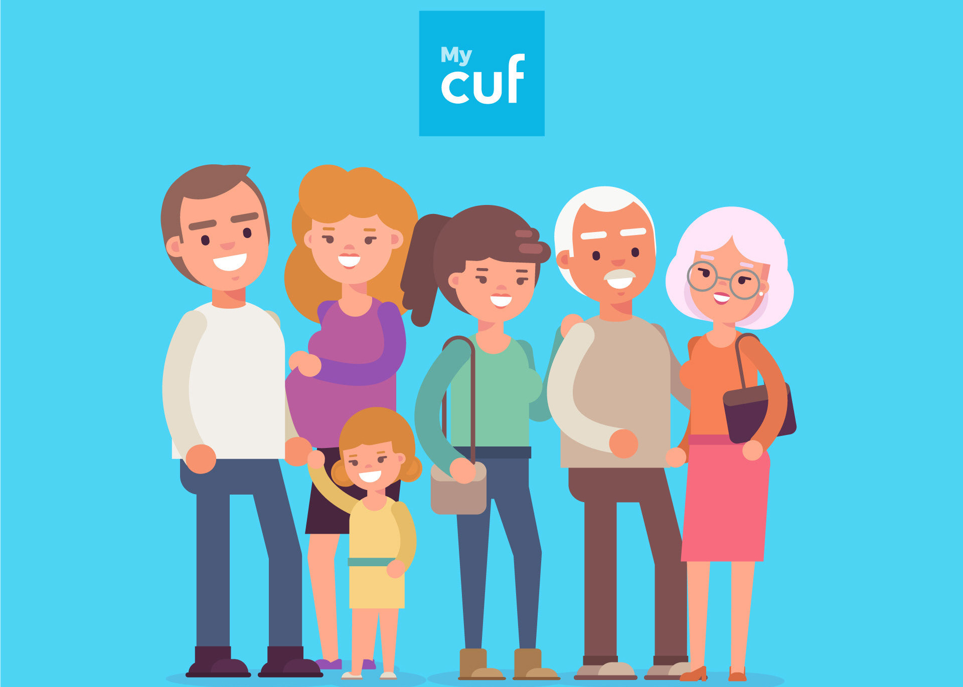
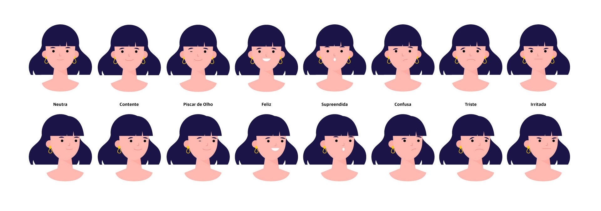
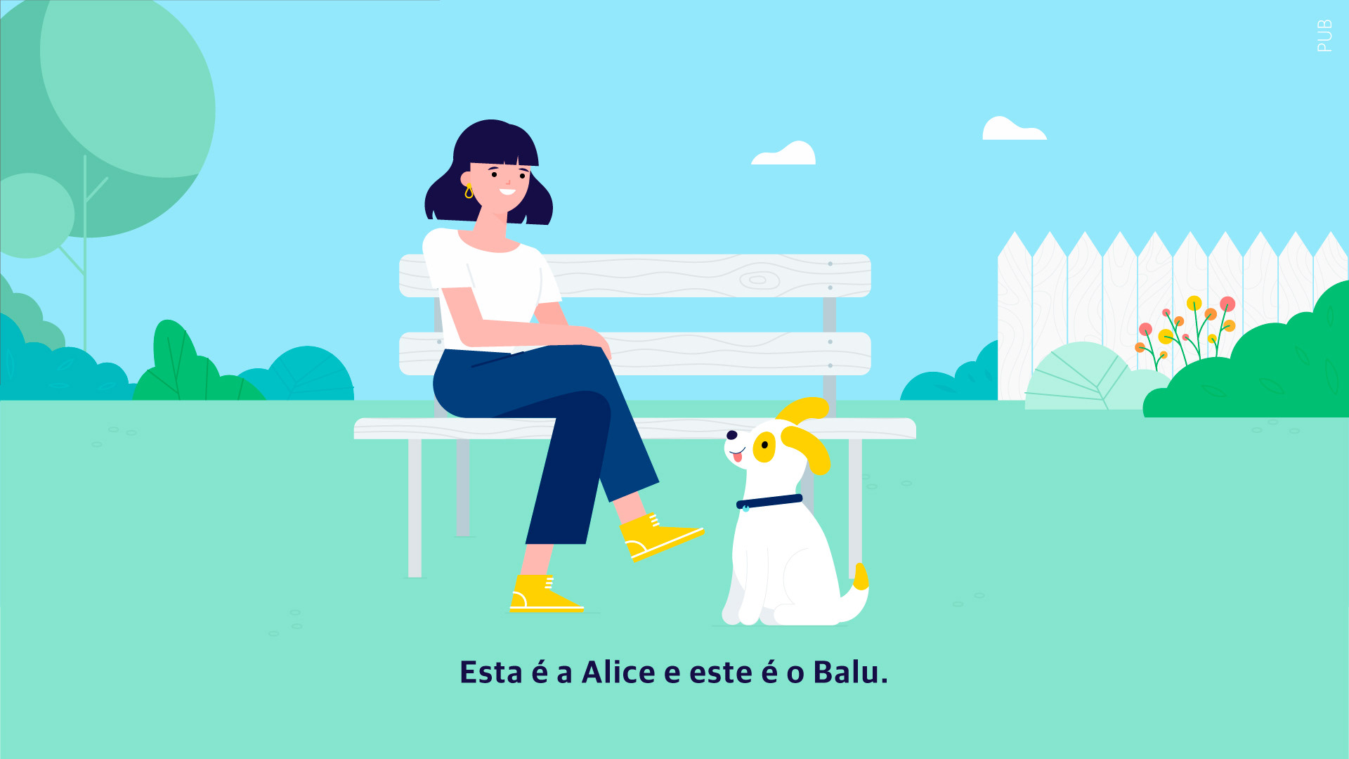
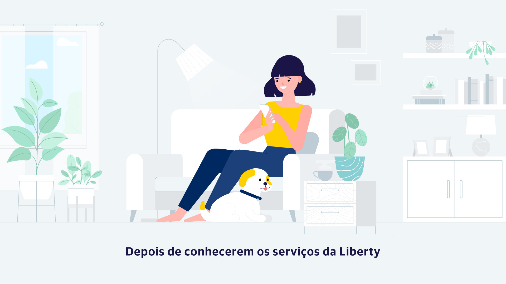
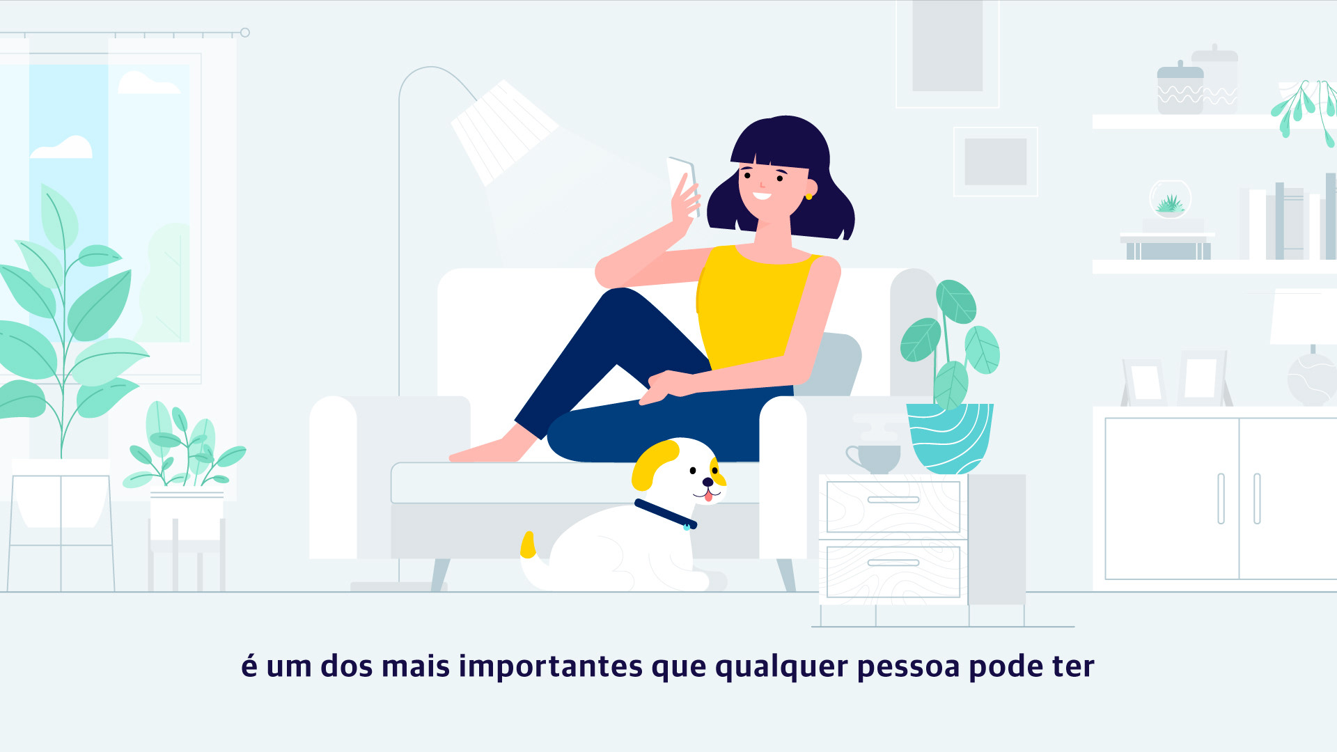
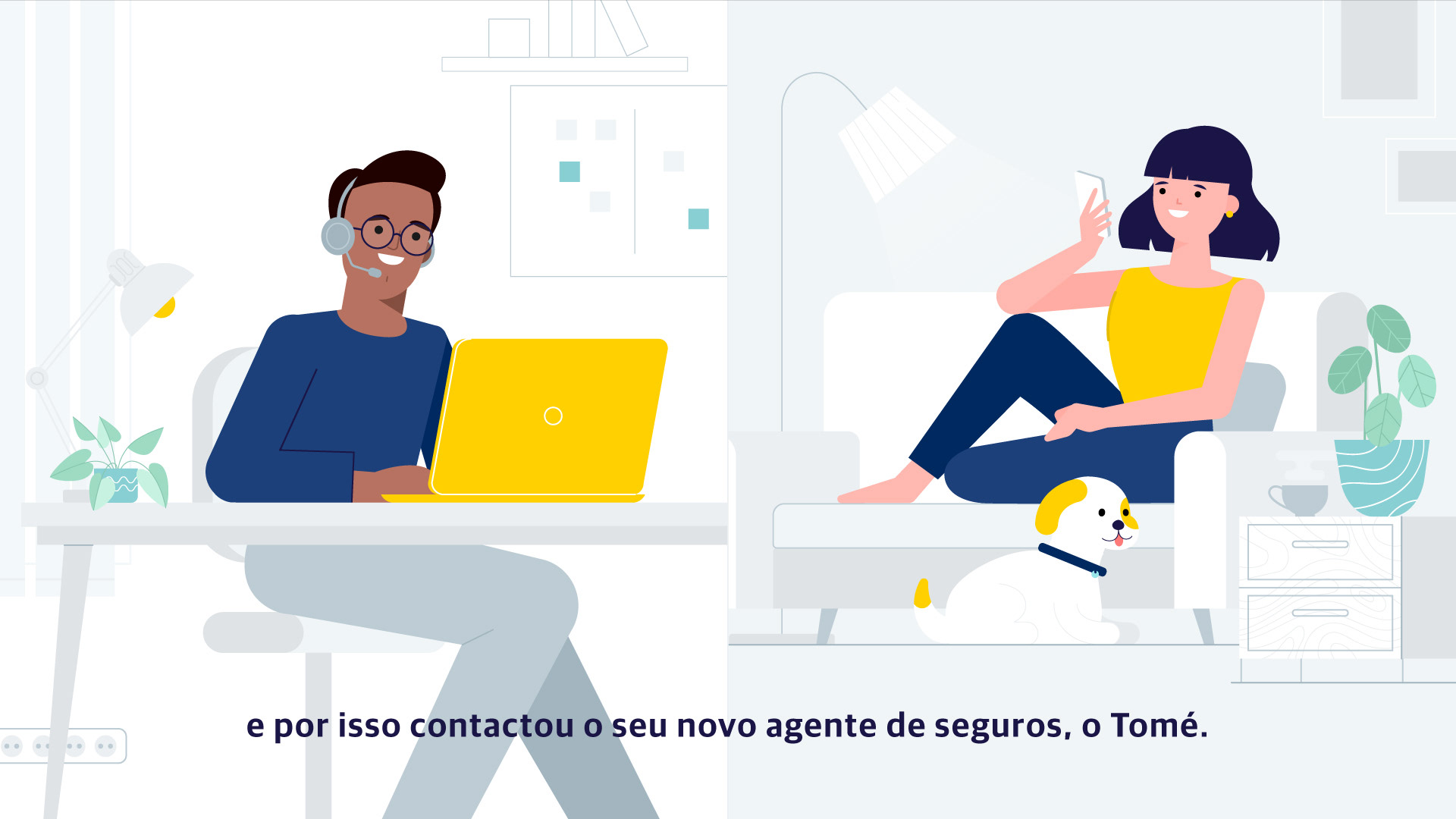
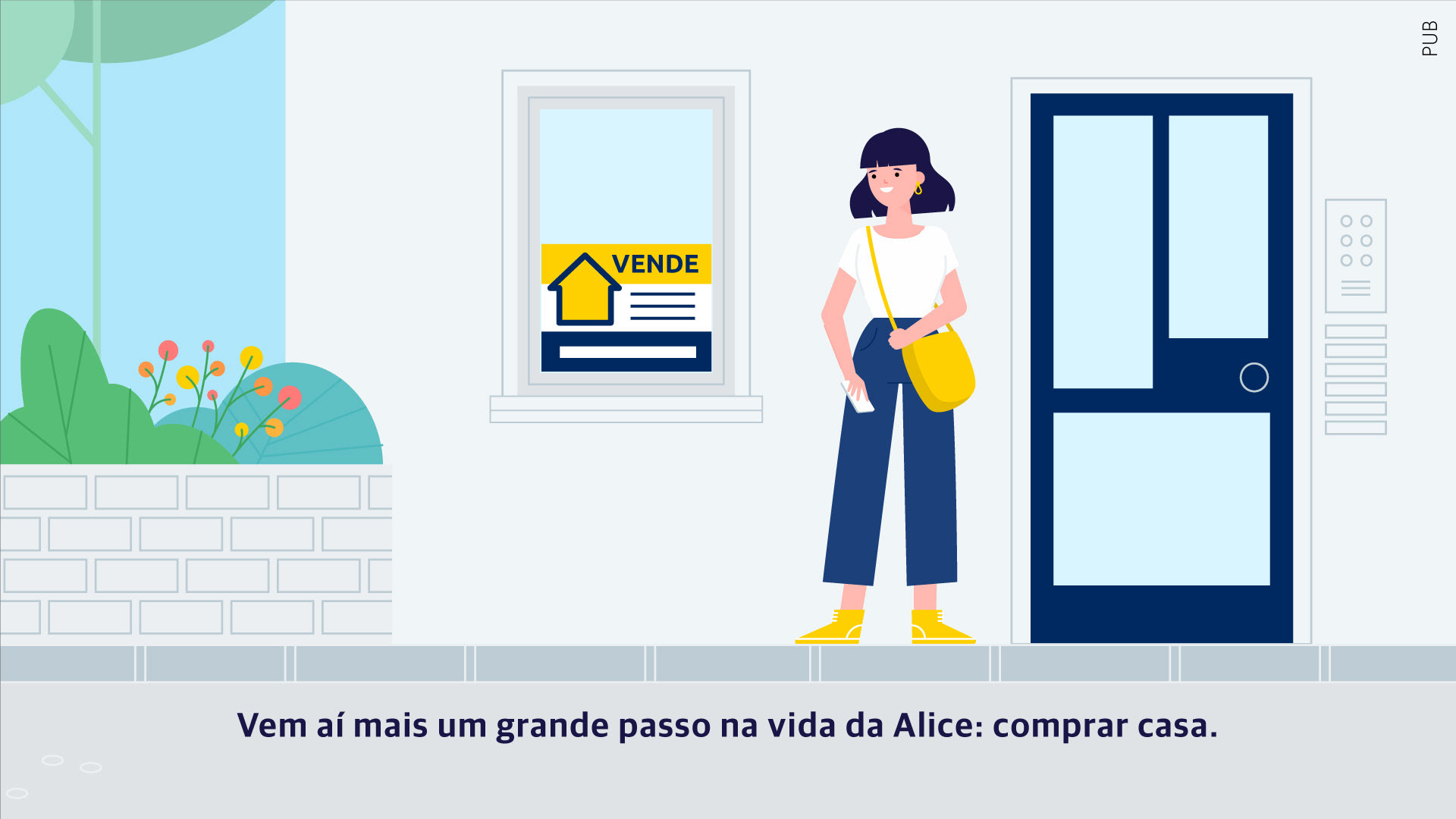
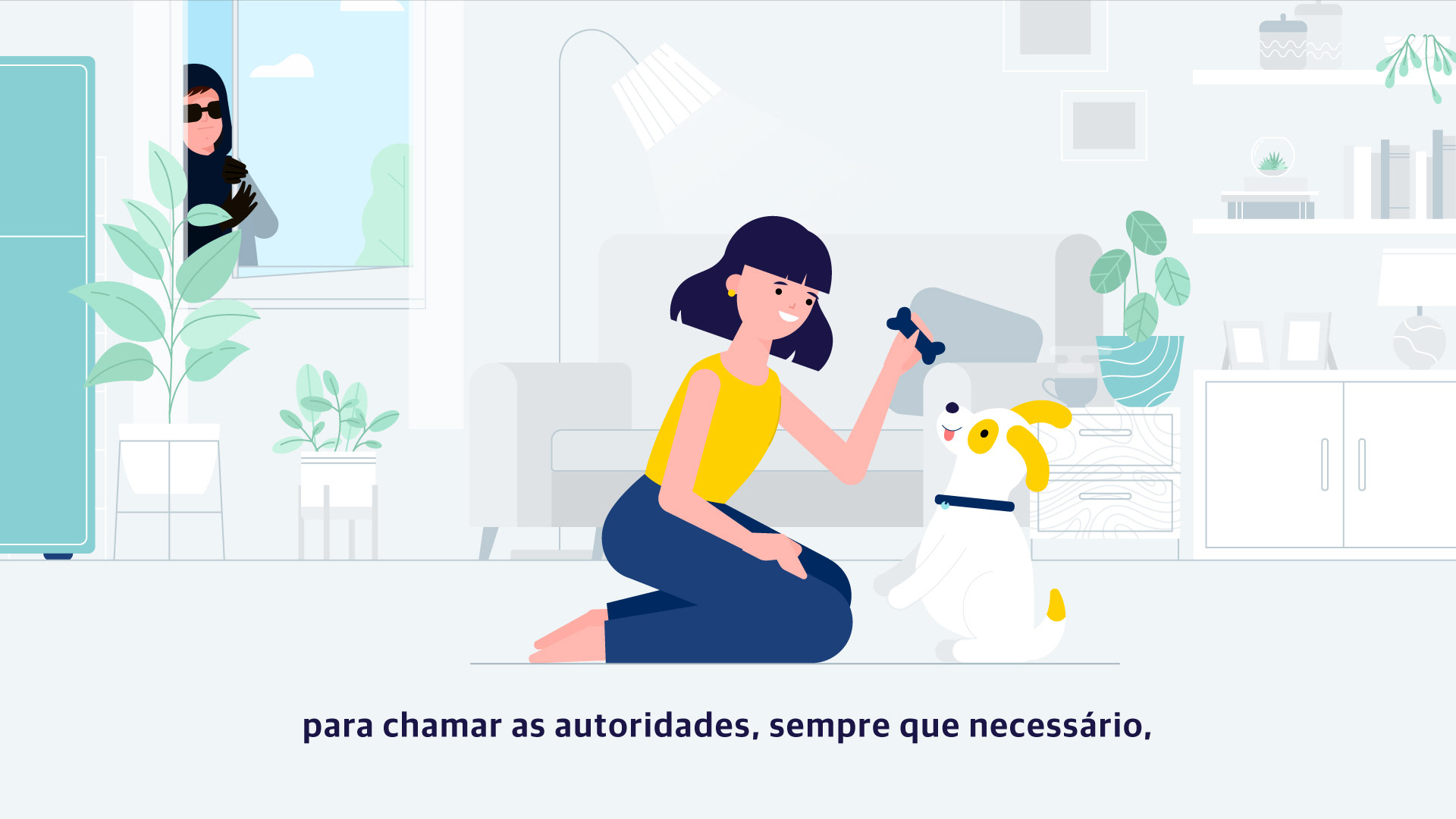
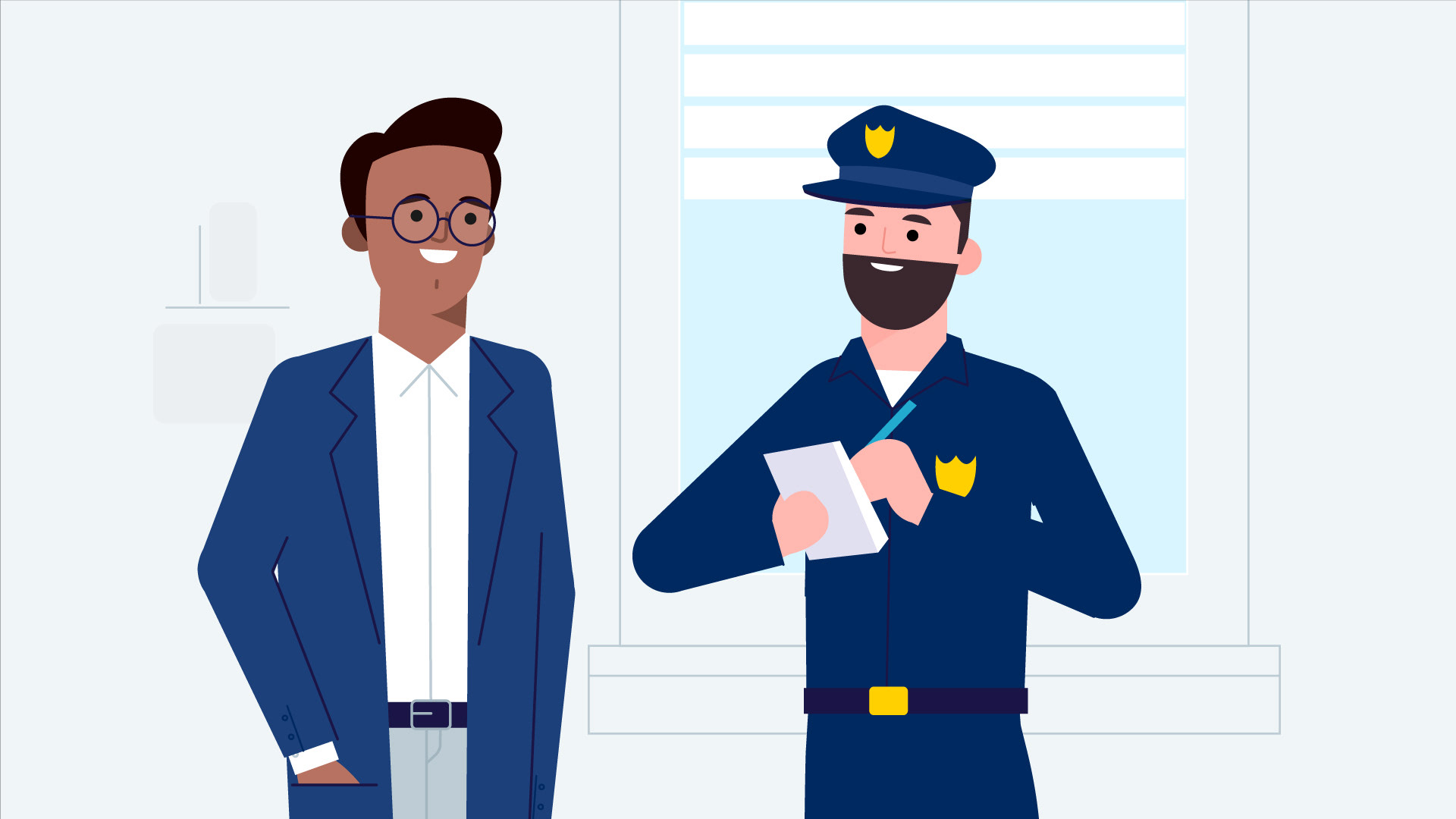
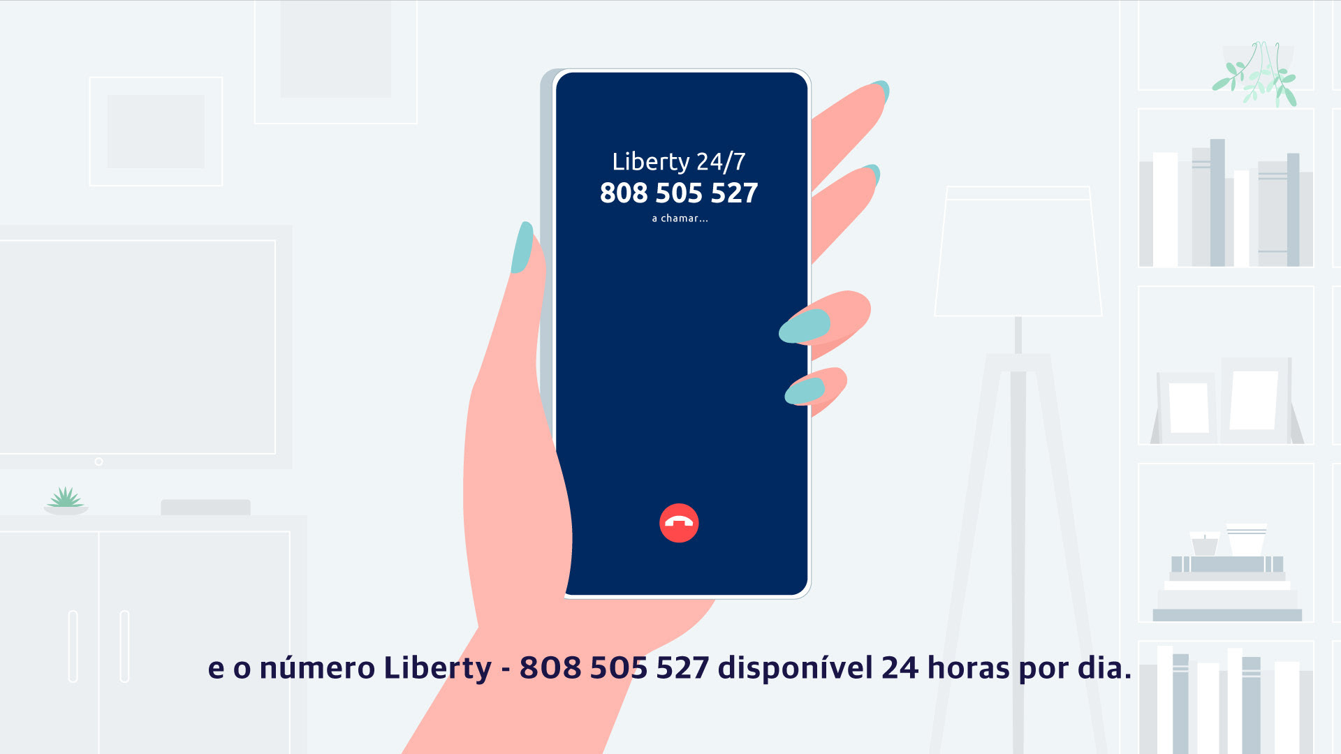
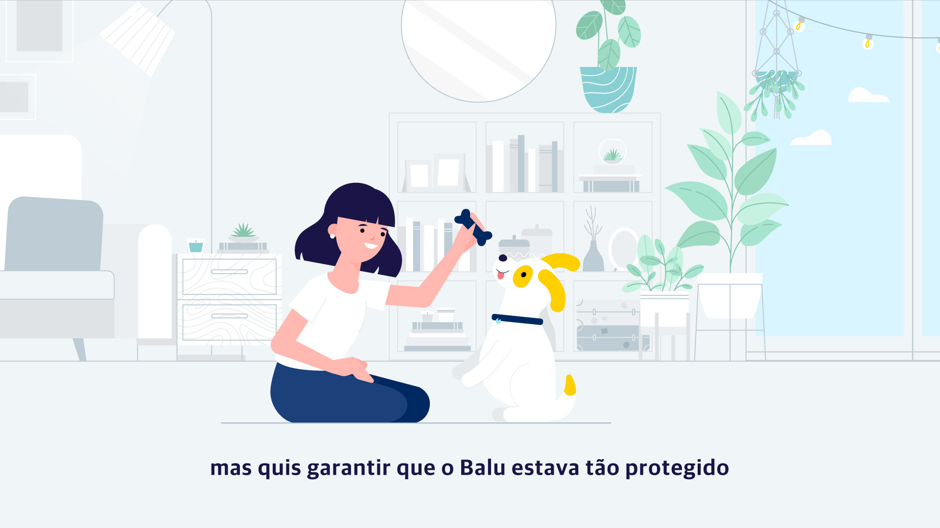
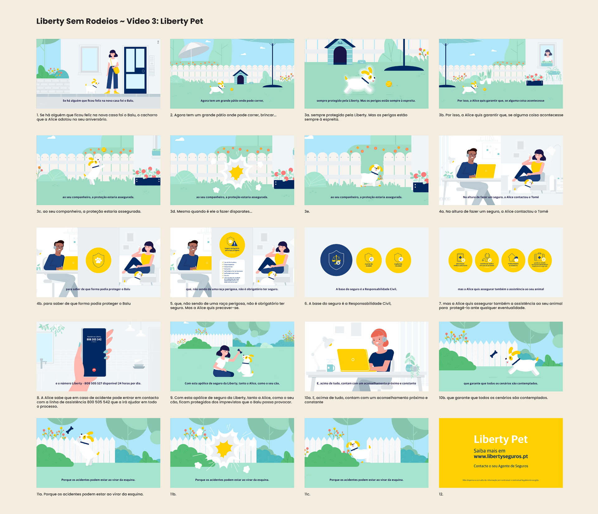
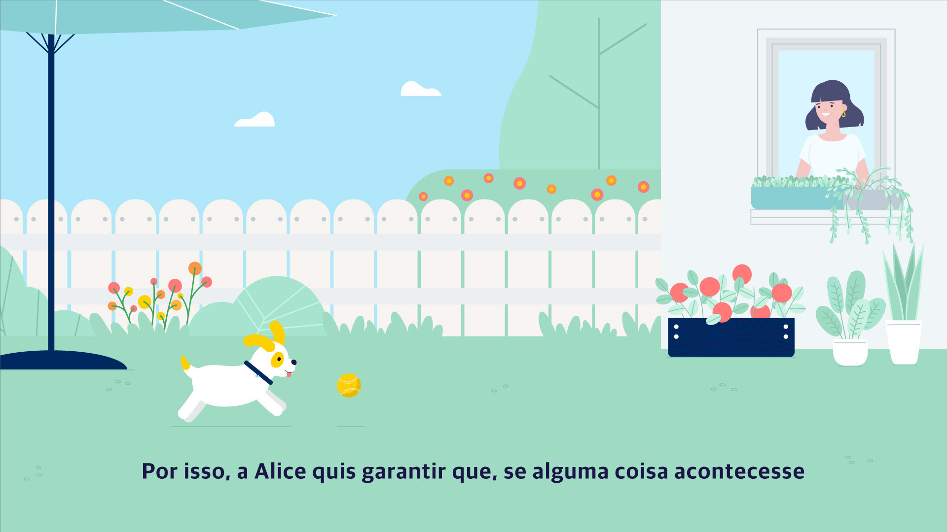
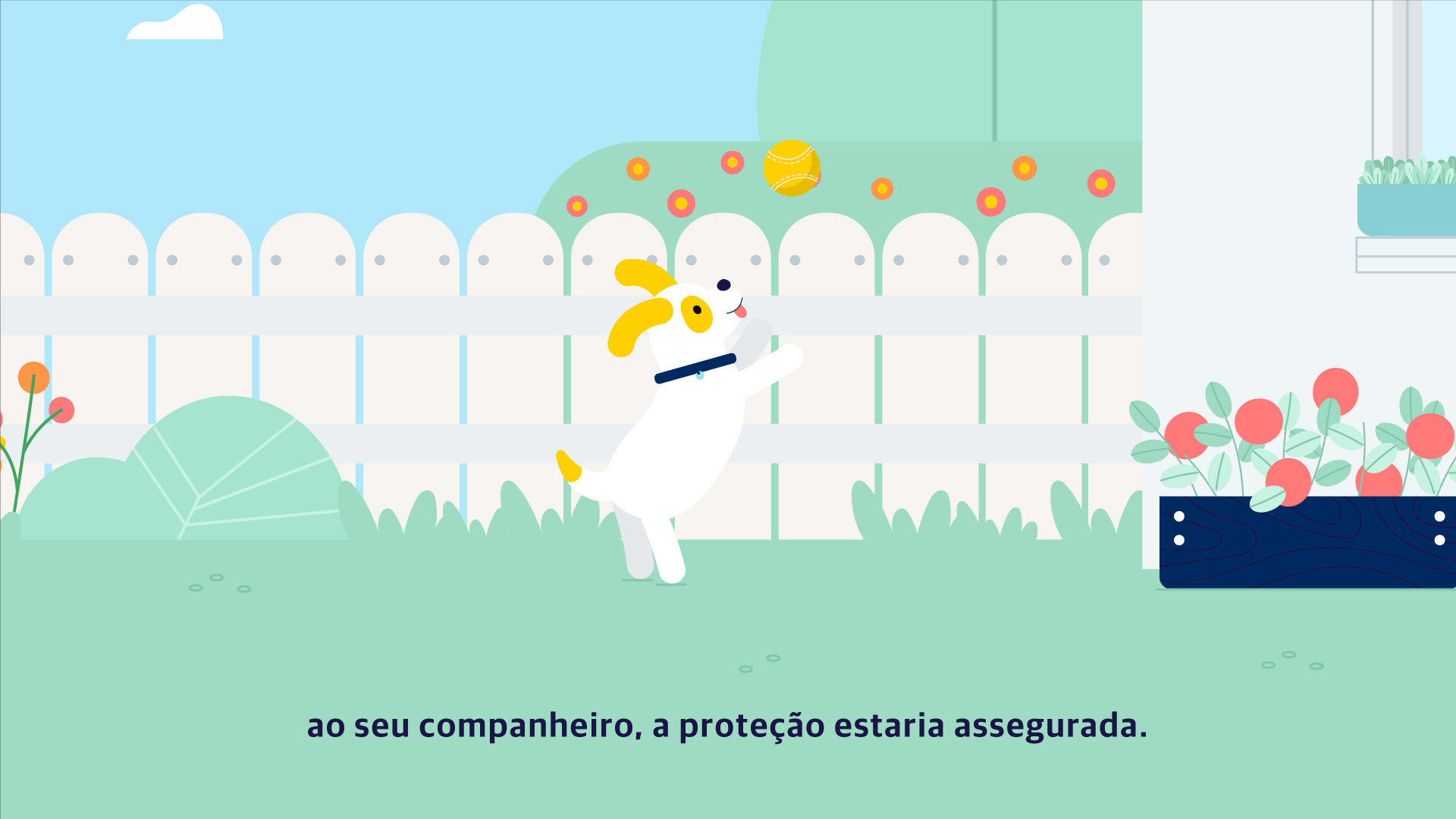
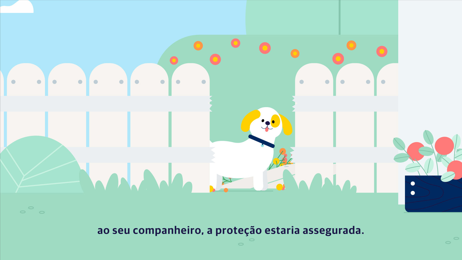
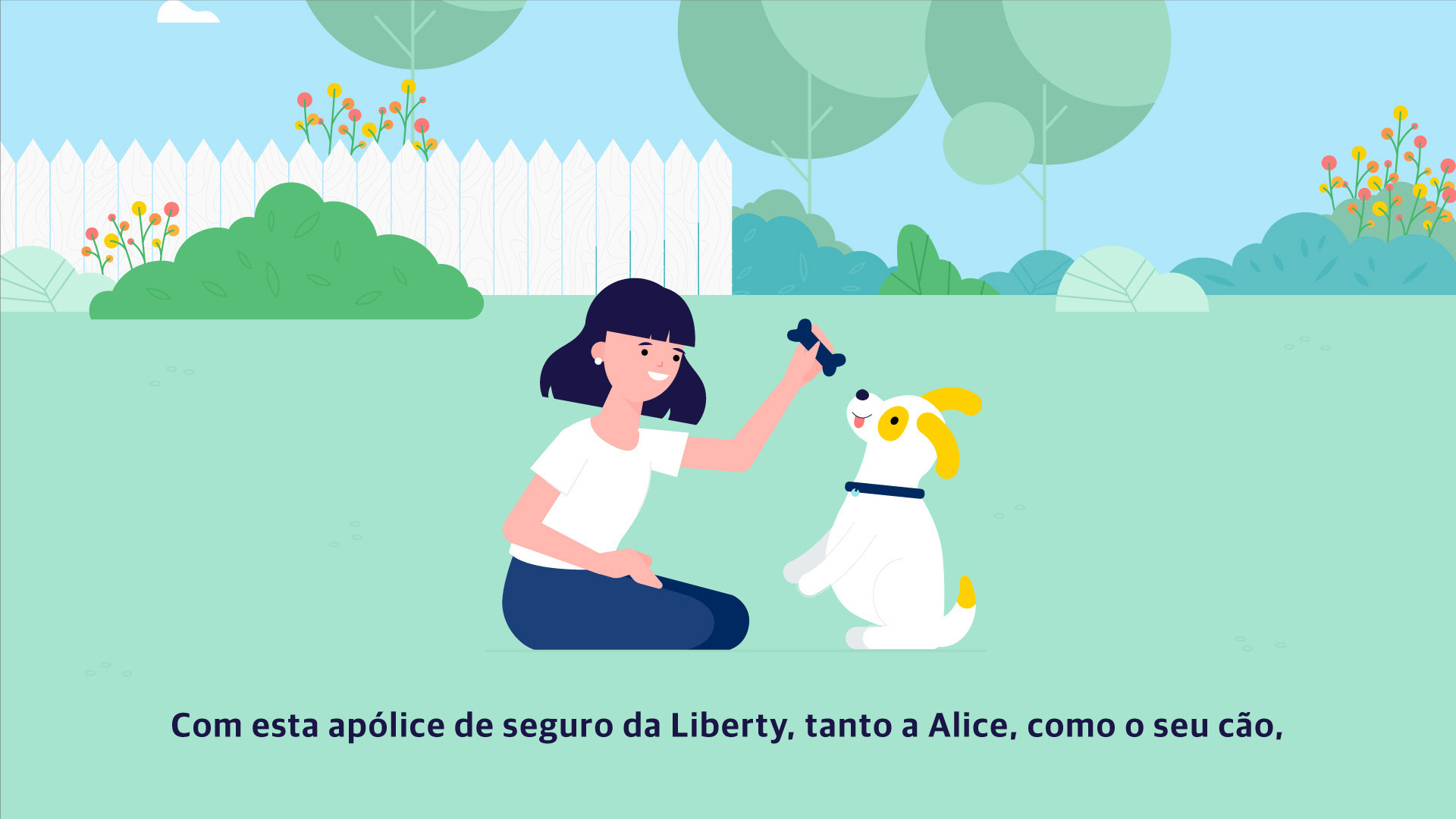
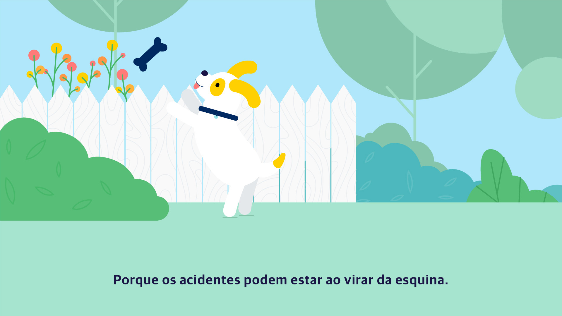
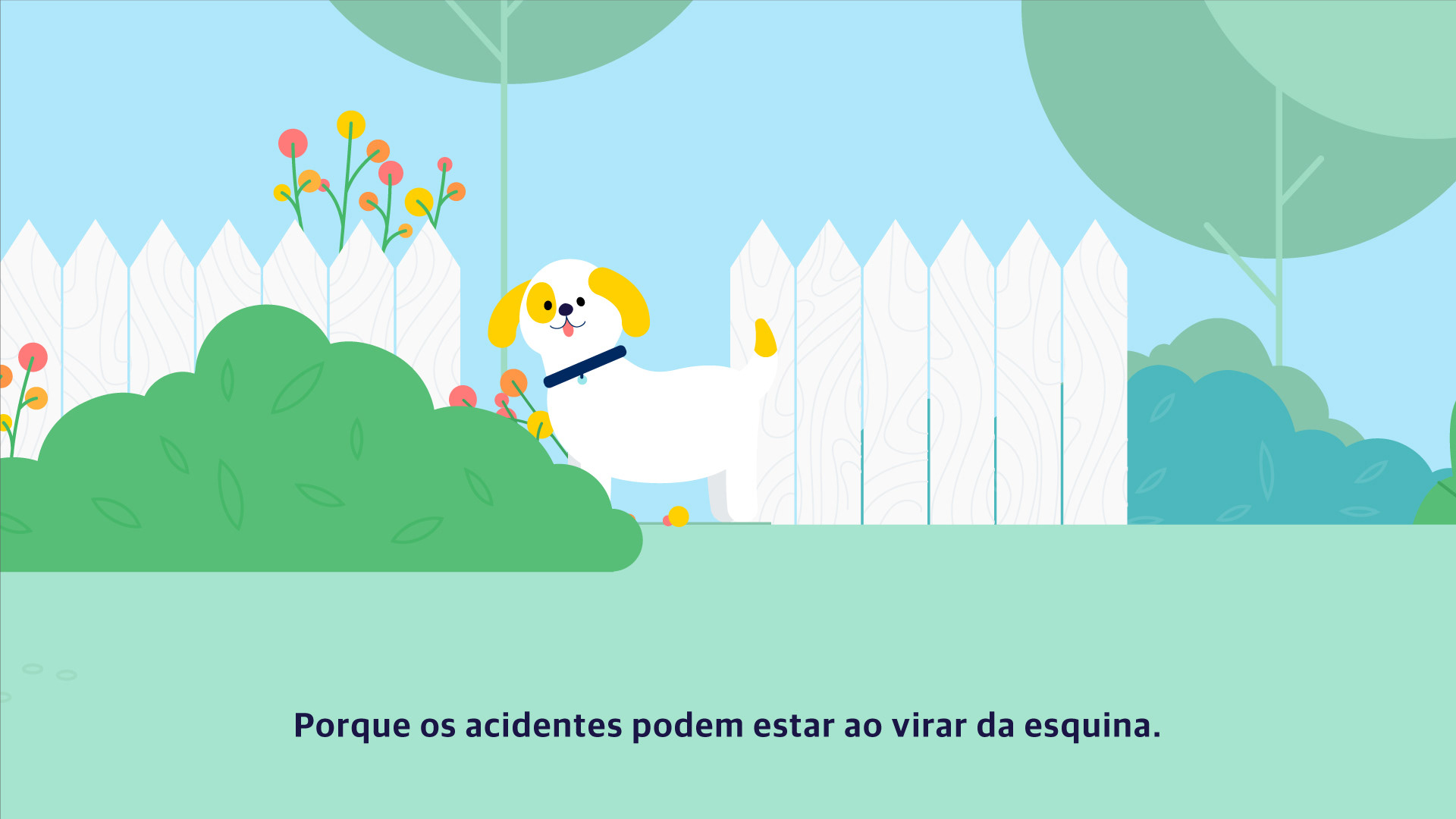
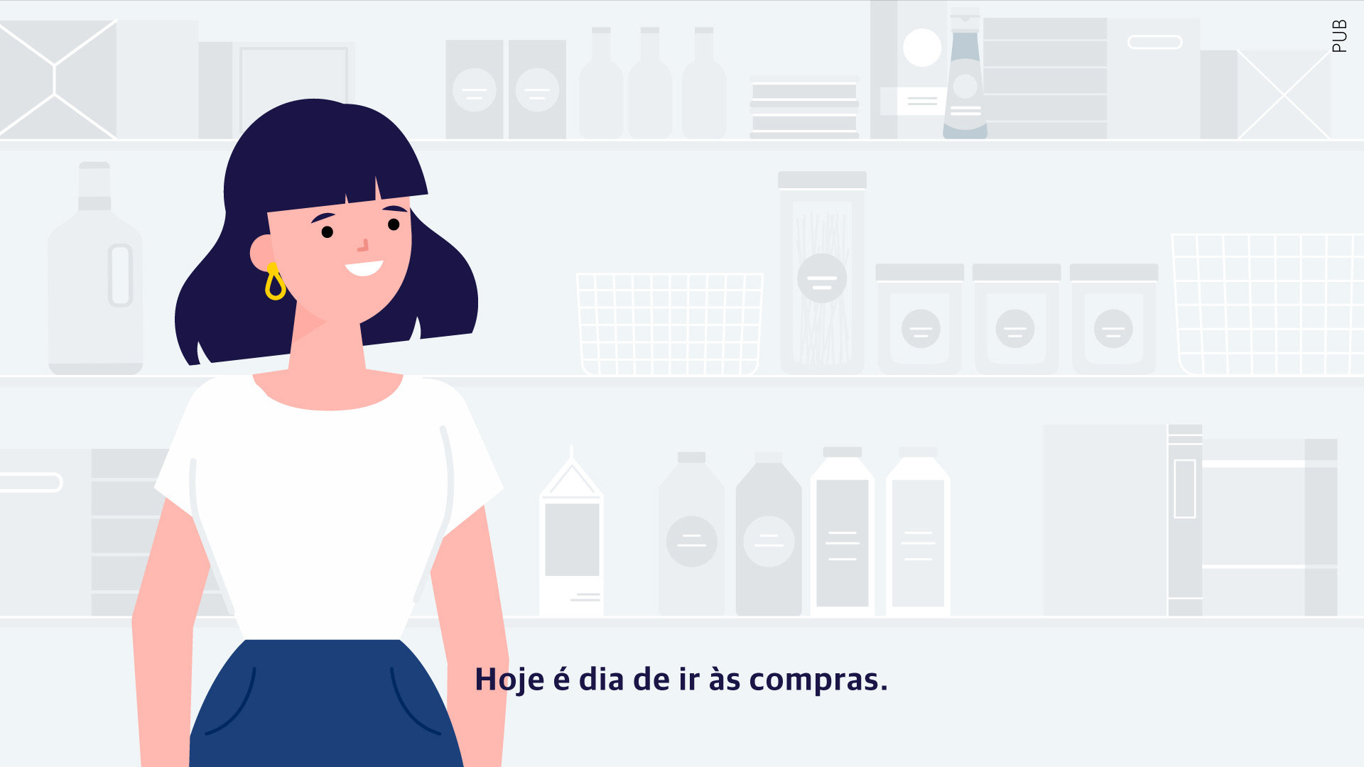
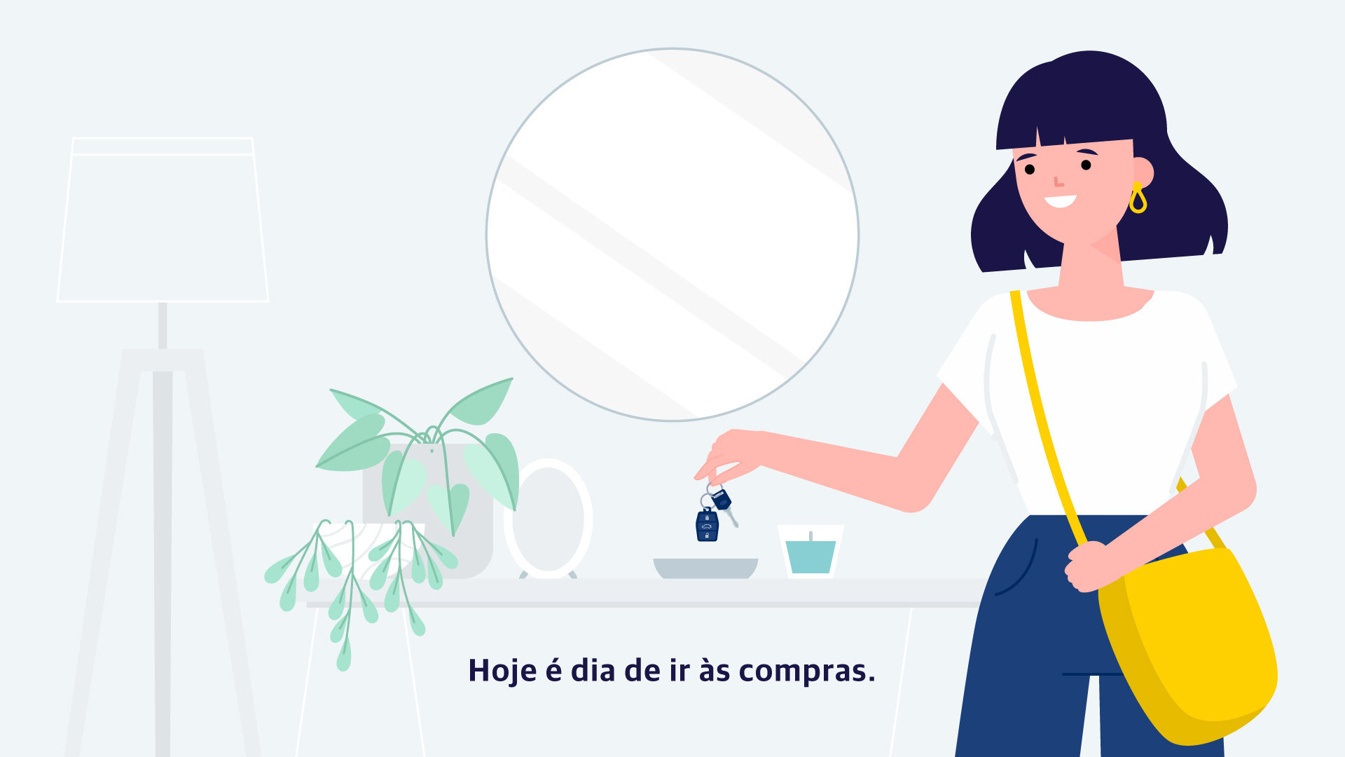
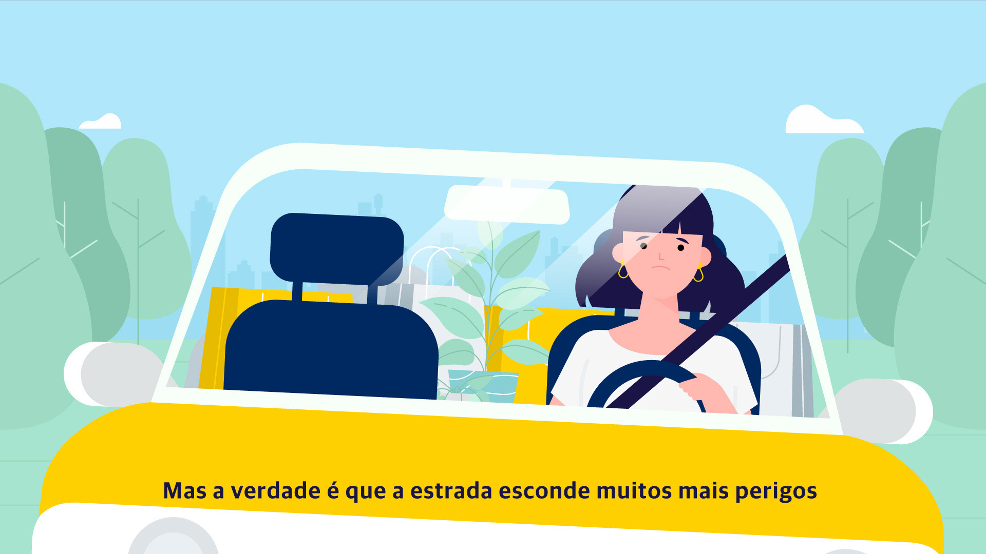
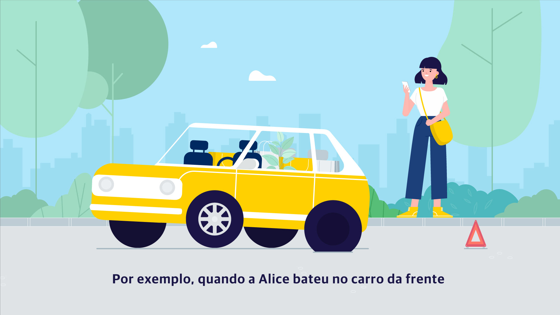
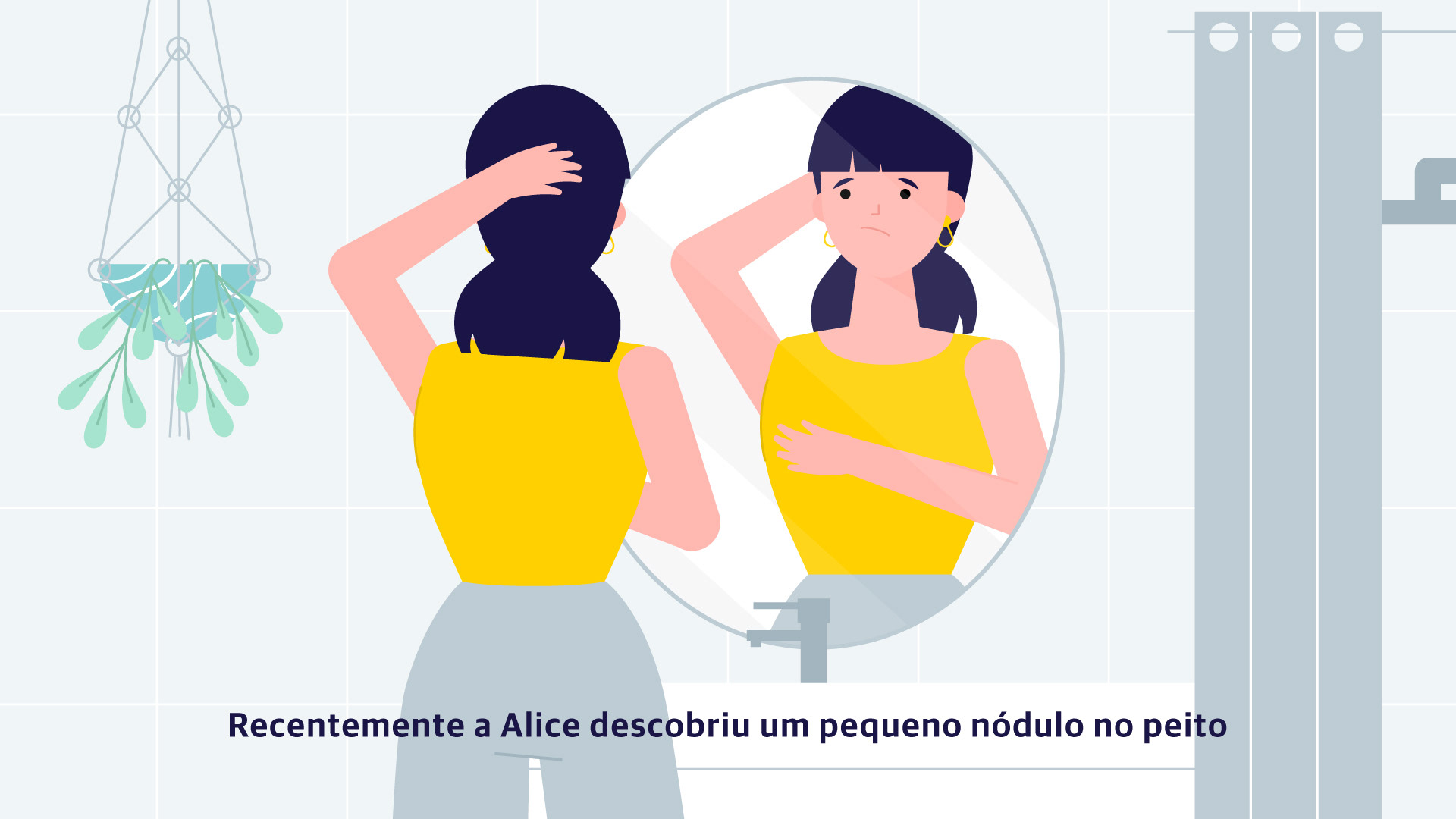
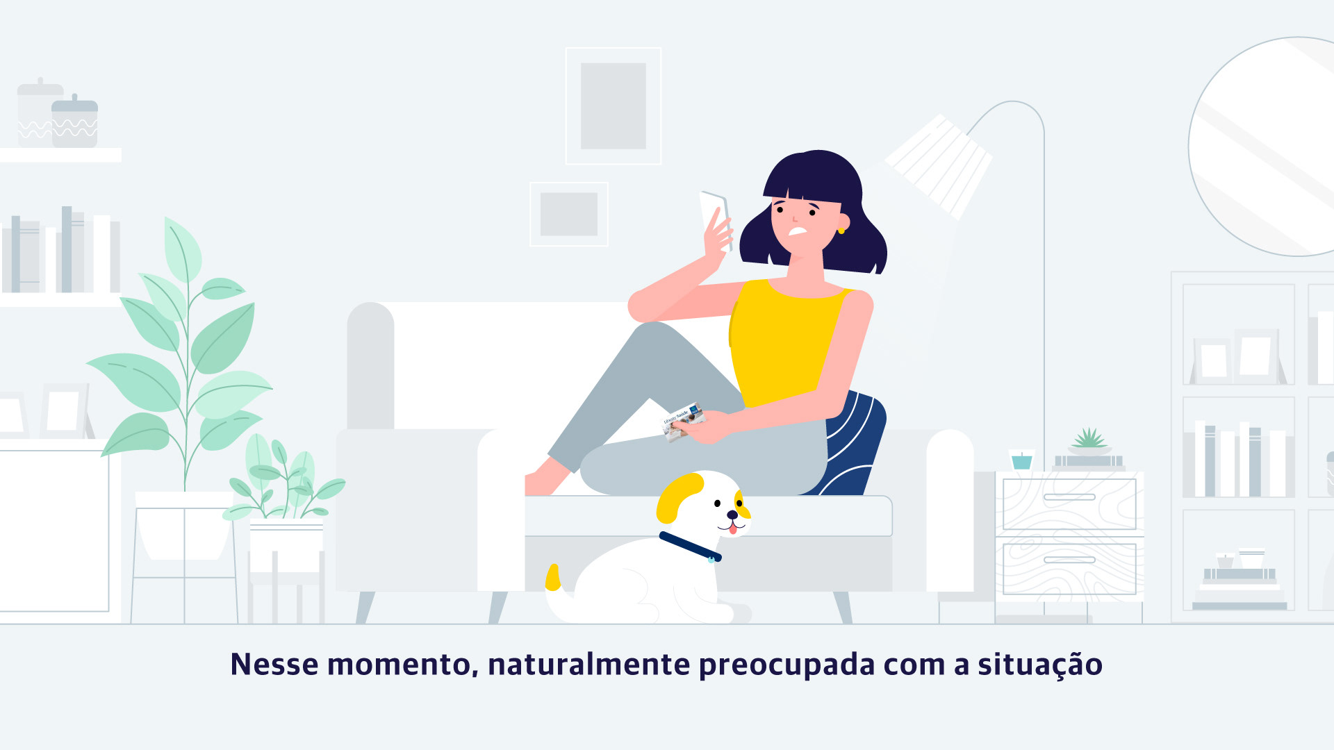
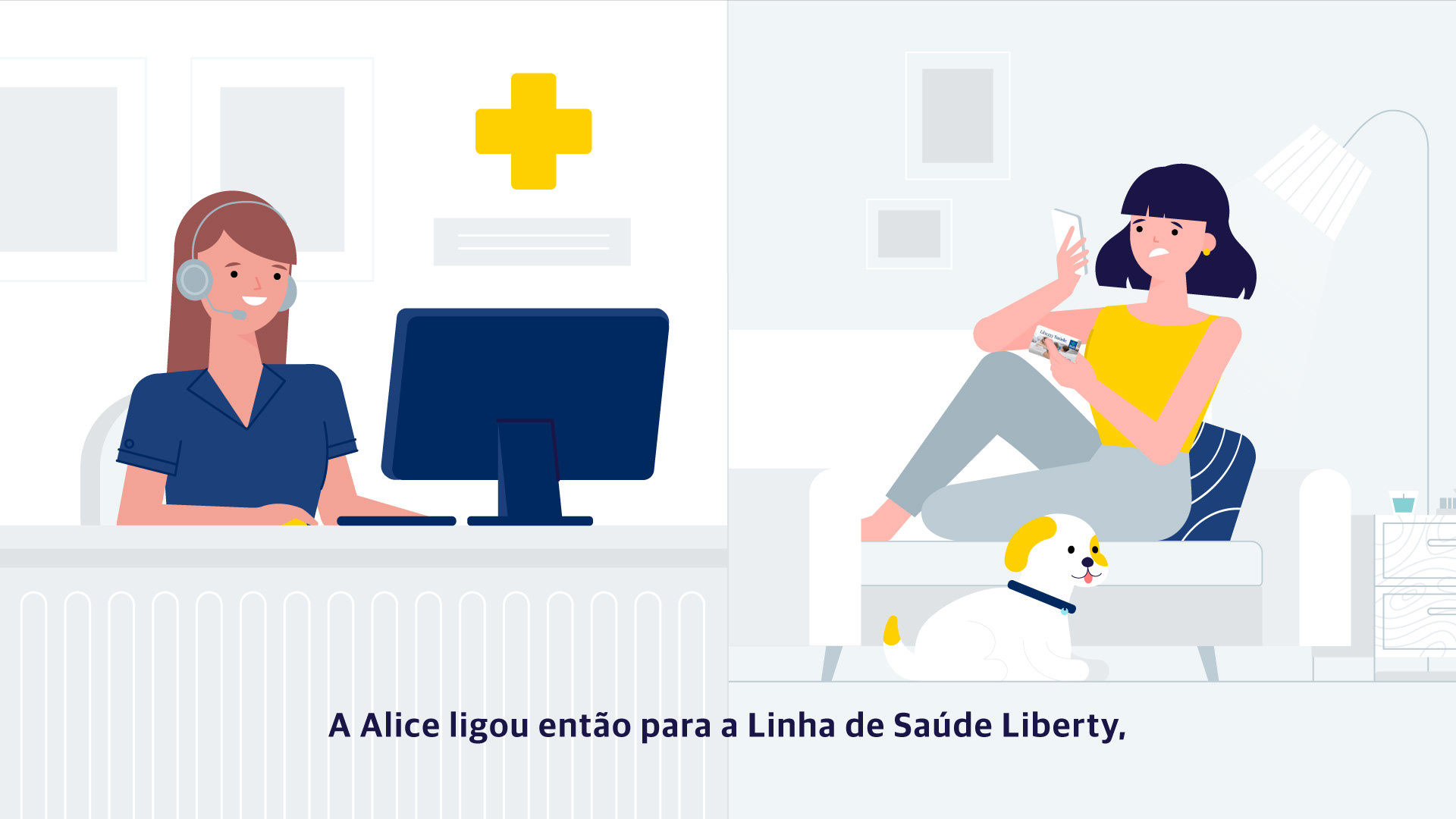
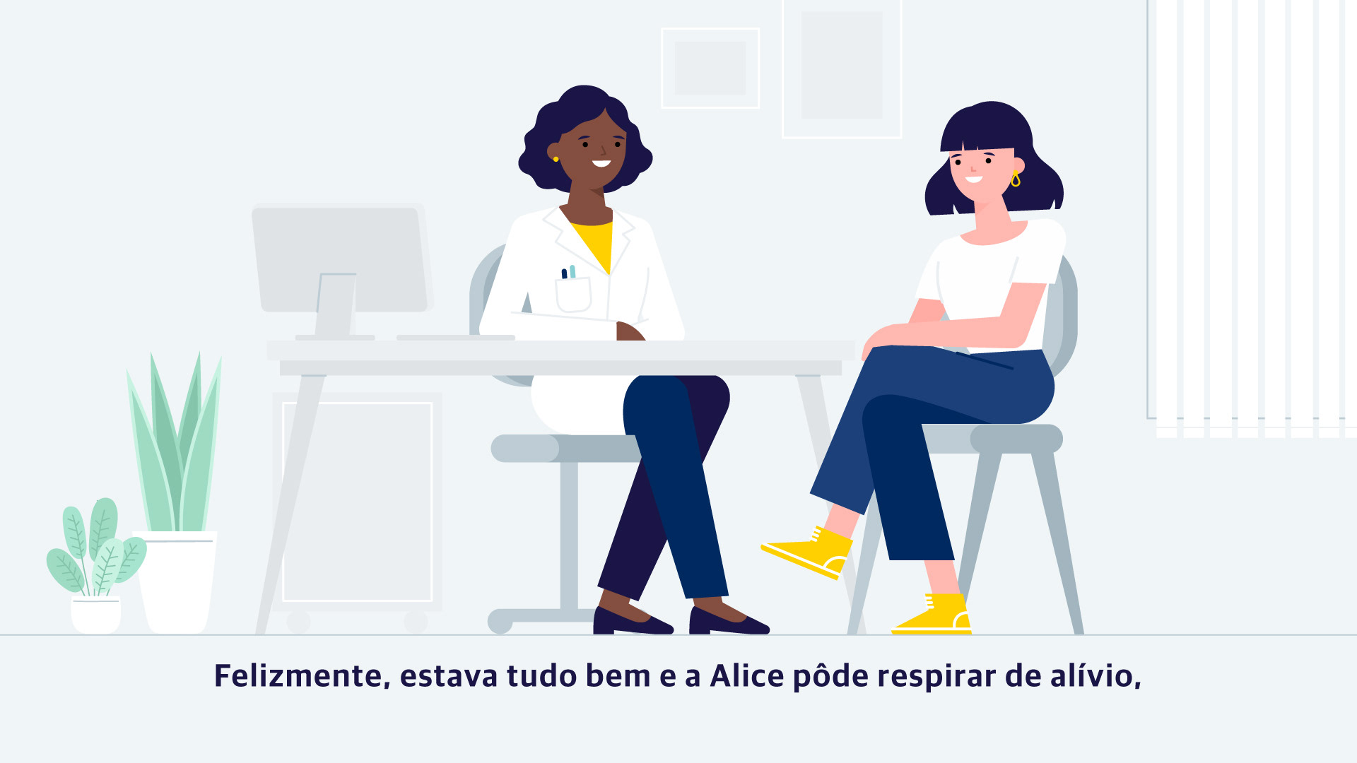
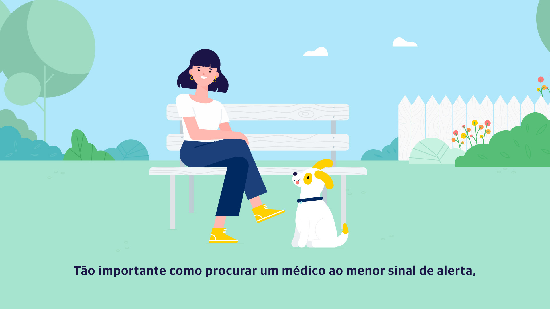
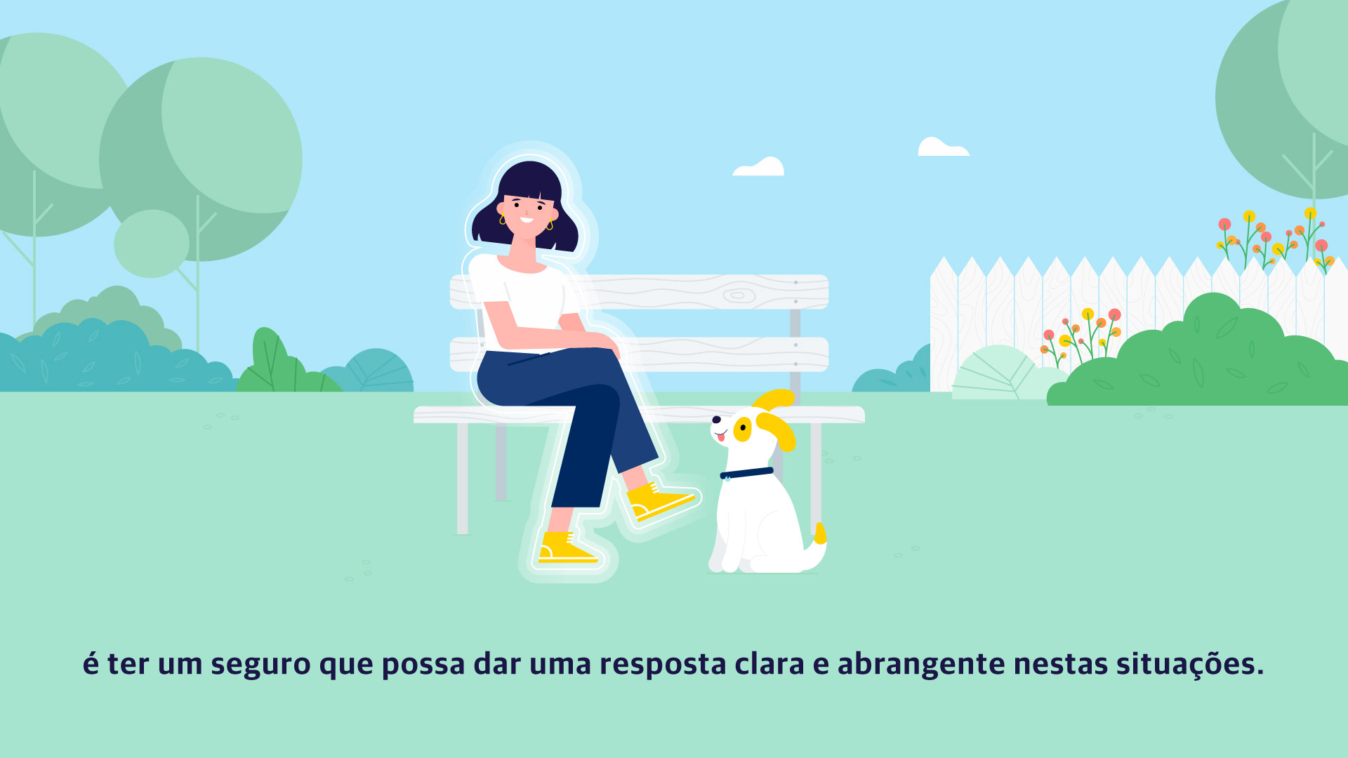
The first step was designing our main character, Alice, who quickly becomes our friend.
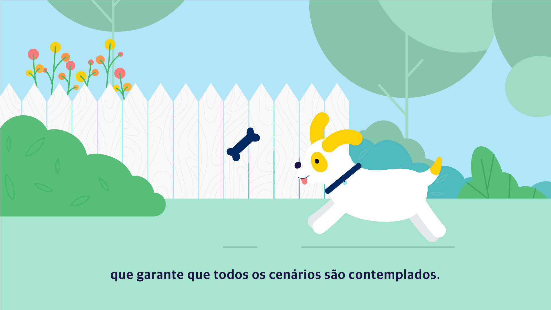
I created her to be instantly relatable and expressive, ensuring viewers could easily see themselves in her situations. And naturally, she has her faithful dog, Balú, by her side, which helped solidify that warm, friendly connection right away.

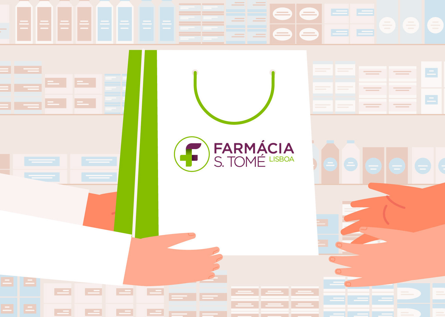
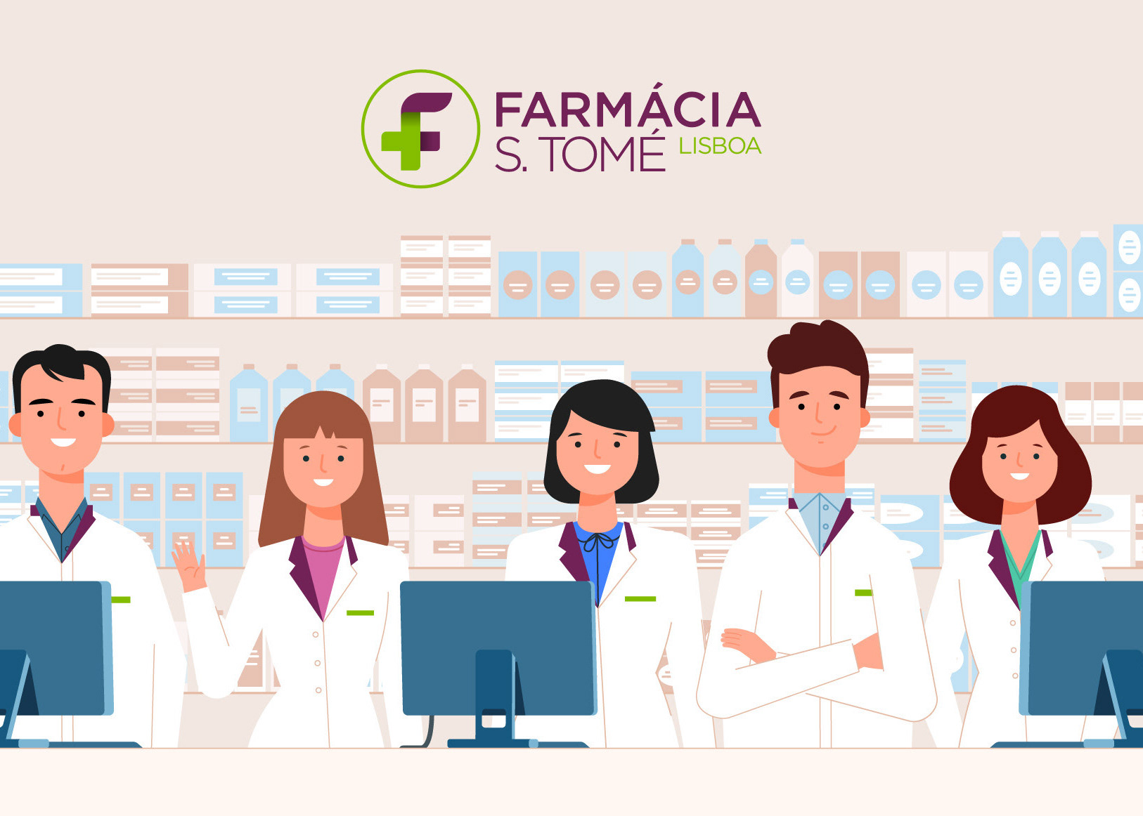
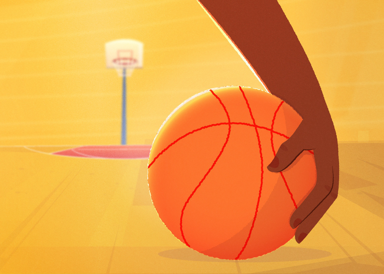
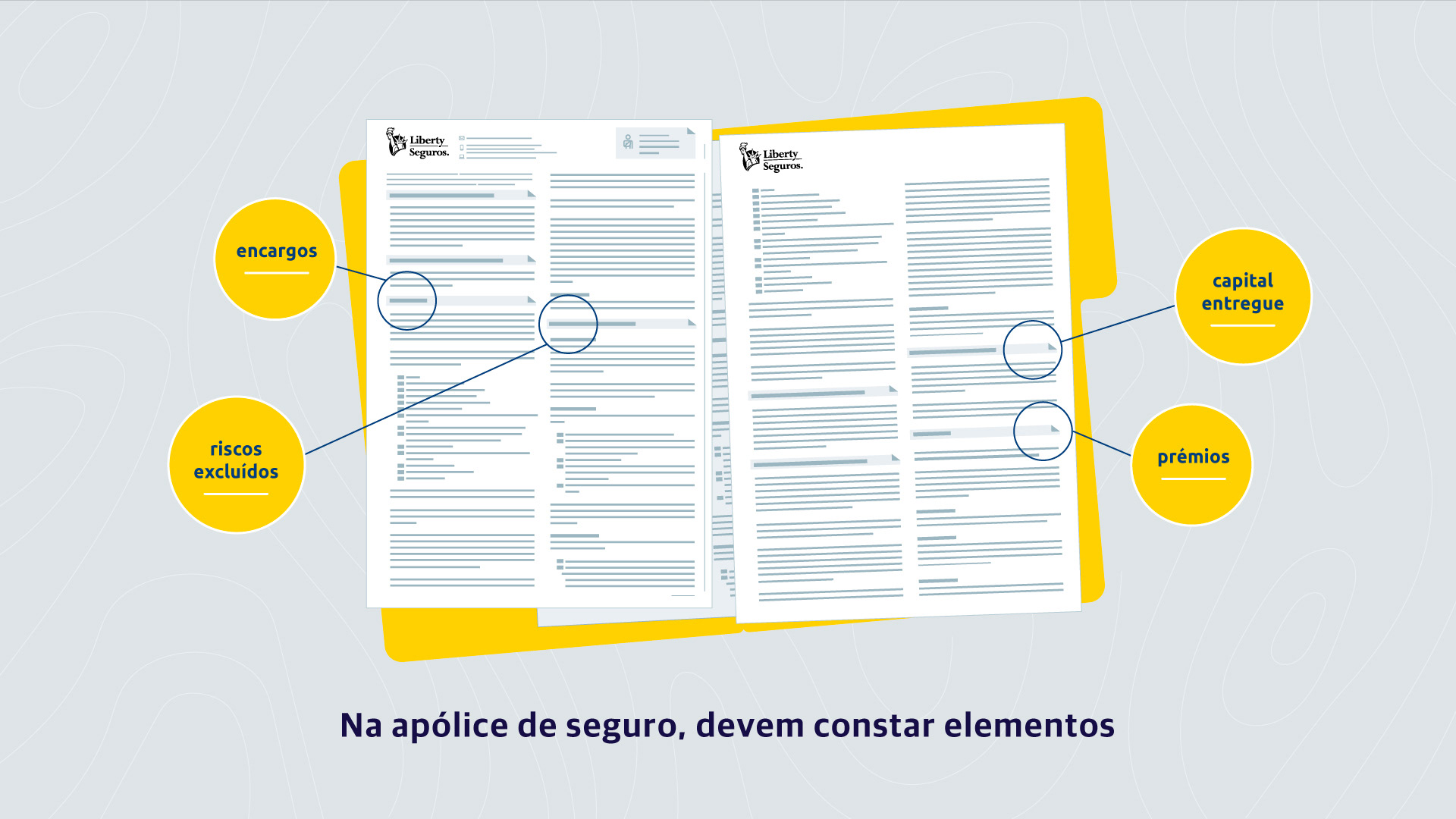
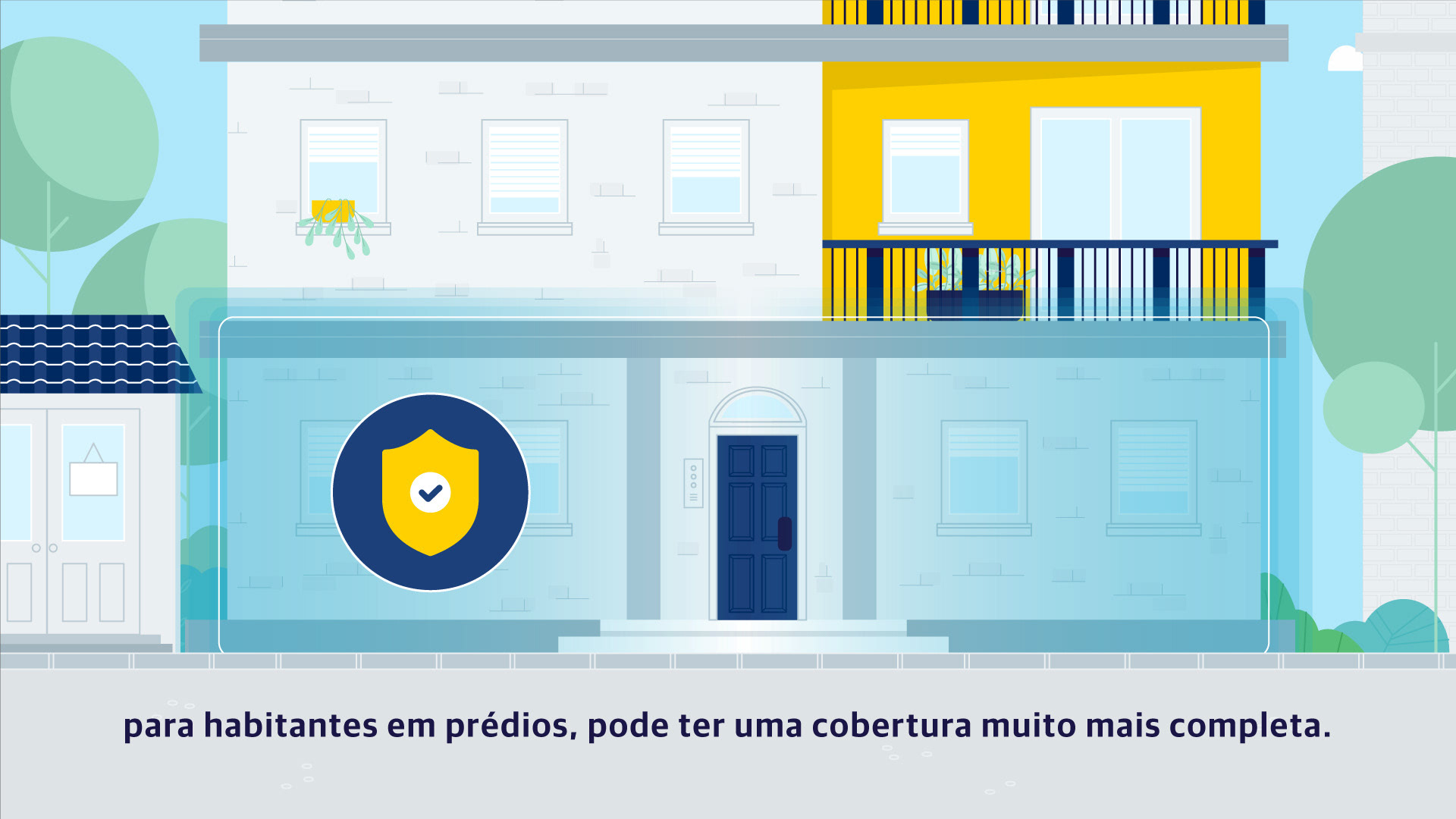
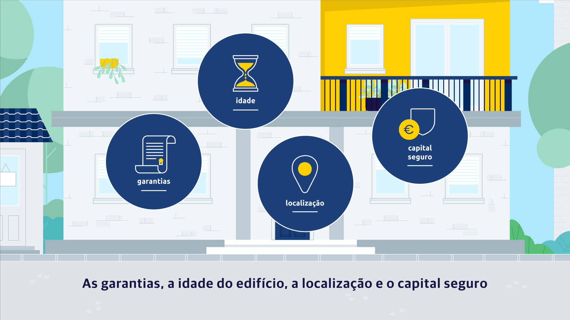
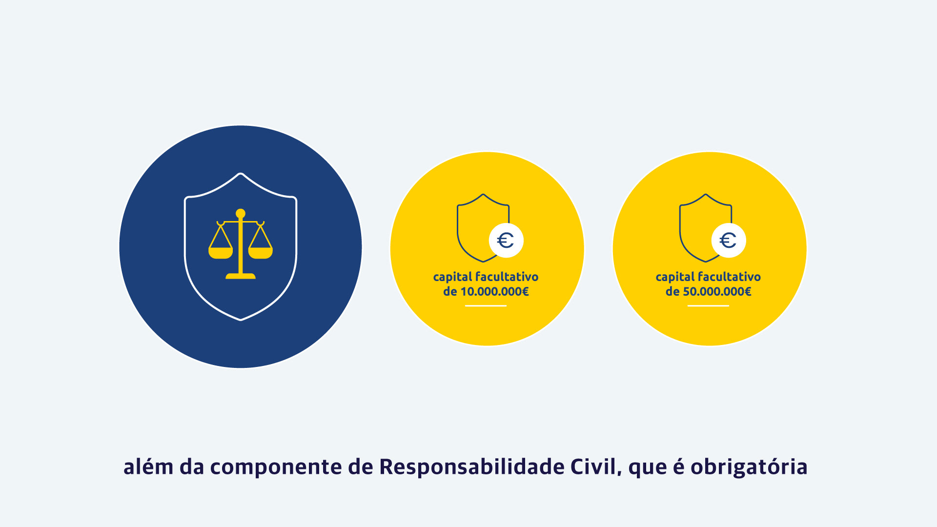
Visually, I created a clever mix of clean, minimal iconography on simple backgrounds, perfect for highlighting heavy insurance details, and friendly characters to humanize the action and make the whole storytelling relatable.
To nail a completely unified look, the color palette was key! It combined brand colors with greys for interiors and details, and soft pastel greens and blues for the exterior, perfectly connecting the minimal icons, the friendly characters, and the whole brand vibe.
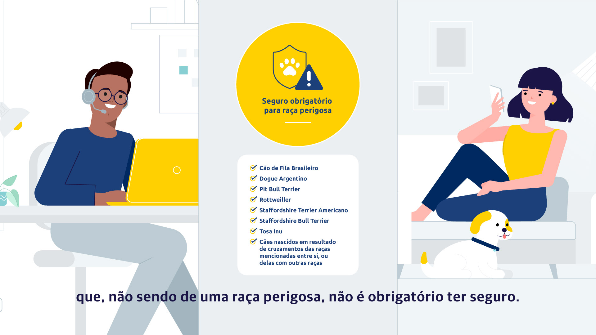
By mixing relatable narratives with simple iconography, we defeated the complexity monster, making the heaviest insurance content straightforward and actually fun to learn.

The Result
Styleboards & Styleframes


Got a great project idea, or thinking of something like this one? Maybe you're just curious about the process, or you feel like saying hello?
Great projects always start with a conversation. Seriously, drop me an e-mail!, I'd love to hear from you!