IoE-EQ ~ Internet of Energy - Education and Qualification

Client: IoE-EQ
Produced by Duall Studio
Script + Voice Over & Illustration: Duall Studio
Role
Art Direction + Character Design + Illustration + Animation
The awesome team at Duall Studio brought me on board for an awareness explainer video for the IoE-EQ* project.
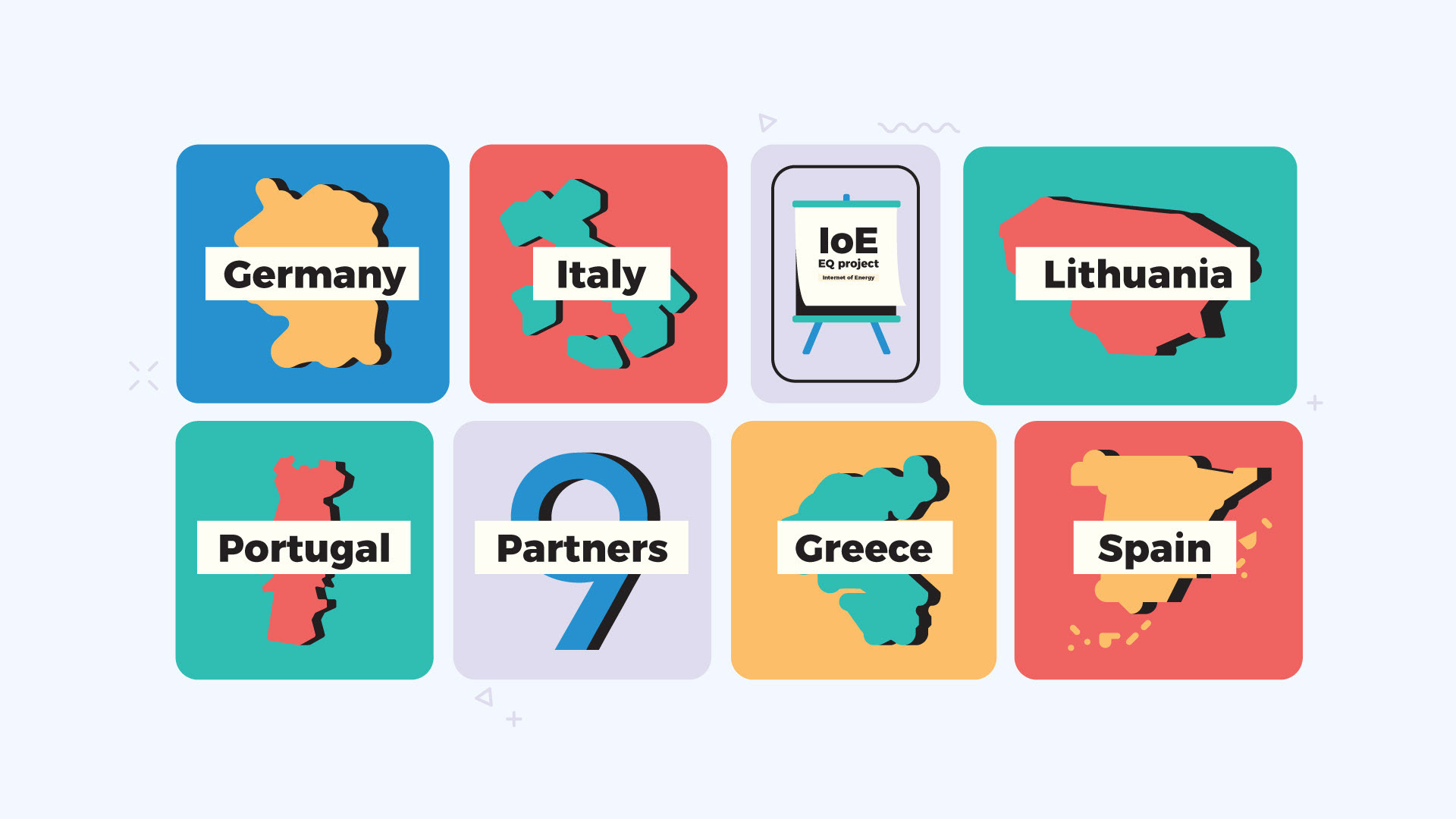
This massive European initiative, backed by nine partners from six different countries, was all about raising awareness among companies and professionals regarding the huge potential and practical applications of IoE technologies.
This explainer video was pure joy to work on! A big thank you to Duall Studio for the collaboration and this fantastic opportunity!
*Internet of Energy - Education and Qualification

The Challenge
To deliver an awareness video that educates European companies and professionals about the huge potential of IoE technologies and shows them examples of their applications.
The Solution
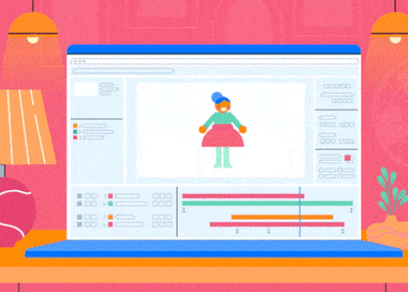
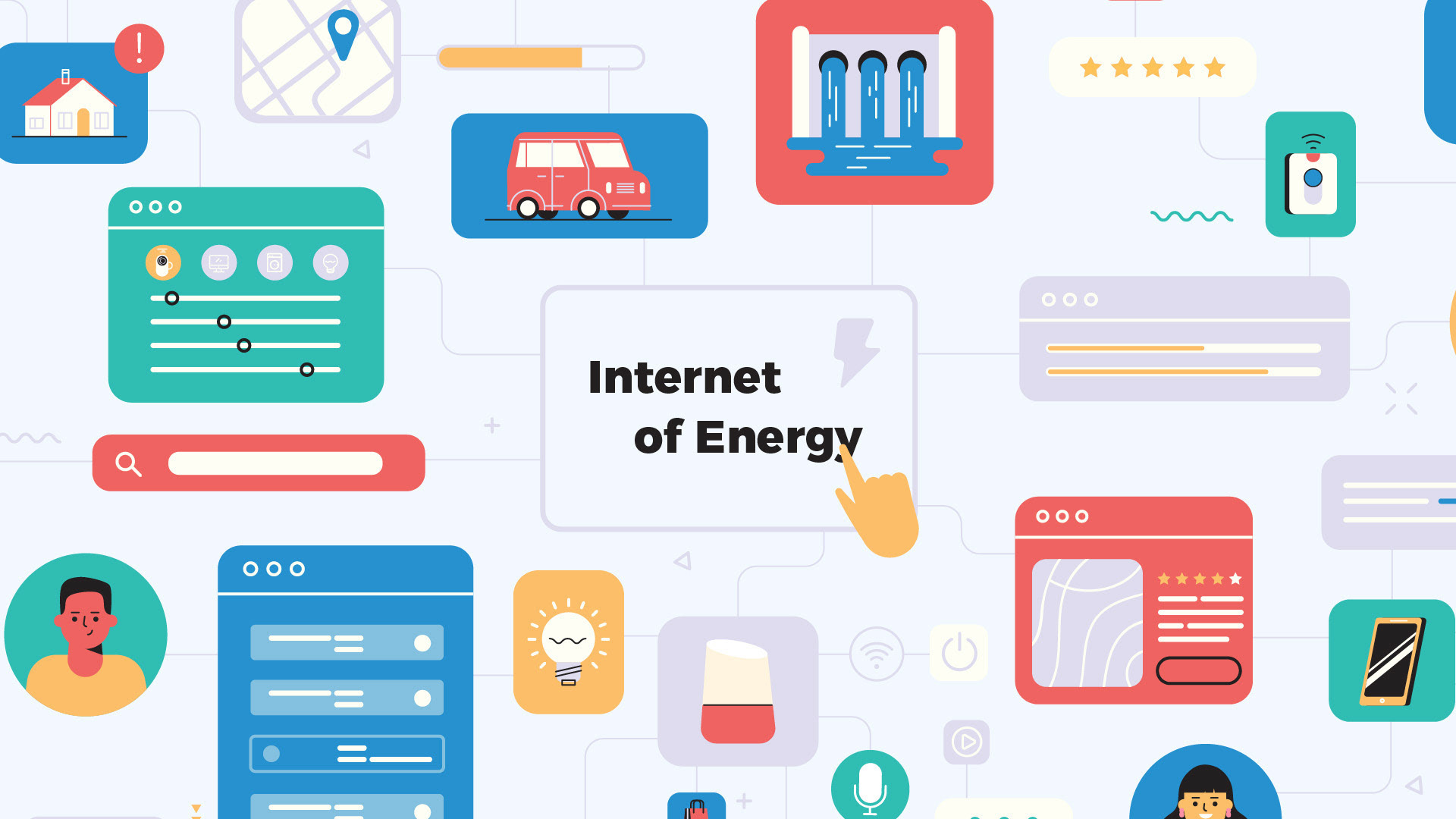
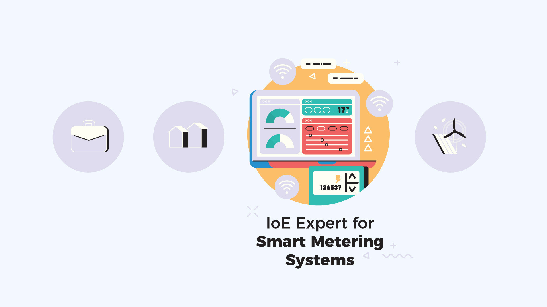
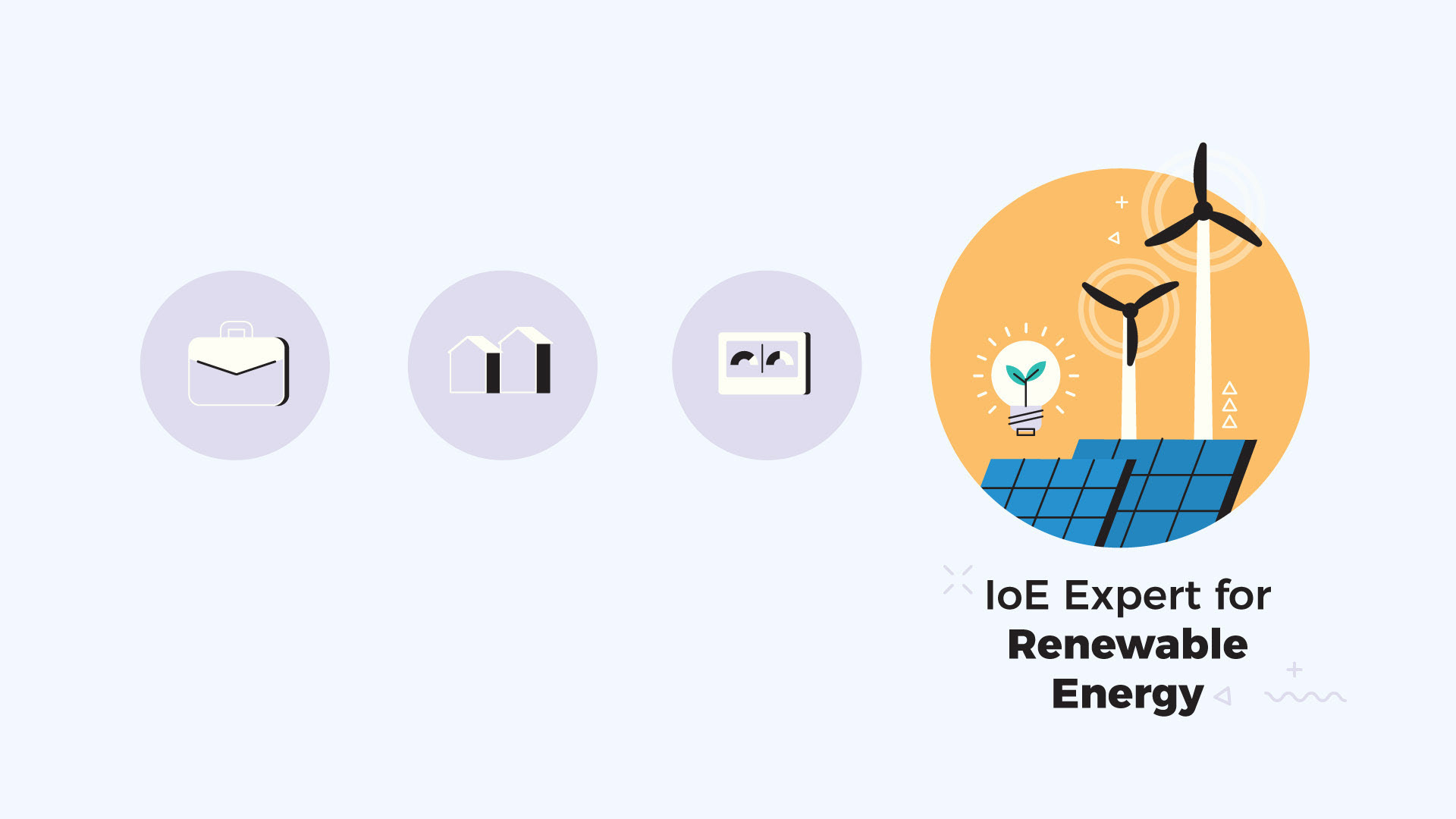
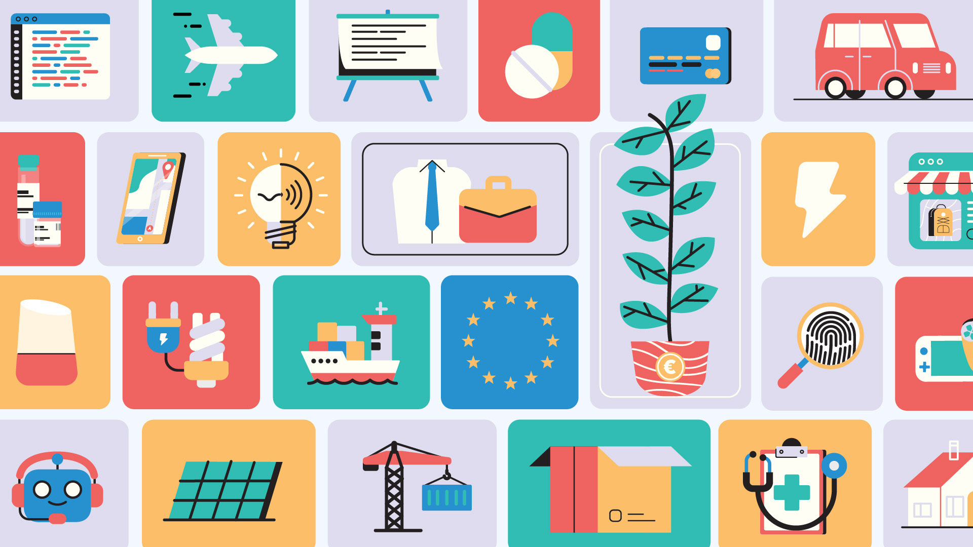
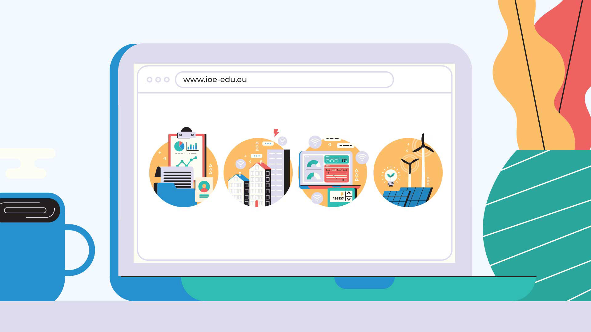
I created one animation where I mixed vibrant, minimal iconography with screens full of real-world IoE examples. This blend was key to making sure professionals immediately saw the huge potential and value of the technology.
Deliverables
~ Full visual development from initial concept to final illustrations
~ Original character and environment designs
~ Storyboard + Styleboard + Styleframes
~ Illustration files prepared and optimized for animation
~ Fully animated campaign launch video (16:9 format)
Visual Approach
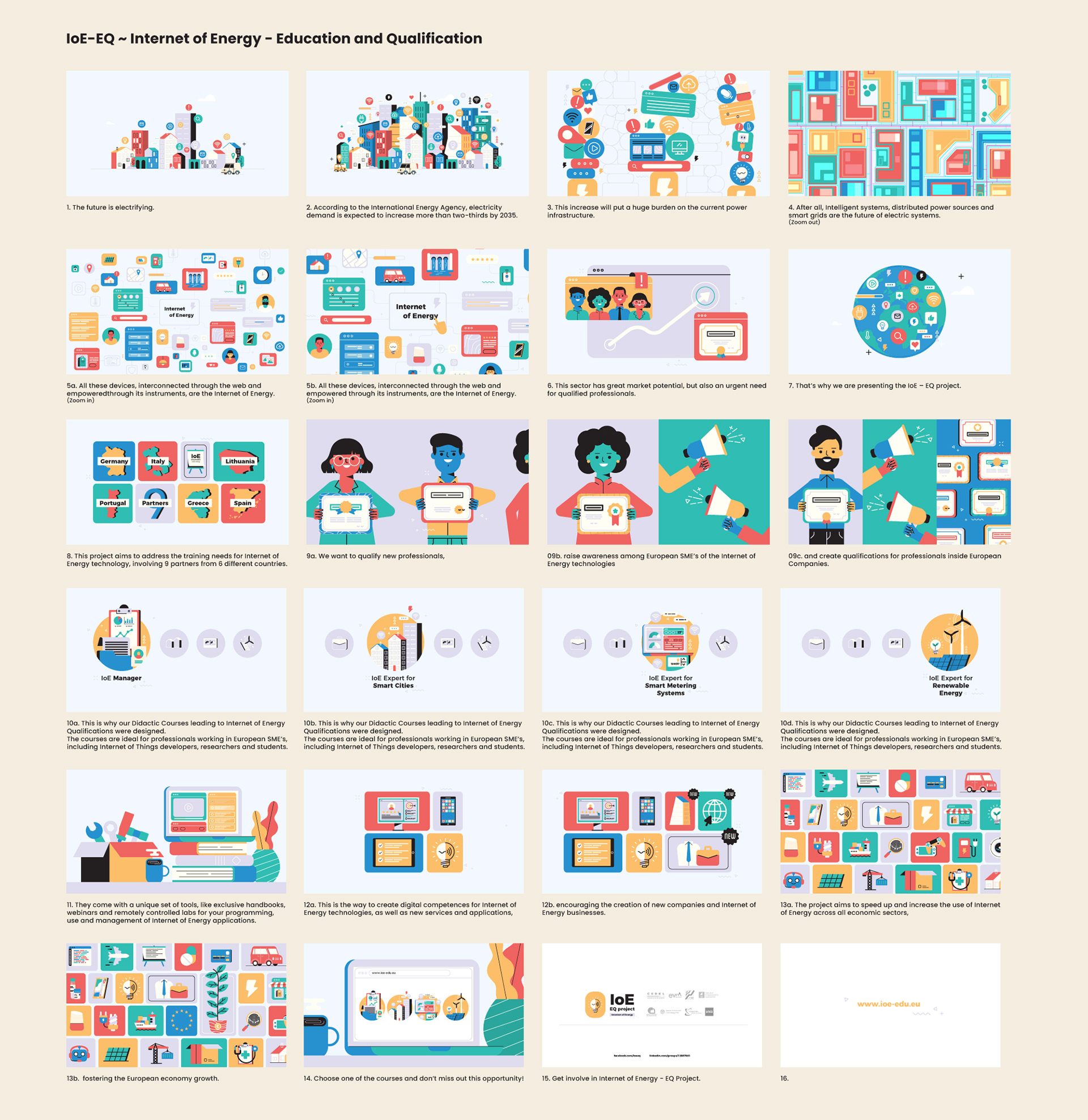
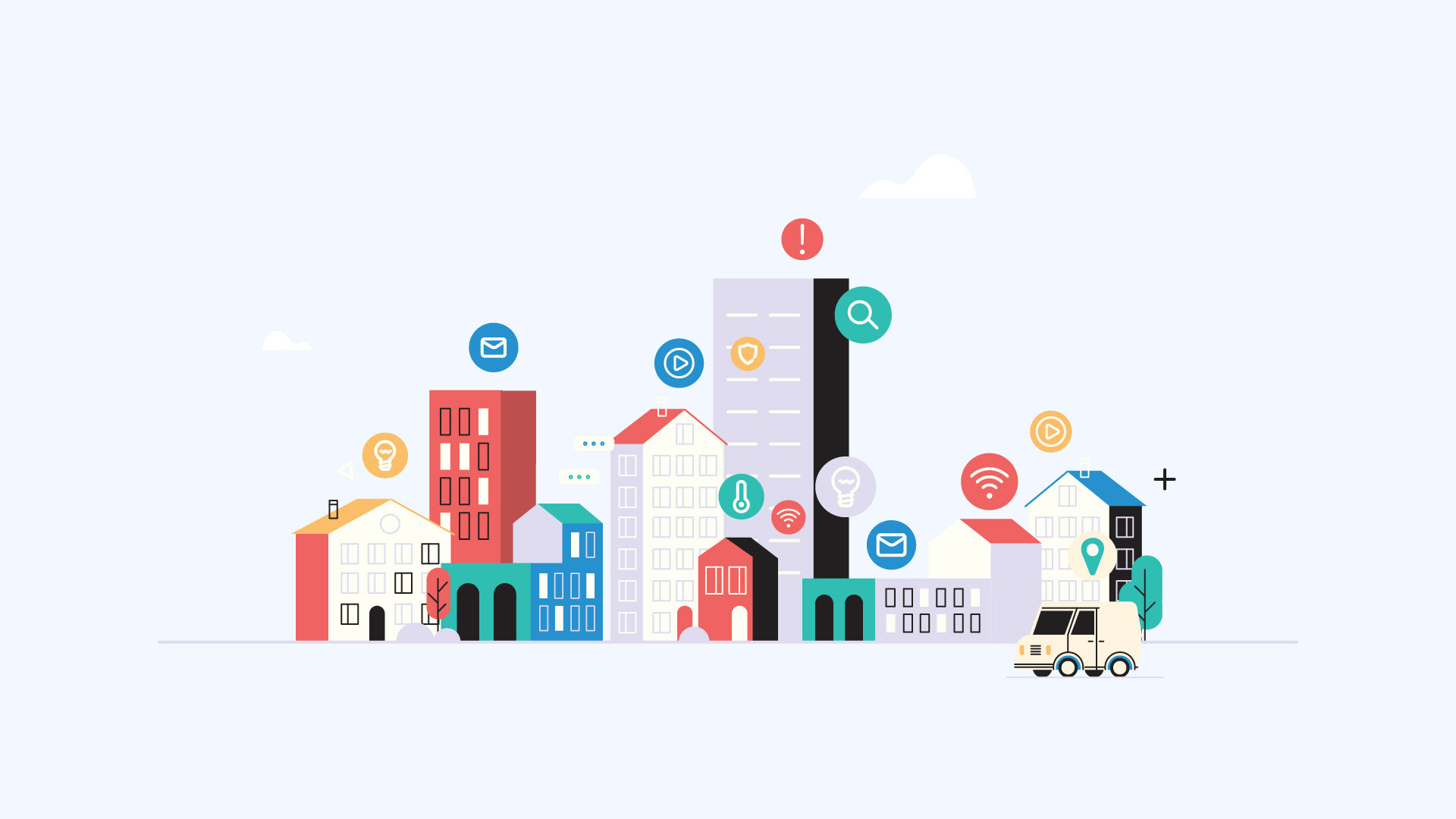
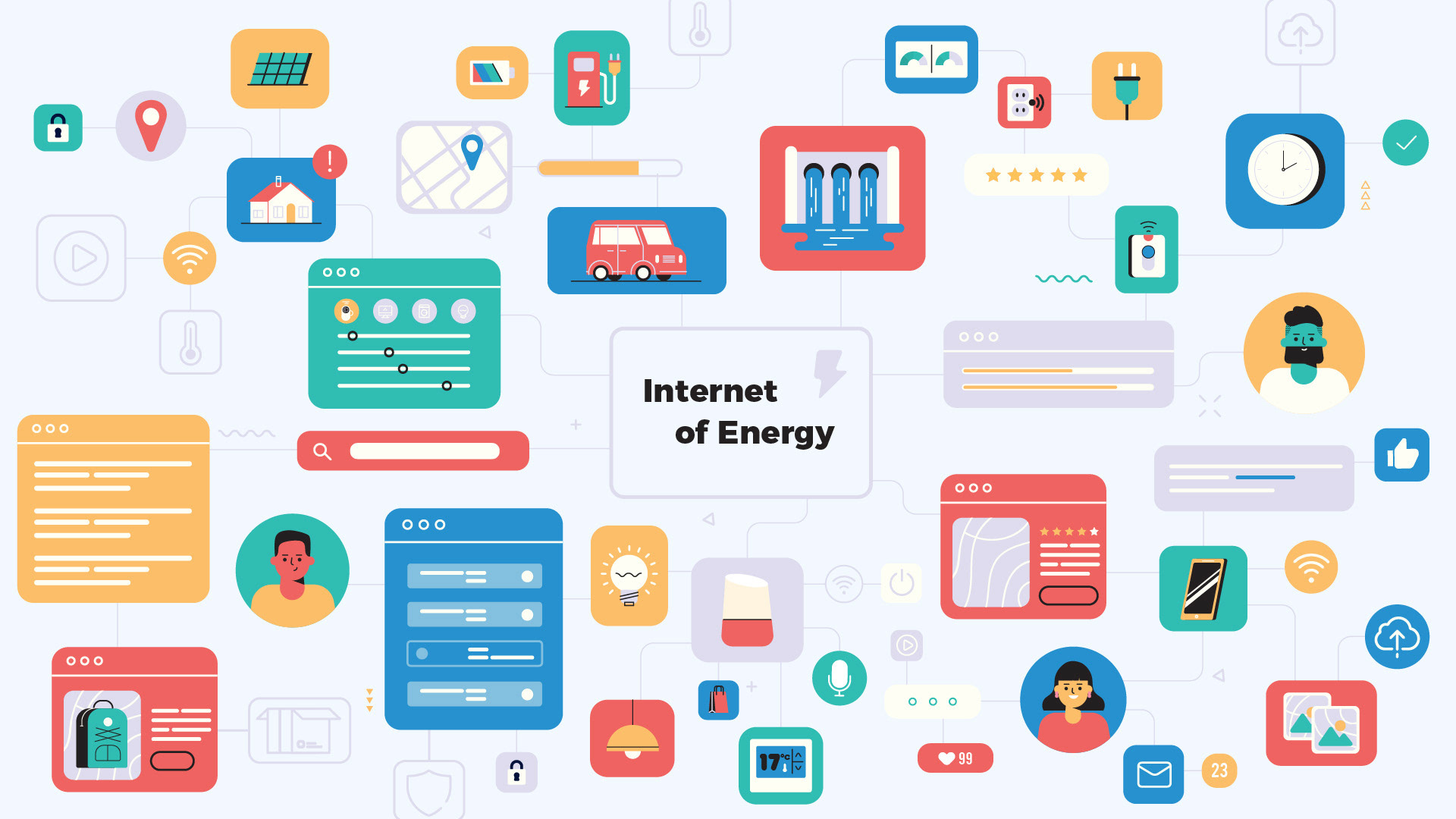
The whole narrative kicks off with a scary statistic: electricity demand is expected to increase more than two-thirds by 2035!
So, how do you transform that worrying challenge into visuals that clearly say "problem solved"? Easy! I played with the colorful palette to build clean, informative visuals that took the narrative straight from chaos to calm.
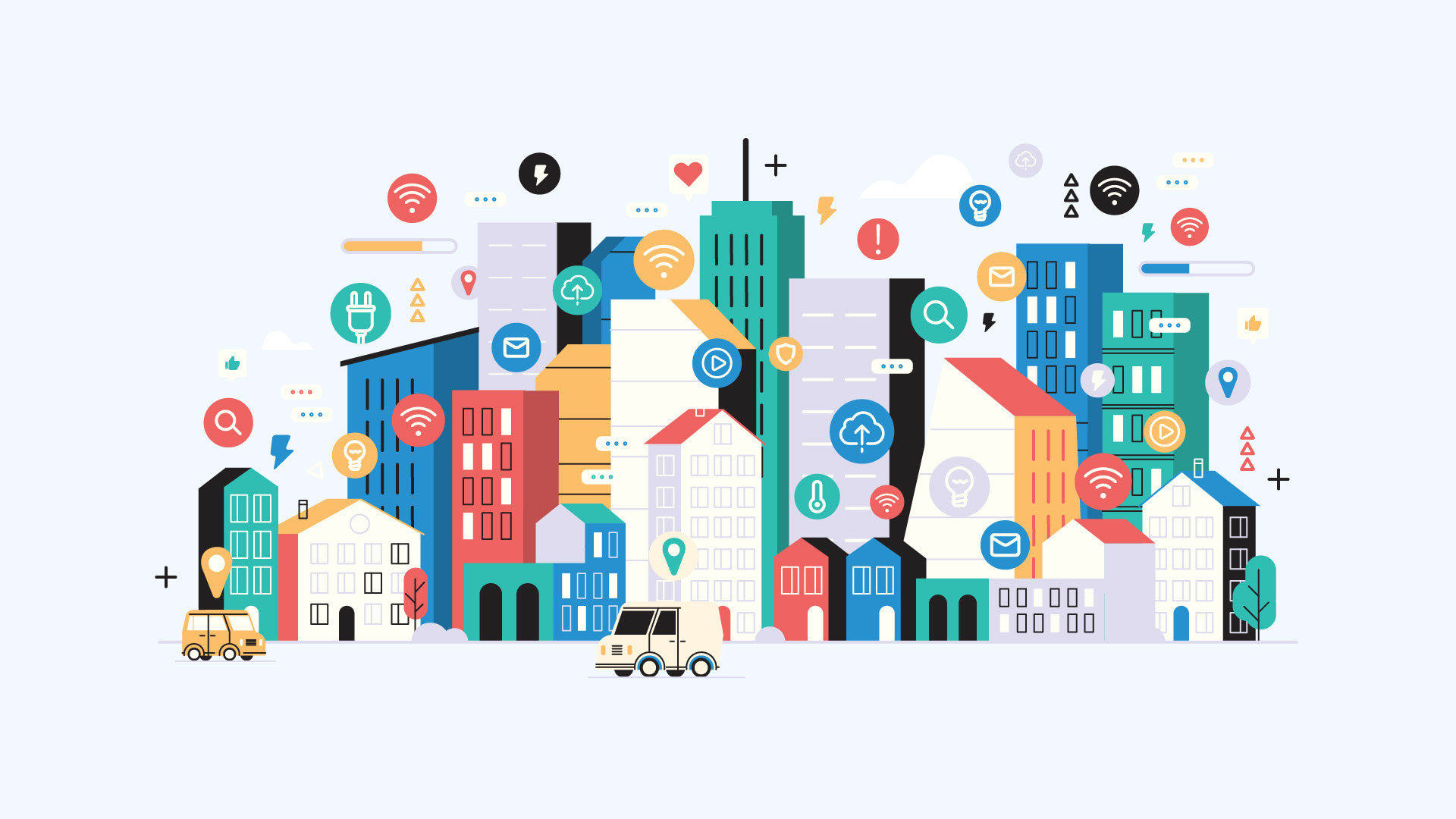
The visuals start out chaotic, hitting you with the urgency of the problem.
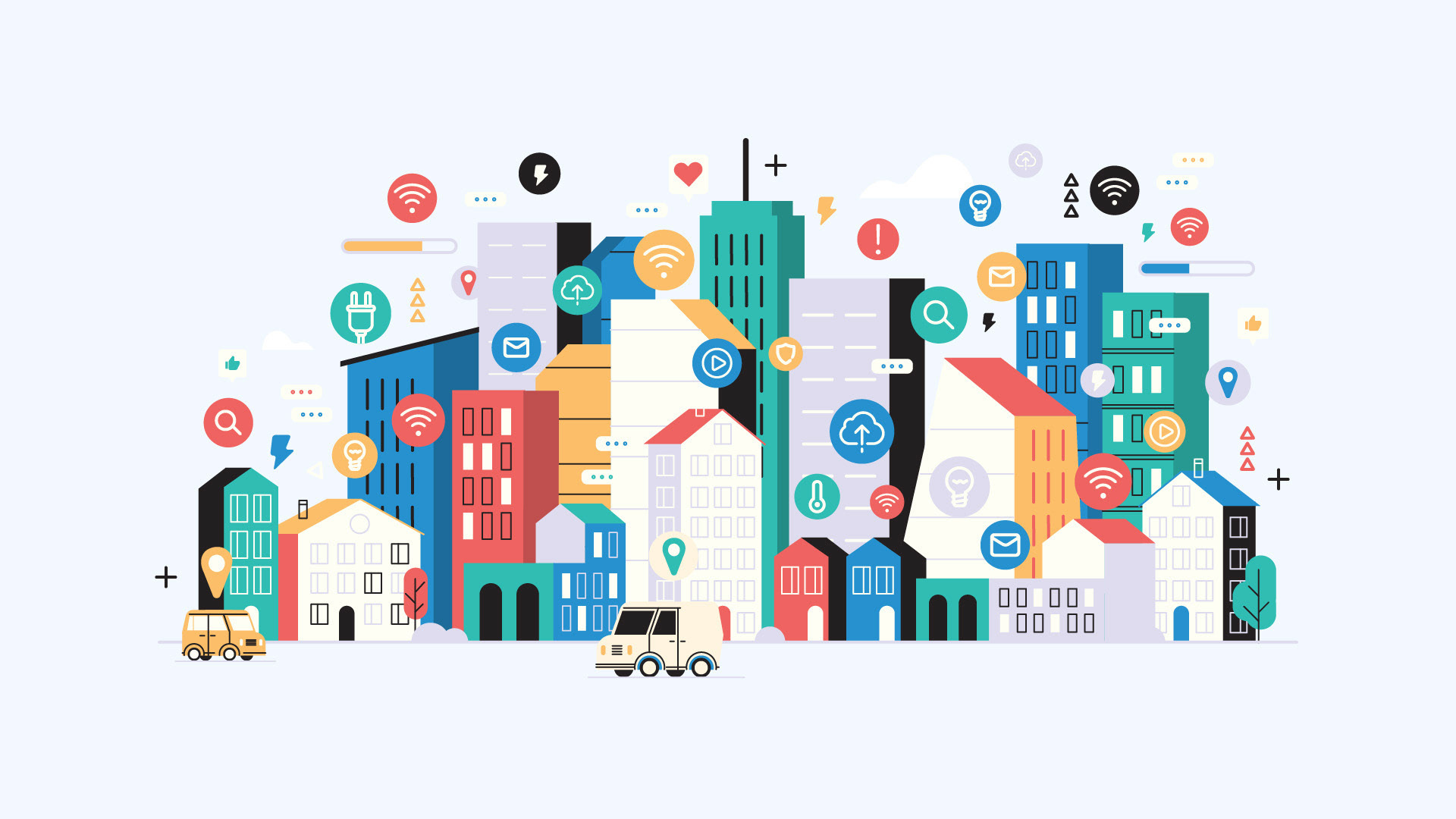

But the second we introduce the smart solutions, the design just settles down and becomes organized and structured.


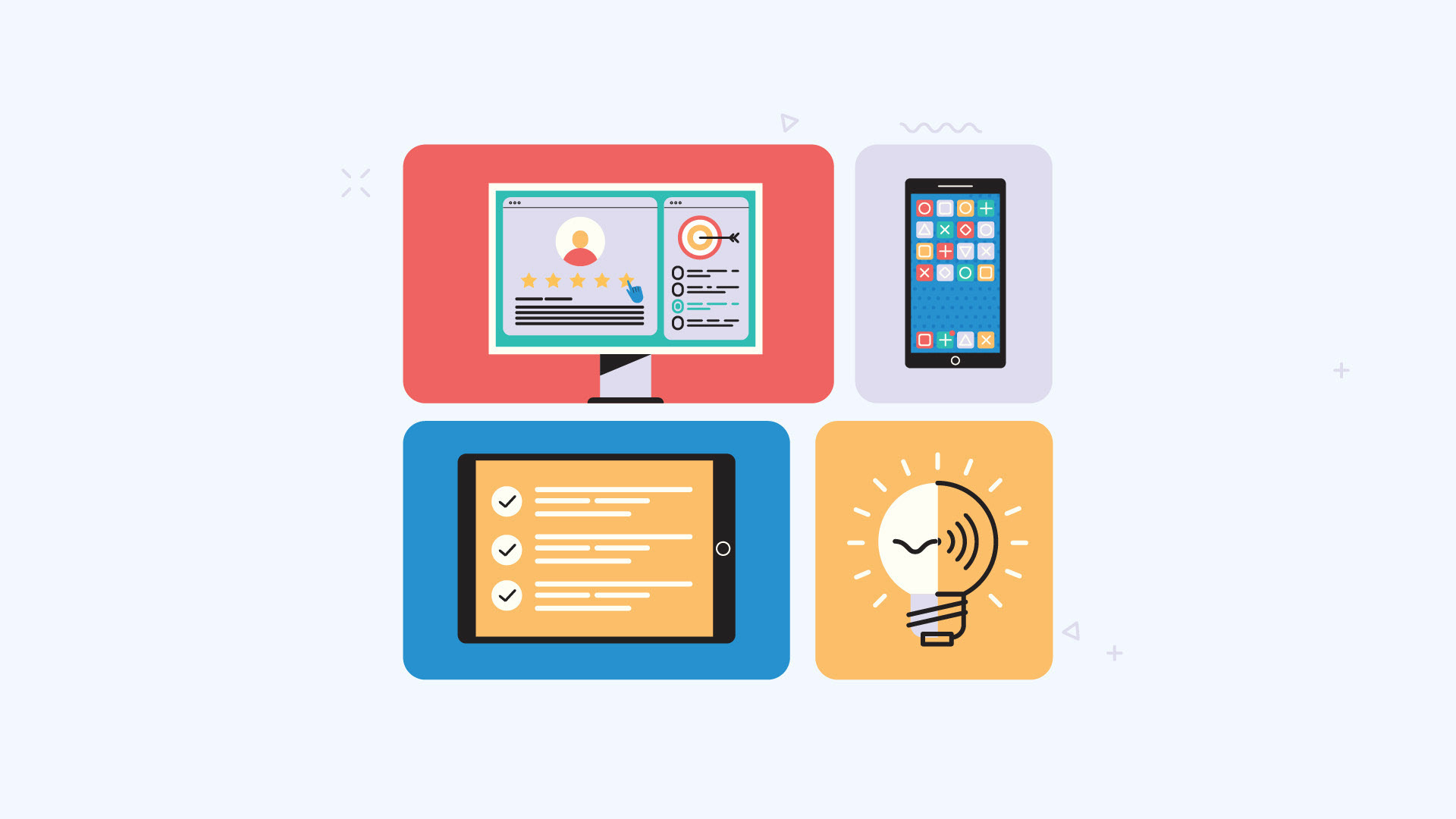
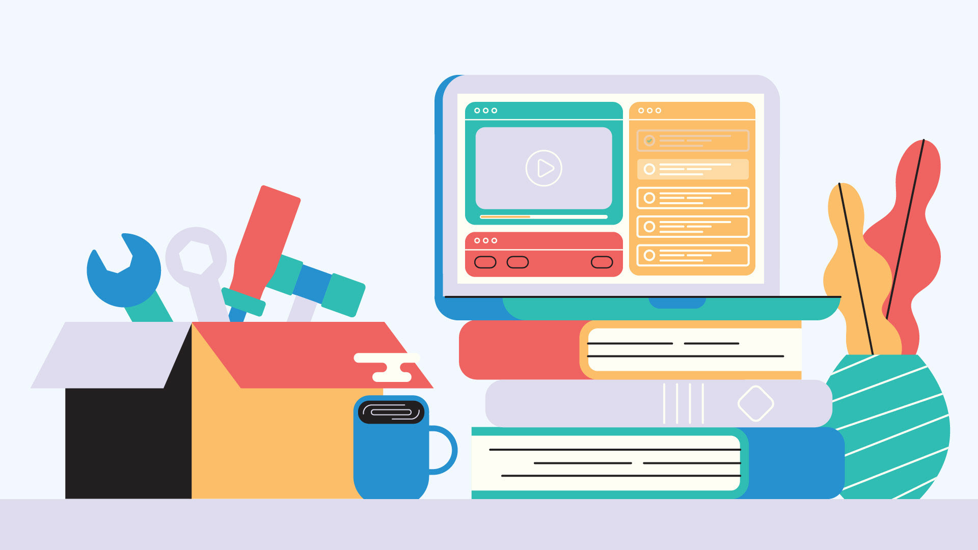
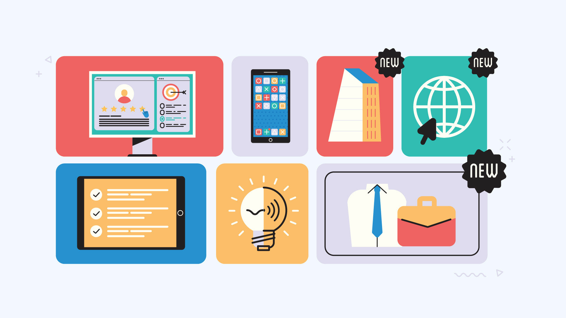
I crafted the visual style around a clean, bold block-color look, perfectly pairing detailed icons with simple software screens, app mock-ups, and small particles.
The contrast was key, all thanks to mixing rich, vibrant colors against super deep blacks, clean whites, and cool greys.

My one and only goal for the animation was simple: to make the information the star and totally avoid a character-driven story.
And honestly? I loved figuring out how to visually explain the complicated IoE-EQ project to show it as the proven, viable path to boosting digital competences and European economy growth.
The Result
Styleboard & Styleframes


Got a great project idea, or thinking of something like this one? Maybe you're just curious about the process, or you feel like saying hello?
Great projects always start with a conversation. Seriously, drop me an e-mail!, I'd love to hear from you!