Ori€nta-te

Client: Grupo Ageas Portugal
Produced by Adagietto
Script + Voice Over + Music: Adagietto
Role
Art Direction + Character Design + Illustration + Animation
I teamed up with Adagietto to create a kid-friendly explainer video about Ori€nta-te, a fun financial-literacy competition that turns elementary school students into mini financial wizards.
The AGEAS Foundation and Mentes Empreendedoras teamed up to launch this amazing project that is all about teaching young people super smart financial management for the future, and getting them to use their new money knowledge creatively.

The Challenge
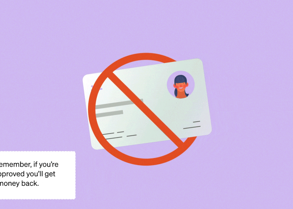
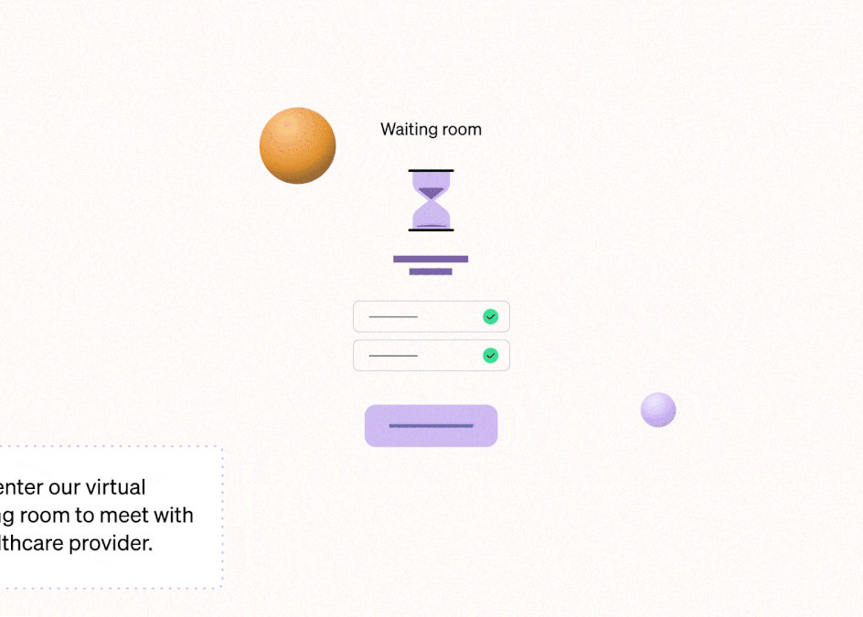
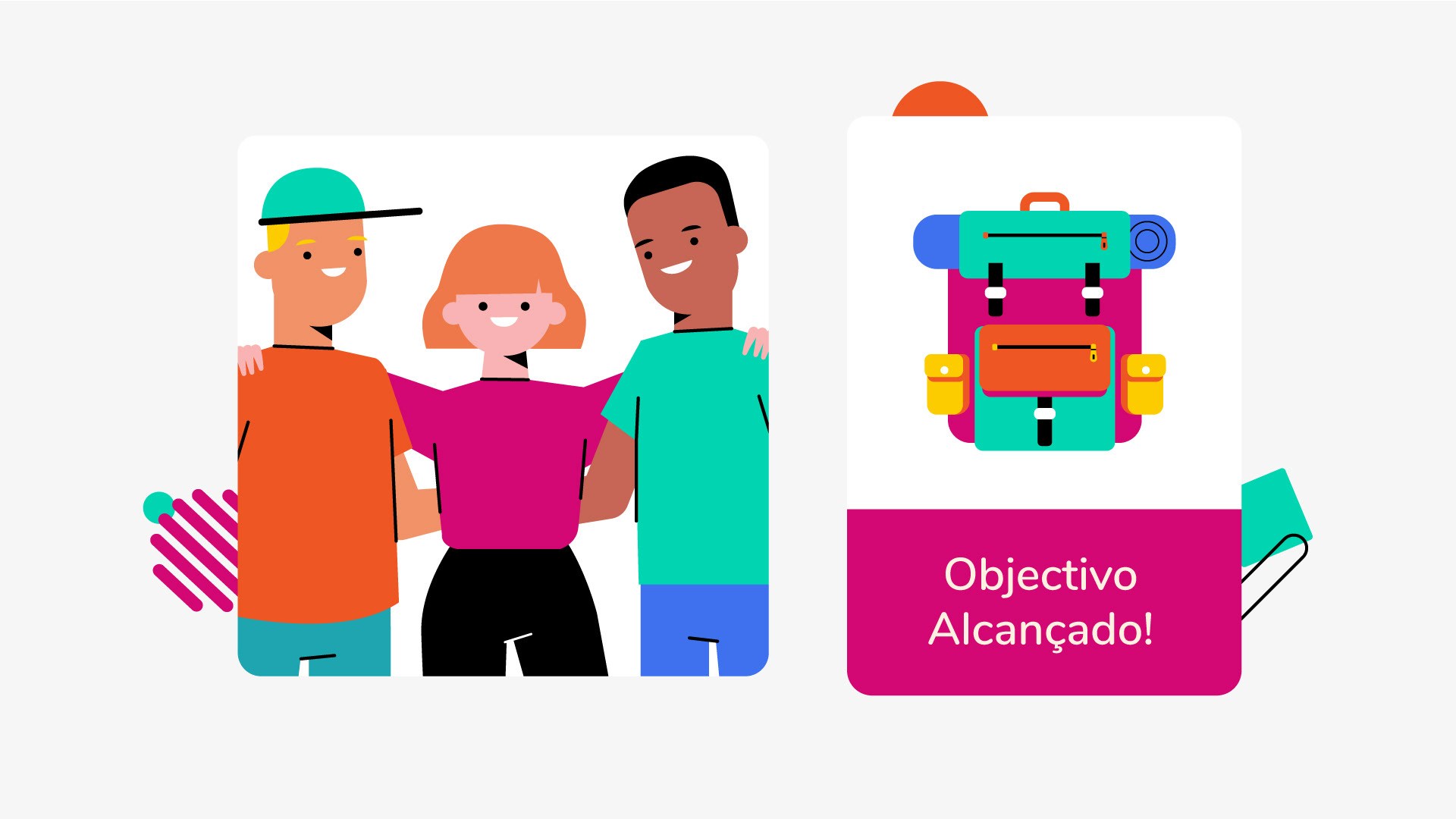
To create a kid-friendly animation that made the competition details easier to understand while we followed the fun journey of João, Maria, and Pedro as they saved for their graduation trip.
The Solution
I crafted a highly colorful and bold character-driven narrative to break down complex competition rules and make future financial planning fun and simple for elementary students.
Deliverables
~ Full visual development from initial concept to final illustrations
~ Original character and environment designs
~ Storyboard + Styleboard + Styleframes
~ Illustration files prepared and optimized for animation
~ Full animated awareness video (16:9 format - approximately 2:00)
Visual Approach
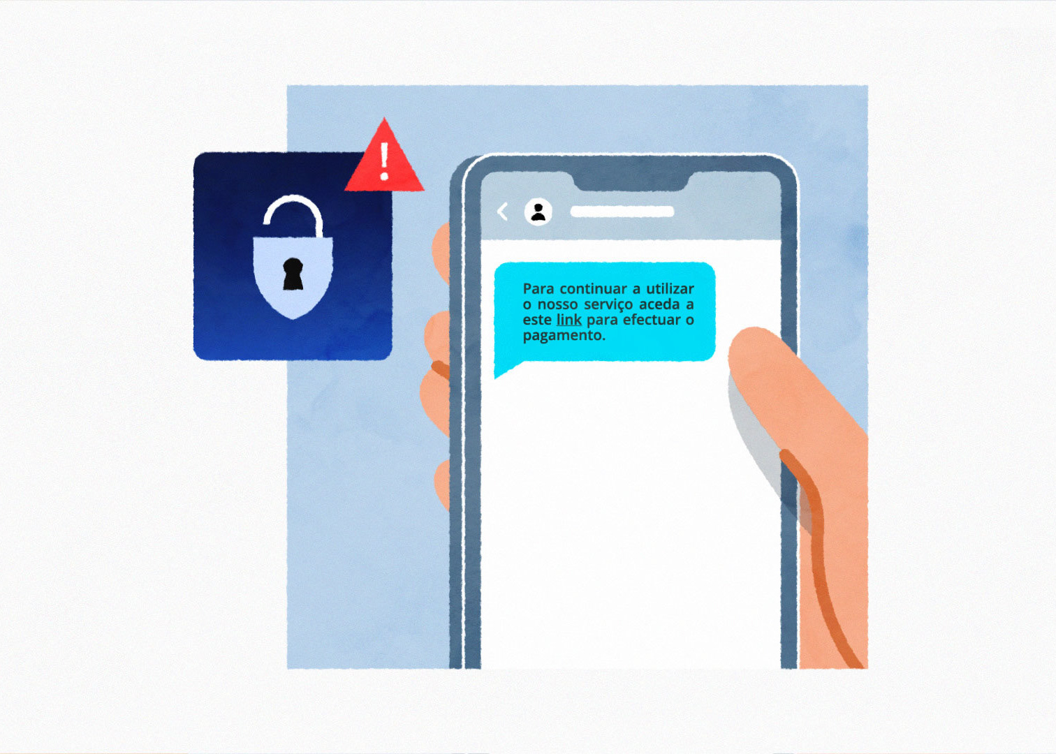
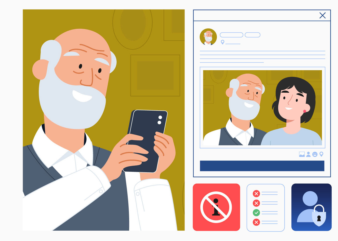
I realized the trickiest part wasn’t just explaining the competition rules! it was making financial literacy engaging, which young students often find super boring.
I had to break down complex topics like budgeting, credit, and savings, by turning it into fun, practical examples they could actually relate to.
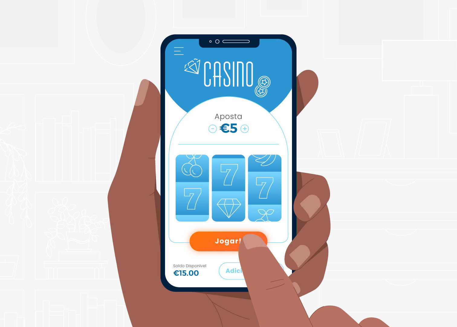
To grab their attention, I went all-in on fun and color! I designed a bold graphic style based on the campaign’s color palette, prioritizing clarity over realism, flooding screens with bright colors, playful details, and simple characters.
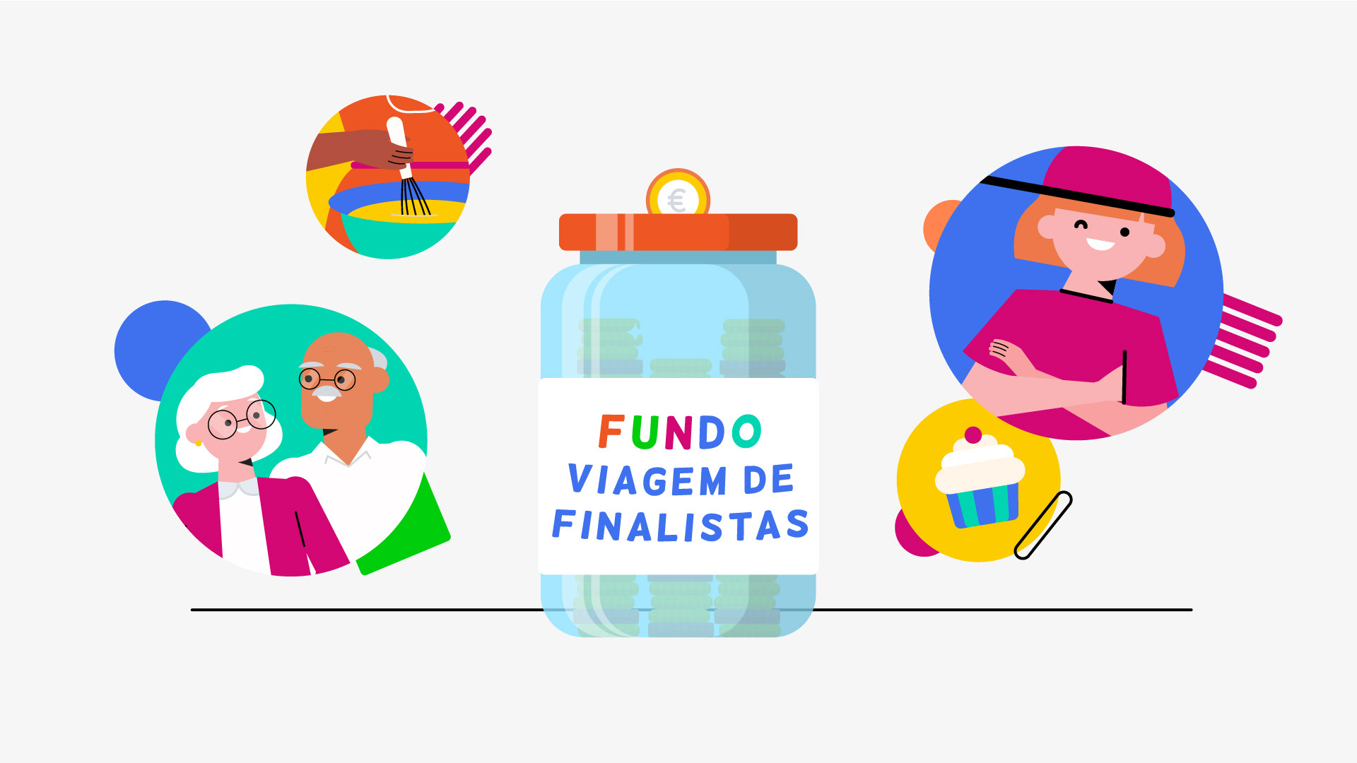
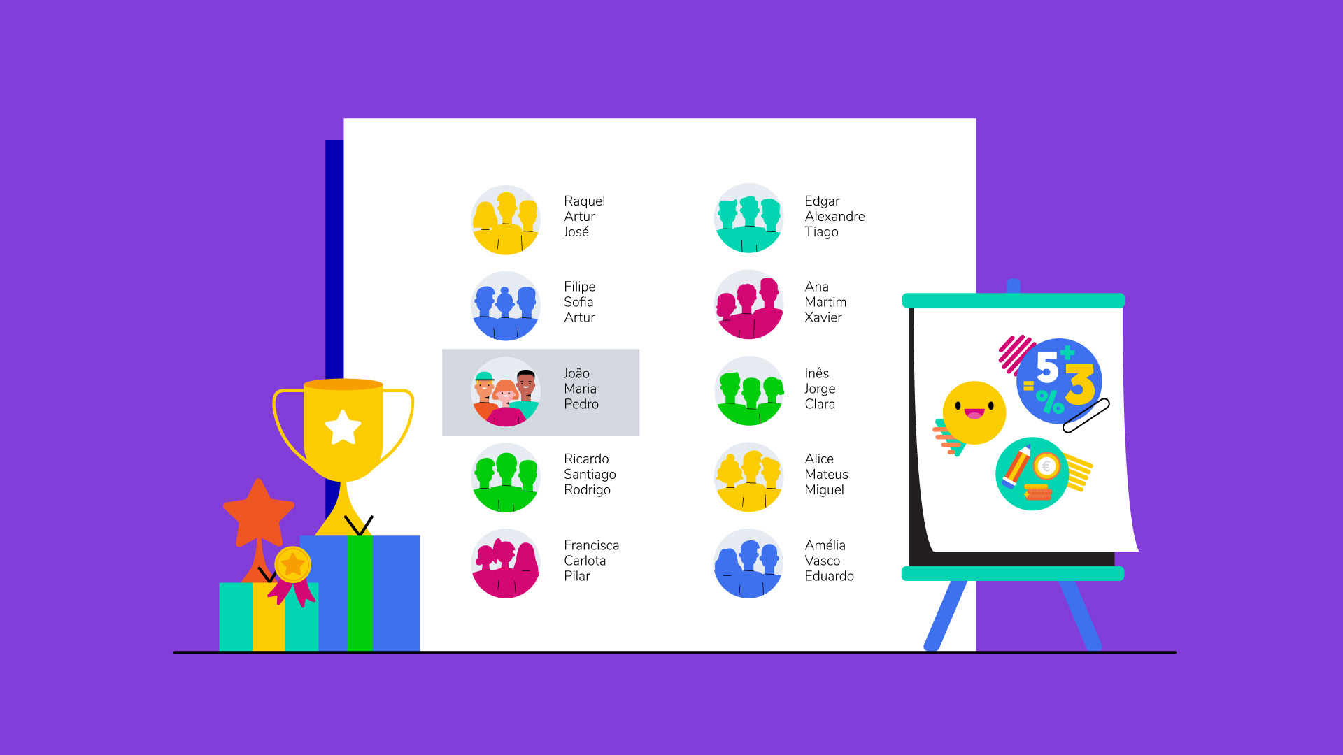
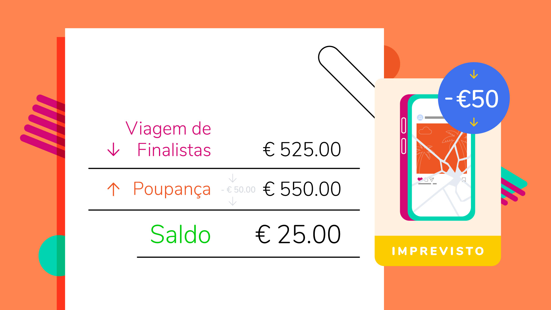
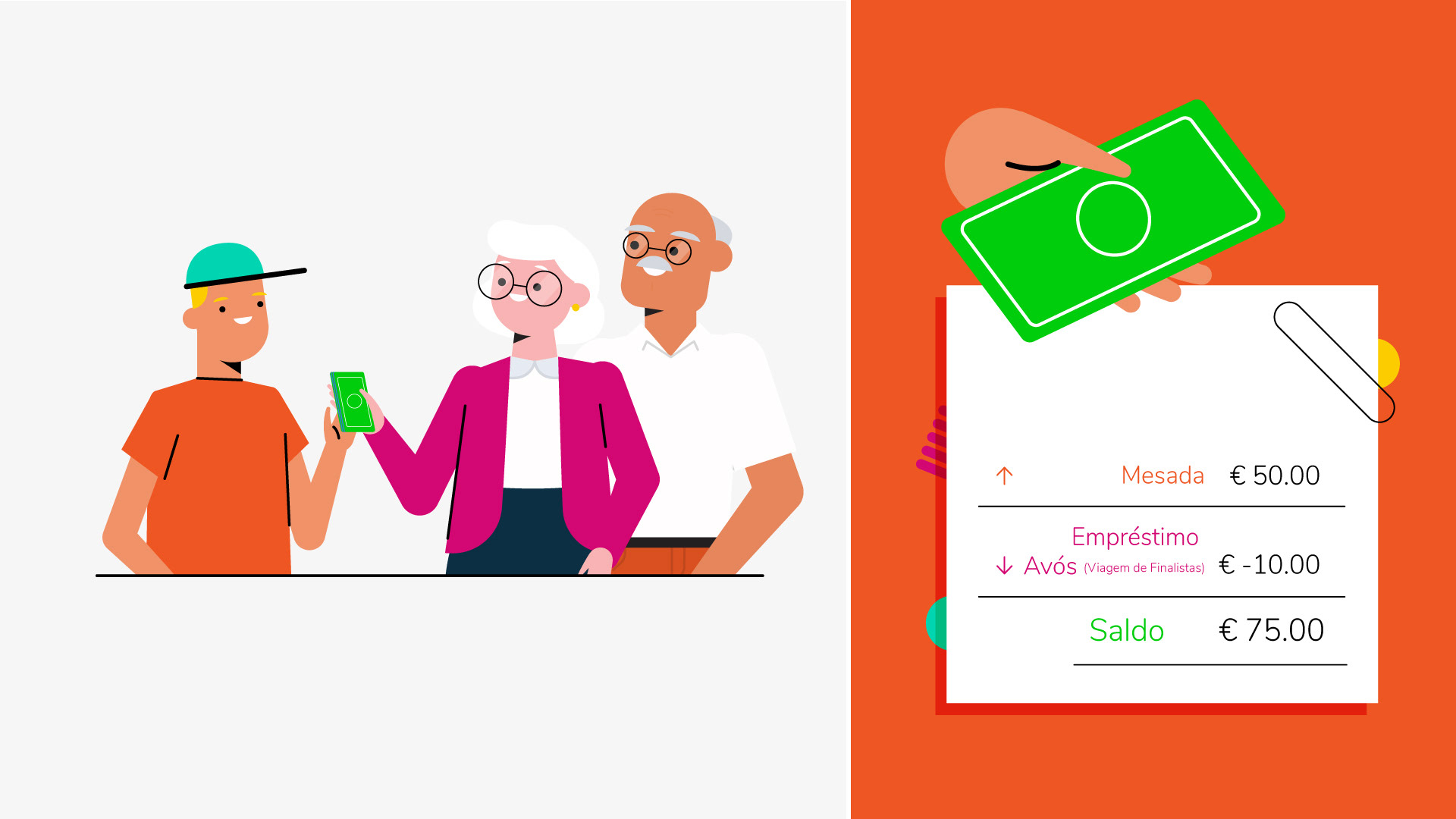
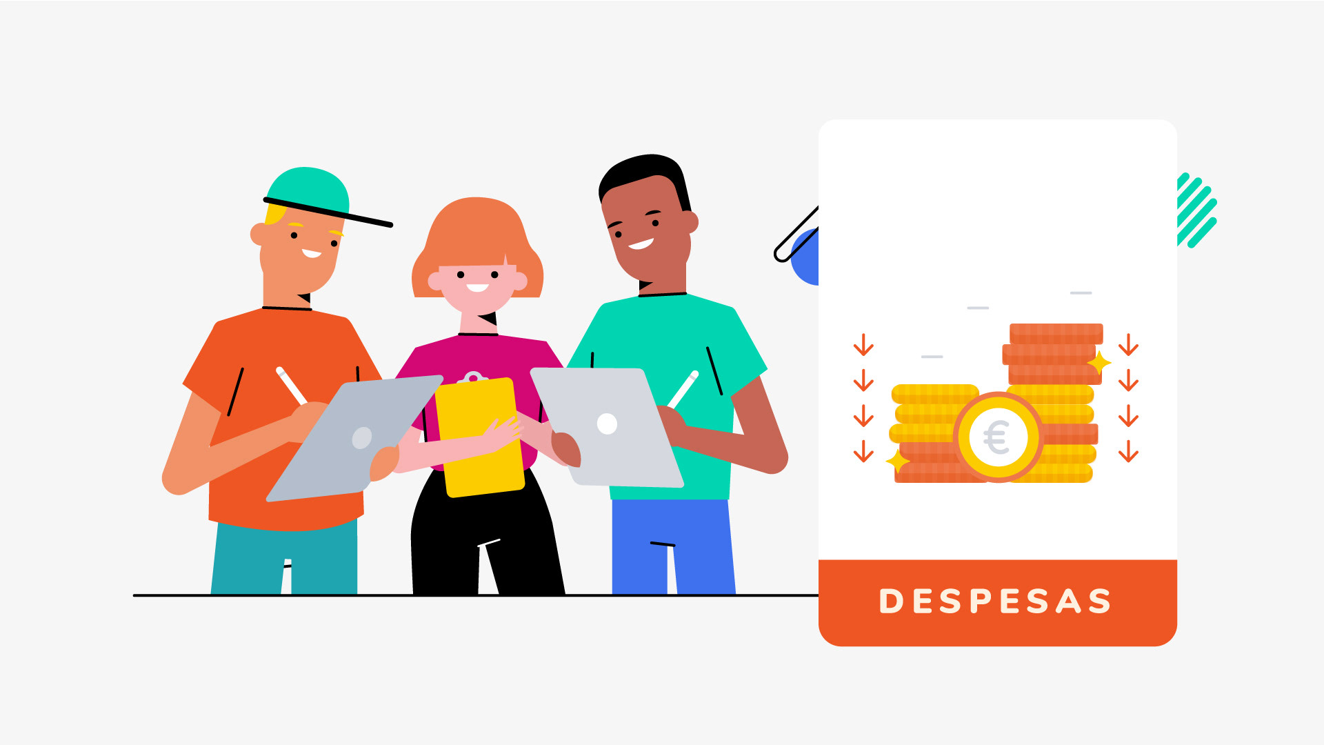
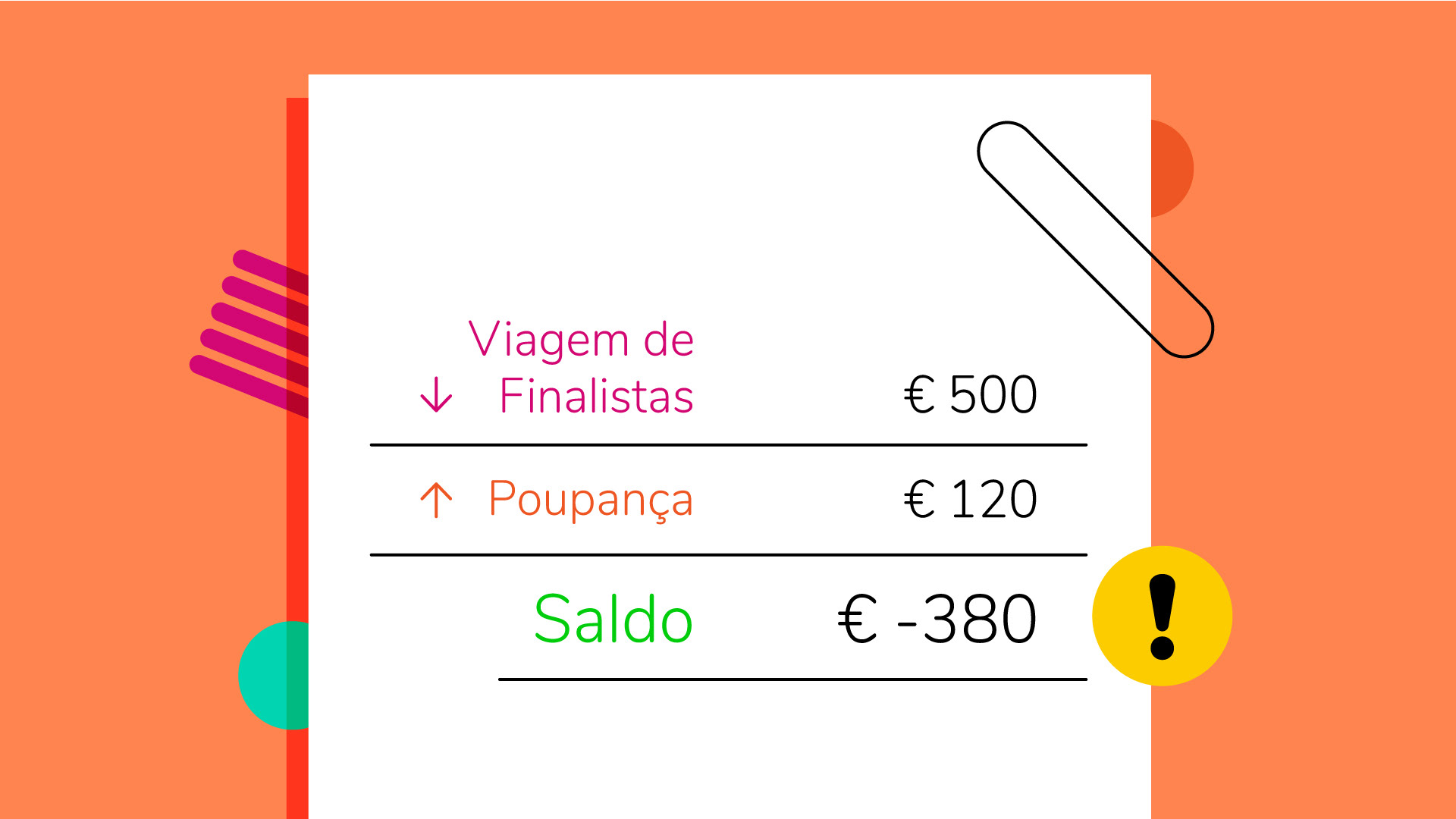
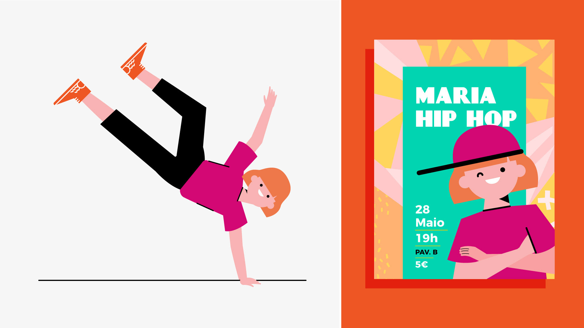
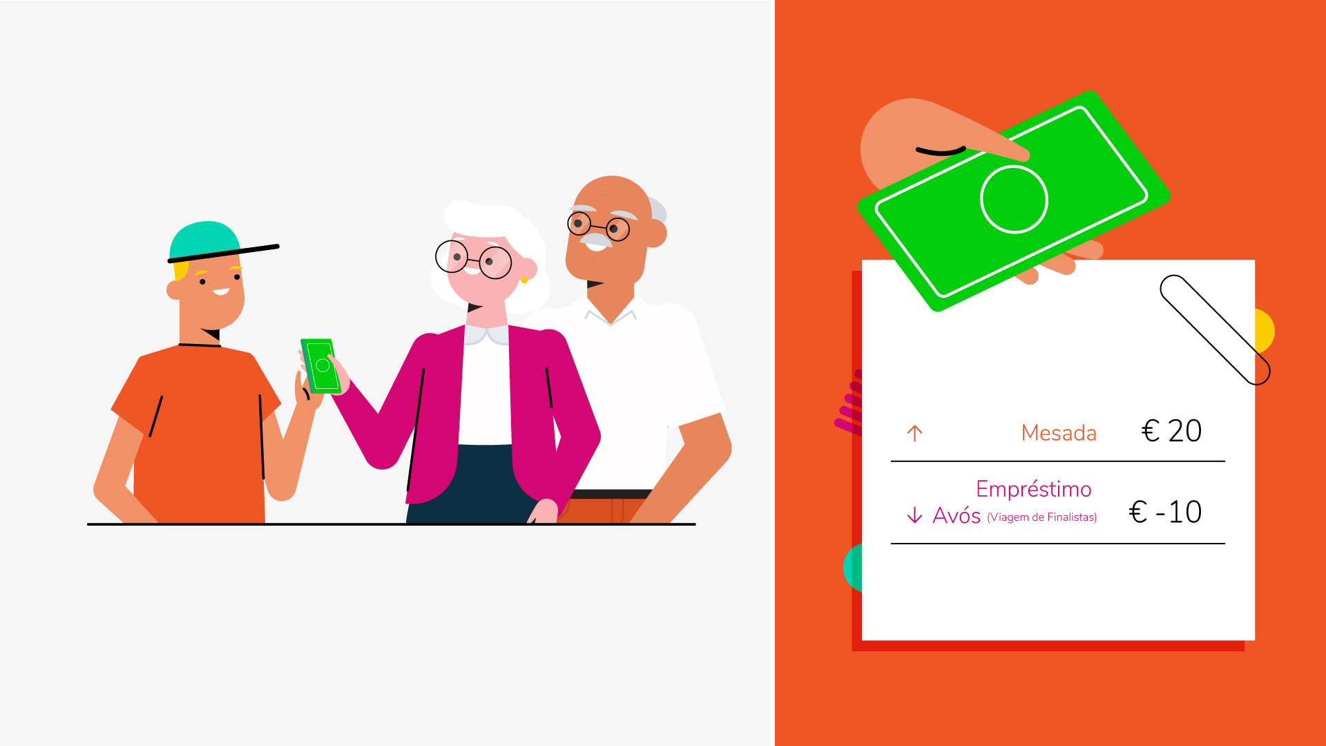
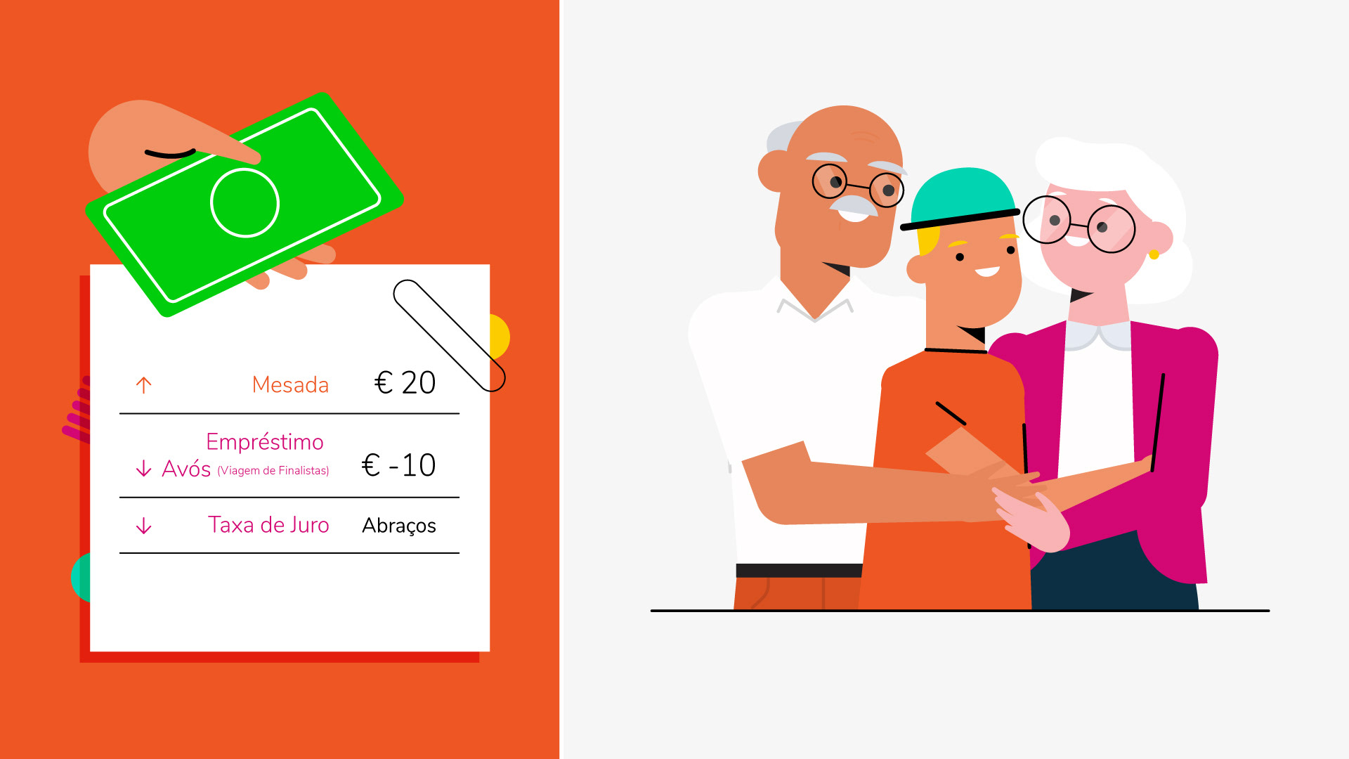
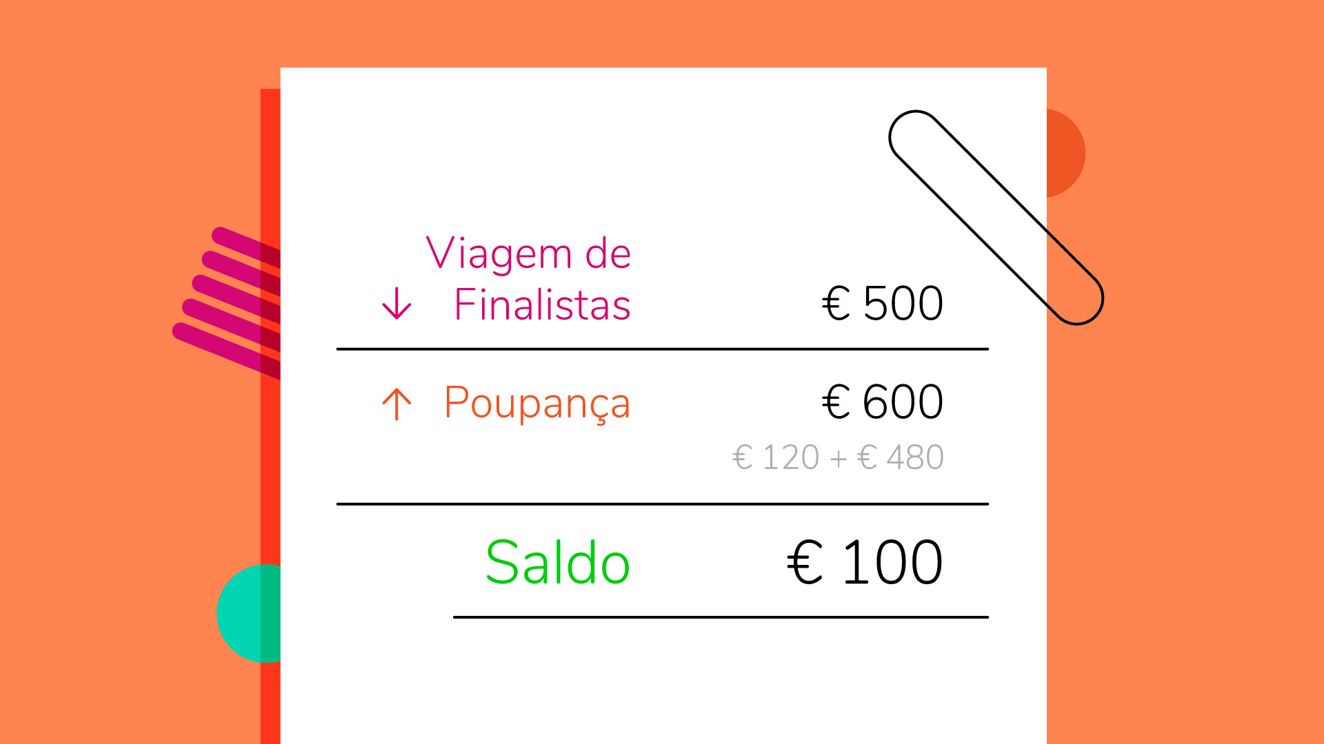
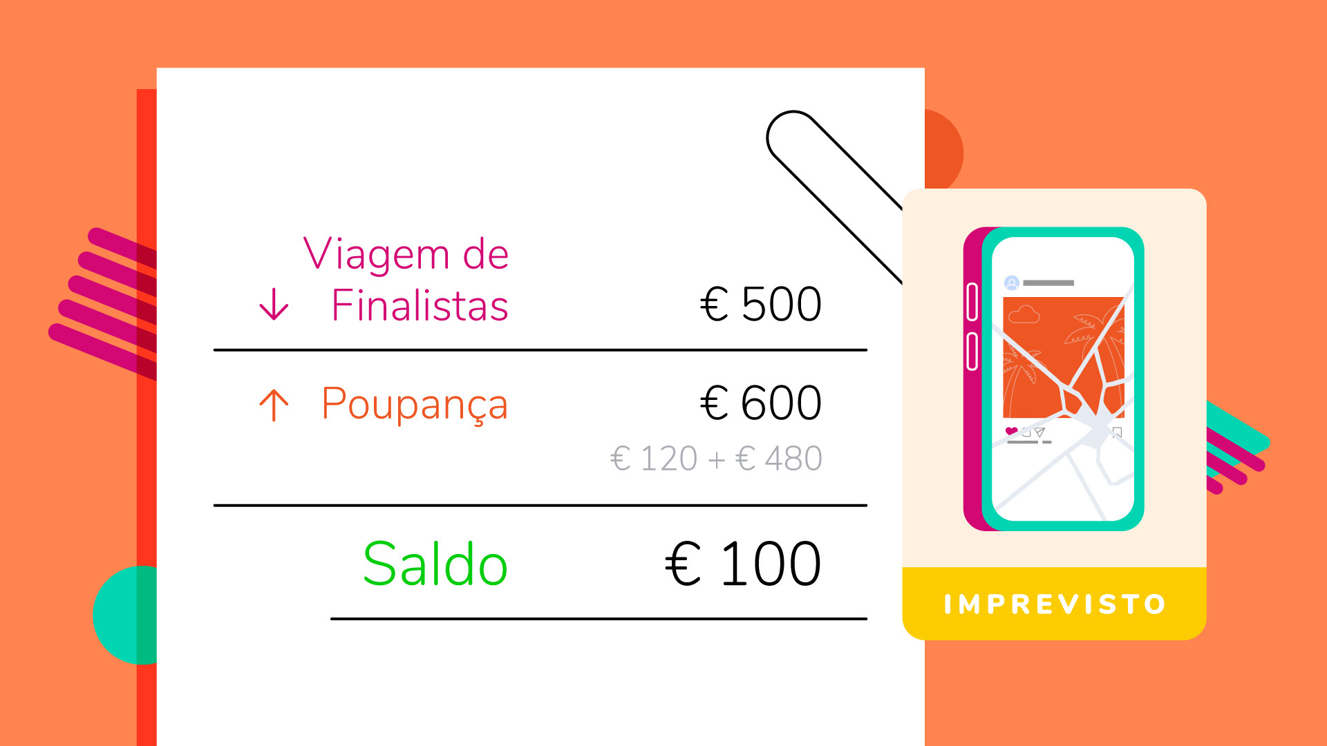
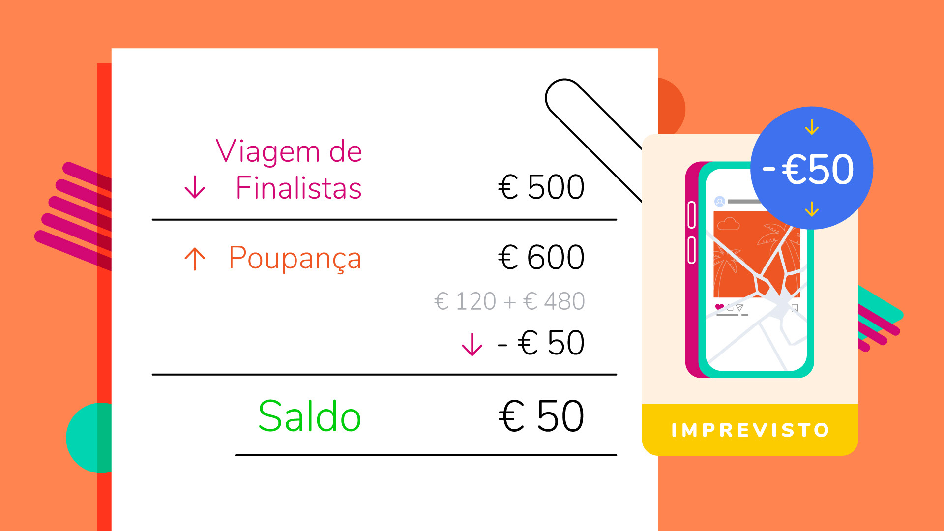
The three characters, João, Maria, and Pedro, have a simplified cartoon style with non-realistic proportions, flat colors, and minimal facial details like dot eyes and simple mouths. This made them pop on screen and blend seamlessly with the graphics and financial data, which was key since the approach avoided traditional narrative scenarios.


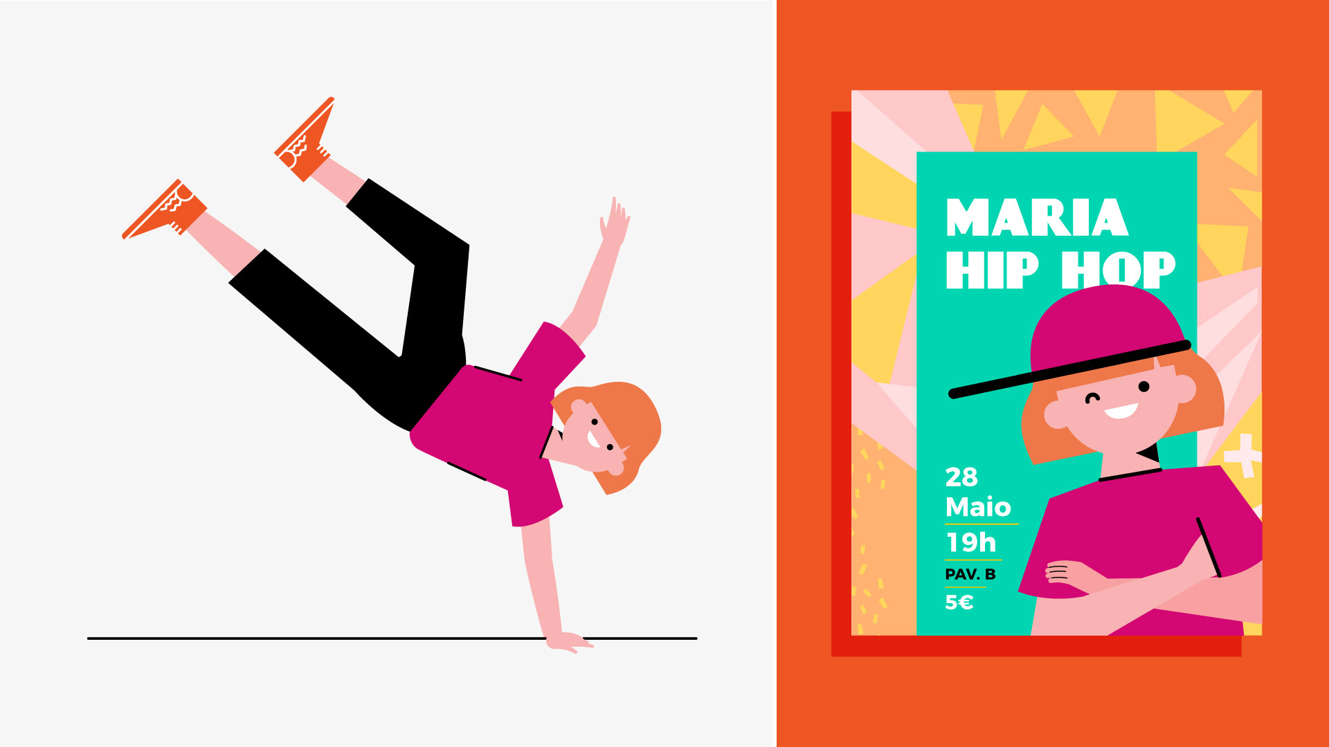
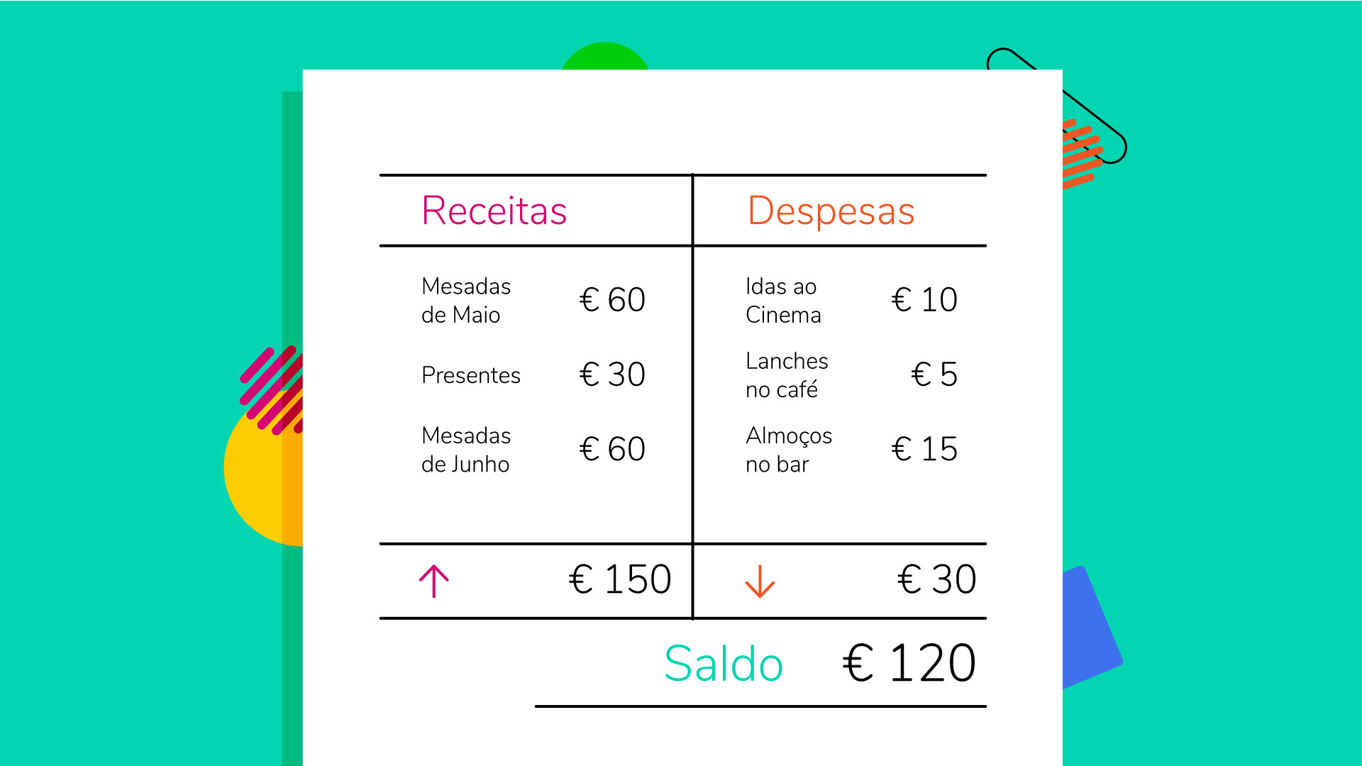
The visual style played with characters, icons, and financial data all mixed up on screen. Sometimes in one frame, other times in split screens, so everything stayed clear and easy to follow.

This let me show the characters’ actions while keeping key info, like budget sheets and infographics, right there, making financial literacy easier to get.

The final result is a seamless, fun integration of character-driven storytelling with practical financial instruction.
The Result
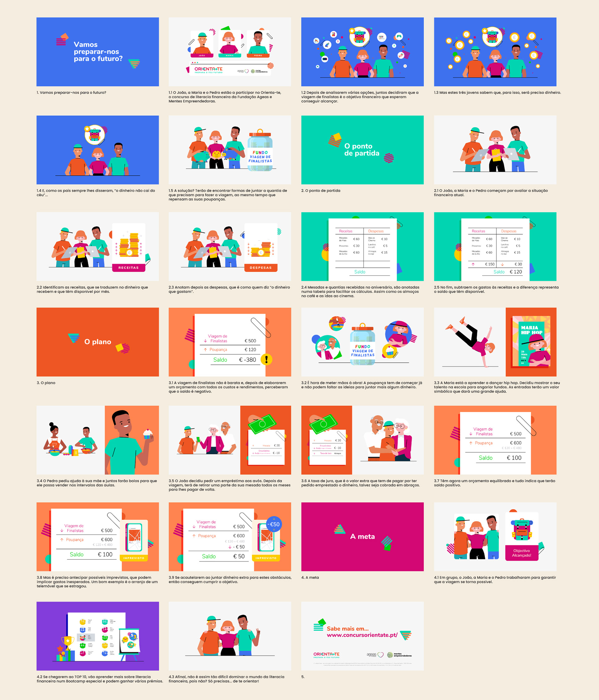
Styleboard & Styleframes


Got a great project idea, or thinking of something like this one? Maybe you're just curious about the process, or you feel like saying hello?
Great projects always start with a conversation. Seriously, drop me an e-mail!, I'd love to hear from you!